A Flight over the Antarctic Sea Ice From Chile to Australia (QF28)

TWCobra

Senior Member.
20161210-152703-oepxr.jpg

[Nov 18 2016] For anyone interested, in a couple of hours I'll be heading out of Santiago heading for Sydney on the QF28. The flight plan has us spending quite a bit of time at 71'30" South and the cloud forecast at the moment shows not a lot of cloud! Lucky I brought 2 GoPros with me!

Fingers crossed for a good time lapse video of the ice pack!

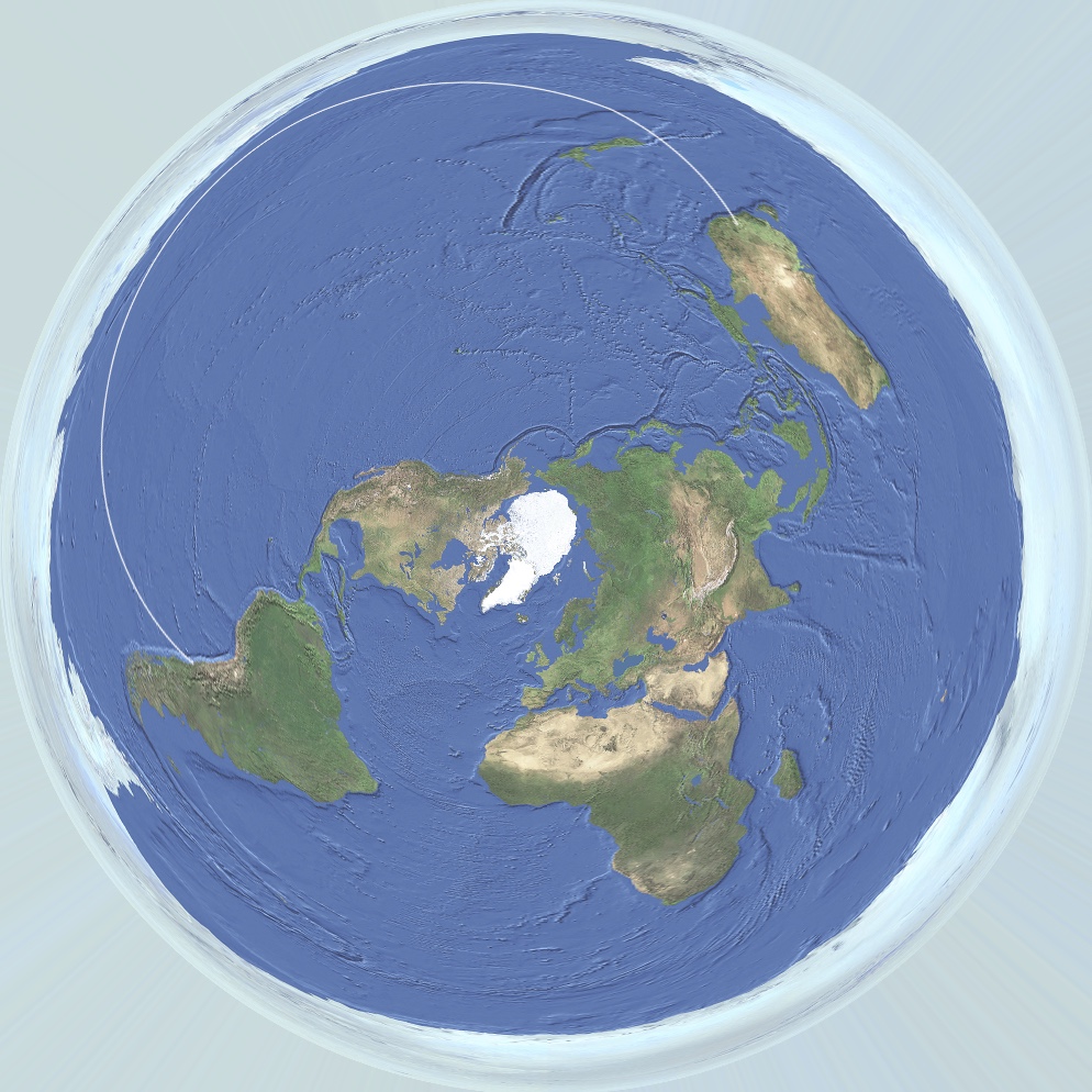
The pic above shows the route. I've been meaning to post something explaining great circle routes and why they are faster. This map will help once I compare it to the Google Earth representation of the track.

In the meantime we will be taking off around 1700 GMT and landing about 14 hours later. Only around 5% of the flight will be visible on FR24 as there is just nobody to pick up our ADSB signals.

Main Flight plan has just arrived with 13:25 as the flight time which should have us in Sydney on schedule at 0645 UTC. Here is what the flight looks like in the Nav software.

upload_2016-12-10_14-58-56.png

[UPDATE: Nov 19, 2016]

Just got in. We had 30 minutes with an awesome view of the ice.


Short time lapse.

Source: https://www.youtube.com/watch?v=gjVA7iEm8Zc


A view from the cockpits of the instruments showing location

Source: https://www.youtube.com/watch?v=X623emPcIYo


[Update by @Mick West ]

The images from both videos match satellite photos of the sea ice taken at about the same time. Here's the match for the "instruments" video.


https://worldview.earthdata.nasa.go...444.4505215033,-1319097.0734755602&r=-128.870

The raw images there are AQUA 2016/324 11/19/2016 00:15 UTC
https://lance.modaps.eosdis.nasa.go...fl2_143.A2016324001500-2016324002000.250m.jpg

Region of interest


Aqua/MODIS
2016/324
11/19/2016
00:15 UTC
https://lance.modaps.eosdis.nasa.go...v.A2016324001500-2016324002000.250m.jpg

This is just after the GPS location, going from

to


So the two red squares here. The yellow indicating the GPS location and the "house"


About 100 miles covered in the timelapse video


Here's a better fit from the "instruments" video, merging three images into a wider one:


The easiest thing to focus on to match them up is the "bowling pin" part of the image:
20161210-151456-mjbxw.jpg


Note to a Flat Earth believer from TWCobra, the pilot:

Abishua, I flew the QF28 flight from Santiago to Sydney a few days ago. I mean physically flew the aircraft, a 747.

We flew within sight of the Antarctic, down to 71.5 degrees south. We can go further south on that route but are limited to 71.5 south by lack of line of sight to the ATC communications satellites over the equator.

That in itself should tell you the world is not flat, however, can you understand that airlines are commercial entities, where containing fuel costs are paramount to maintaining profitability?

Santiago and Sydney are almost on the exact same latitude of 34'00 south. Sydneys Longitude is 151 deg East and Santiago is at 72 deg W. To fly between the two cities I must cover 137 lines, or degrees of longitude.. Correct?

The flat earth model has the distance between degrees of longitude becoming much larger as we approach Antarctica. This greatly increases the east-west distance the aircraft must fly to cover those 137 degrees of longitude. In this case the flat earth model makes it physically impossible to fly the distance on a full load of fuel.

Yet that is what we did. Because lines of longitude converge at the pole, the distance between them is shorter the closer you get to the pole. This is how great circle routes works and why airlines always fly an approximation of a GCR. The do get modified by winds and airspace restrictions.

[In the post above] are two representations of the route we followed [and videos and satellite photos of the route]

The first [map] does not depict the lines of longitude as they are or even as the Flat Earth model presents them. The do show the jets streams however.

The second is the actual route we flew, which was basically a straight line GCR modified for the winds on the day, and the 71.5S constraint. It depicts the lines of longitude converging at the pole, making this route the shortest way.

It may not be congruent with your beliefs, but that's the way we fly between these two cities, and we do it because any other way would cost too much fuel.

Sorry the "Flat Earth" does not exist. That's all there is to it.
 
Last edited by a moderator:
Just got in. We had 30 minutes with an awesome view of the ice. Will post video some time tomorrow. Here is a taste. Mick, that's exactly where we saw the ice.


IMG_3546.JPG
Is this a house (on ice floe or a small island)?
Screen Shot 2016-11-21 at 17.57.18.png
 
Last edited by a moderator:
This is just after the GPS location, going from
20161122-082446-nxuvk.jpg
to
20161122-082520-1mmoj.jpg

So the two red squares here. The yellow indicating the GPS location and the "house"
20161122-082549-4ojvy.jpg

About 100 miles covered in the timelapse video
I unsuccessfully tried yesterday to identify this distinct piece of ice (red arrow) in the middle of the video:
Screen Shot 2016-11-21 at 15.49.25.png

After your results its location is obvious:
Screen Shot 2016-11-22 at 16.46.39.png

It was cunning of you to switch to the next day in the Worldview, despite the location being to the East of IDL. Interestingly, the Aqua image of this area on Nov 19 is rather similar to the Terra image of Nov 18:
Screen Shot 2016-11-22 at 16.47.33.png
 
Last edited by a moderator:
It was cunning of you to switch to the next day in the Worldview, despite the location being to the East of IDL. Interestingly, the Aqua image of this area on Nov 19 is rather similar to the Terra image of Nov 18:

More luck than cunning. I noticed the ice did not move a huge amount from day to day, so looked either side to see what was the best image. These do match very well.

The Aqua image is only just on the 19th, at 00:15, however the flight was, I think, from 1700 UTC on the 18th to 0645 UTC on the 19th. The video seems to be within an hour of the Aqua image.
 
It was approx 0010 UTC. Look hard enough and you might spot the aircraft!
It may well be that you have left a trail captured in the satellite image. It is hard to see on a white background and possibly a figment of my imagination, but here it is:
Antarctic contrail?.jpg
The red line is the putative plane track deduced from your photo and videos. The enlarged area (that was flown over between the two videos) has a stripped background due to rows of small low clouds. There appears to be a white line going across the strips parallel to the plane track (highlighted with dotted line in the small square; click on the image to enlarge). See for yourself in the enlarged area, or directly in the NASA WordView of this area: http://go.nasa.gov/2ggFlUT

That might be just an mage glitch, from the raw Aqua image:
20161123-121938-7i0jo.jpg
 
That might be just an mage glitch, from the raw Aqua image:
It is a possibility, but the processed images look clean. However, the "trail" does not stand out in Band 7-2-1image, unlike the cloud rows.

Edit:

I watched again the second OP video. According to two different dials in the cockpit, its time actually was 00:15z, that is, essentially the same as the Aqua image. Note that by that time the plane hadn't reach the proposed "trail" location yet. In principle, as the location was in the middle of the Aqua swath and therefore filmed about 2-3 minutes later, the plane could get there 'on time'. However, there probably would be not enough time for the trail spreading and becoming visible at the satellite camera's resolution.
 
Last edited by a moderator:
In the meantime we will be taking off around 1700 GMT and landing about 14 hours later. Only around 5% of the flight will be visible on FR24 as there is just nobody to pick up our ADSB signals.

Actually a bit more than 5%
20161212-113216-xnwfq.jpg

20161212-113430-8p1wp.jpg

Interesting as FA do not indicate any feeder station near there:
20161212-113903-2zy31.jpg

So where is the data coming from? Ships? Satellites? Temporary stations near the ice shelf?
 
There are feeder stations on ships/boats - if you look at the world map there are stations in the middle of oceans - eg the map currently shows this in the area between Fiji (left of picture) and French Polynesia (Tahiti) at eh right.

The bunch of dots in the middle is the cook islands, but the highlighted one is not associated with any island so probably a boat of some sort.Capture.JPG
 
While this is most likely not the source of our wayward blip, (and is sort of off topic but does a little to help answer a question,) I was interested enough in this to research a bit to find out that they now have a solar powered autonomous 'FloatRadar 24' Wave Glider drone in tests that for a period of a few weeks can go out and cover areas!

https://www.flightradar24.com/blog/tag/wave-glider/


We can expect in the near future that our coverage areas will be greatly extended by these types of tech. Boats and surface stations may not be the only coverage in the near future, and there was one of these testing in the Northern arctic seas a few months ago, so it would not be out of the question for a second one to exist, or this same one is being tested again down south and I've yet come across the reports of it.
 
Further to the discussion on Great Circle routes, attached is an excerpt from the flight plan when we were at 71 degrees South and heading basically Grid West. i.e along a line of latitude; because the concept of east and west gets a little nebulous at those latitudes.

IMG_0673.PNG

I have highlighted a segment which was along the 71.5 S line (approx) which was 310 miles long. (OT, on google earth it measures 308 miles which leads me to wonder if a longer distance due to curvature is automatically adjusted on the plan. )

Anyway, the yellow box is distance in nautical miles, the red is estimated en-route time in minutes, the cyan is ground speed in knots, the magenta is fuel flow in metric tonnes per hour and the black is estimated fuel used on the segment in metric tonnes.

The thing to remember is that this is done pre-flight, on the planned loaded weight of the aircraft and the forecast winds and plans to use the minimum amount of fuel burn.

It is a legal document. If it is wrong on a flight like this, the consequences can be dire.

The segment represents almost exactly 16 degrees of longitude between 137 W and 153 W.

One degree of longitude at the equator is 60 NM miles so the same journey over 16 degrees of longitude there is 16 X 60 and equals 960 NM; over three times the distance.

If the aircraft had simply tracked west out of Santiago along the 35 degree latitude line, the same travel between the two lines of longitude is 787 NM. Almost 2.5 times the flown distance.

The increases in flight time, fuel burn and distance required to be travelled are obvious.

Below is a Google Earth graphic of the three distances which illustrates why, when crossing multiple lines of longitude, getting nearer the poles is what works.

Top Line-Equator

Middle Line-35 Degrees South

Lower Line-71 Degrees South

Distance comparison.jpg
 
Just gotta find a reason to fly to Santiago! That would be amazing to look out at while flying! I am a serial window seater :)
 
Sorry for the necropost, but I just wanted to ask you ( @TWCobra ) a question: are GCRs the thing many "flat-earthers" always bring up when discussing airplane routes, because they think they are strange on a globe earth?

I myself have always wondered, when looking up at planes paths on flightradar24, why many planes would choose to approach the respective pole (depending on which emisphere they were flying in) instead of choosing a "straight" path. I noticed that the more the departure/arrival places were distant, the more the path tended to curve towards the pole (say, a flight between Los Angeles and Beijing).
Is the reason behind it, the same as to why you choose that path, instead of going straight along the 35° latitude line?
 
Last edited by a moderator:
Is the reason behind it, the same as to why you choose that path, instead of going straight along the 35° latitude line?

They chose it because it's shorter. Great Circle Routes are the shortest distance between two points on a globe, and when you draw them on a flat map they look curved, especially near the poles.
 
They chose it because it's shorter. Great Circle Routes are the shortest distance between two points on a globe, and when you draw them on a flat map they look curved, especially near the poles.

Thanks for the reply. So I got it right!

What would they look like on a flat-earth map though? (the one with all the continents around the N-pole)

And what would be the shortest distance there?
 
Last edited:
I myself have always wondered, when looking up at planes paths on flightradar24, why many planes would choose to approach the respective pole (depending on which emisphere they were flying in) instead of choosing a "straight" path. I noticed that the more the departure/arrival places were distant, the more the path tended to curve towards the pole

Nice observation: you are right that the further apart the ends of the journey, the more "curved" the route will tend to appear (barring cases where the start and end points are close to the equator, of course).

The most effective way to understand the logic is to get an actual globe, and stretch a piece of string between the two points. You should quickly see that the shortest route doesn't follow the lines of latitude (unless both start and end point are actually on the equator).
 
You can also play around with it at http://www.gcmap.com

Pick a city pair that you see being flown on FR24 and check the GCR on that website. You'll find a close correlation.

As I mentioned before, an airline uses the GCR as the start point in flight planning. Other factors then come into play like forecast winds and route restrictions such as keeping a twin engine aircraft within a specified flying time of a diversion airfield.
 
Do aircraft usually fly GCR rather than on a fixed heading, even when flying in controlled airspace, eg. over the uk?
I have noticed, that at high resolution, that the track often seems to 'drift' slowly..
 
Nice observation: you are right that the further apart the ends of the journey, the more "curved" the route will tend to appear (barring cases where the start and end points are close to the equator, of course).

The most effective way to understand the logic is to get an actual globe, and stretch a piece of string between the two points. You should quickly see that the shortest route doesn't follow the lines of latitude (unless both start and end point are actually on the equator).
You can also visualize an extreme case where a plane flies from one point to another point that's 180° of longitude away. In that case, flying directly over the nearest pole would be the shortest route on a globe, and on a flat map projection would look like two separate vertical lines.
 
Have any of you taken this flight and used a hand held compass? It's reported the compass will show SW which fits FE while the on screen NASA map shows NW which is GE.
 
Back
Top