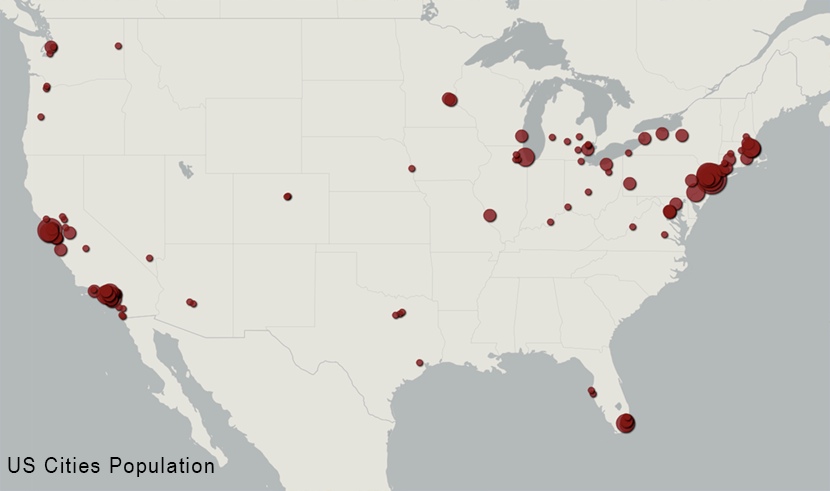
The above image is a map of US cities by population. Something that occasionally crops up in conspiracy cultures is taking two different maps that basically reflect the population density of the United States, and then claiming that there's some correlation between them. Of course the correlation is simply population, but instead the theorist will claim that whatever the subjects the two maps happen to be about are actually linked.
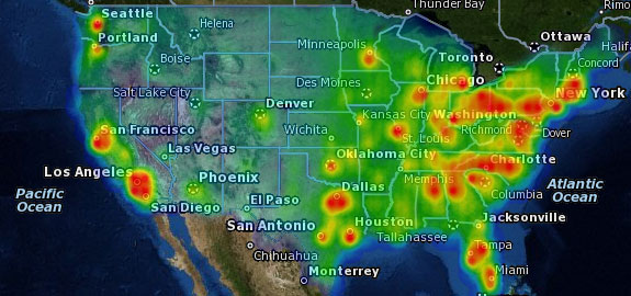
For example, in this Before It's News article, and related video, we see two maps. the first is from the CDC, and is a map of the U.S. Quarantine stations.
http://www.cdc.gov/quarantine/quarantine-stations-us.html
External Quote:U.S. Quarantine Stations are part of a comprehensive system that serves to limit the introduction and spread of contagious diseases in the United States. U.S. Quarantine Stations are located at 20 ports of entry and land-border crossings where international travelers arrive (see map below).
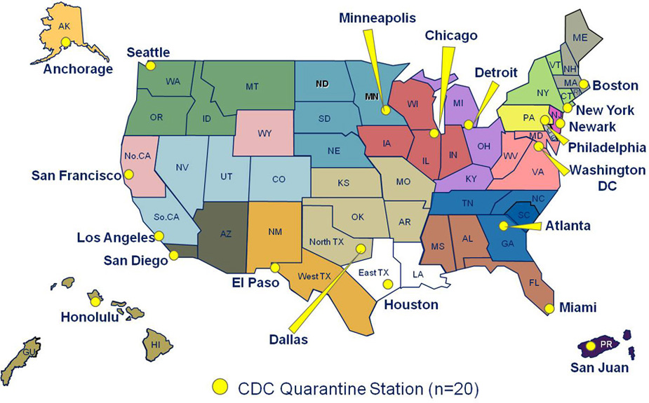
Notice these are Quarantine centers for people arriving in the US. It's not an "Ebola Quarantine" map. It basically reflects large cities, because large cities are where the large international airports are, so that's where people arrive. There's also one at the relatively small El Paso, Texas, because of the land border with Mexico.
There are 20 quarantine stations. Back in the 1970s there were 55, but with eradication of infectious diseases due to vaccination this was reduced to just 8. But between 2004 and 2007 this was increase to the present 20 because of bioterrorism concerns, and because of the 2003 SARS outbreak.
But then they also show this map:
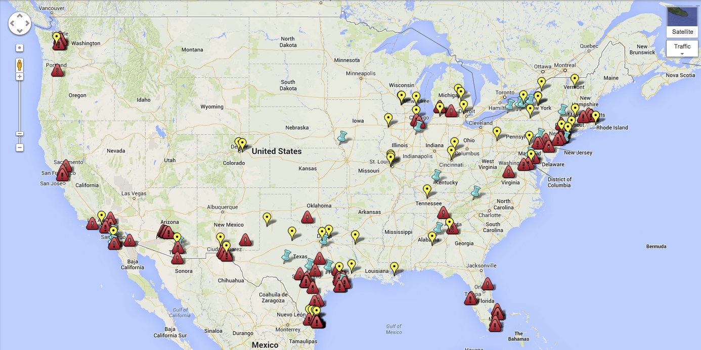
Which is a basically a list of every reported relocation center of unaccompanied immigrant children, collated by NumberUSA, an anti-immigration web site run by Roy Beck.
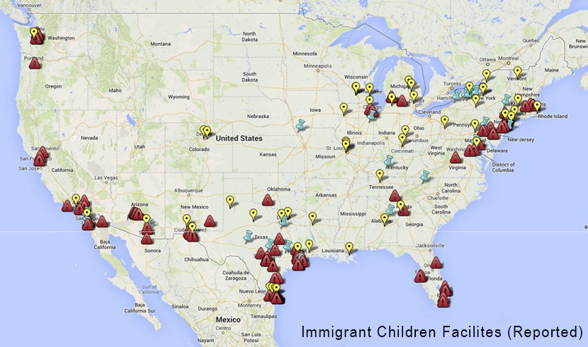
Again the map simply represents population centers, with a concentration on the Mexico border. The actual immigration facilities are the red triangles. The blue and yellow markers represent reported proposed or cancelled immigration facilities. But it basically just represents cites with lots of people, and places near the border. Compare the immigration center map against the population map:
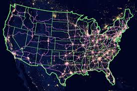
Before It's News then takes it another step with the addition of this map:
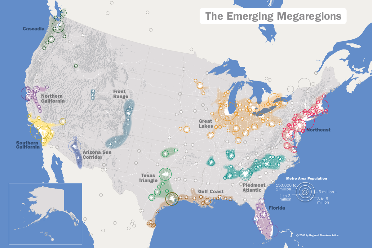
They try to make out that it's an "Agenda 21" map, some kind of plan for population redistribution by a global elite. However, as you can see, it simply reflects expansion of existing population, and is part of a 2011 report on high-speed rail by the Regional Plan Association, a 90 year old New York based urban reform association. It's not about getting people into those areas, as the people are already there. It's about linking up the areas with high speed rail and other infrastructure reforms.
Another video about the same maps thinks that it's incredibly suspicious that there are no "Megaregions" or CDC quarantine centers in the Yelllowstone region, and goes on to suggest that the global elite might be planning to reduce the population by triggering a supervolcano explosion under Yellowstone.
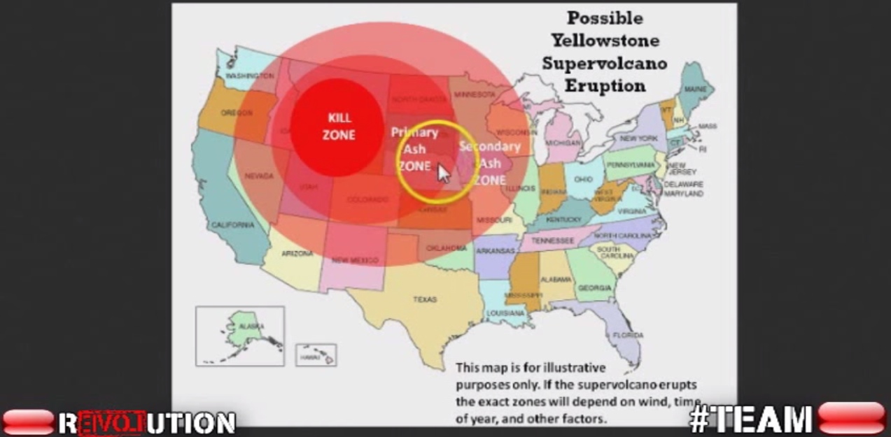
Of course the reason there's no Megaregions etc there is because nobody lives there.
Last edited: