The Rush to Explain an Illusion with Train Track Pieces - Jastrow AND Perpective

Mick West

Administrator
Staff member


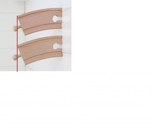
In a widely shared tweet two identical pieces of curved train track appear to be different sizes.


This has been widely explained as an example of the Jastrow Illusion, something that's commonly illustrated with toy train tracks. And indeed that that's part of it, however there's more to it than that. Compare the top segment to the bottom segment here.

upload_2016-4-14_11-41-15.png

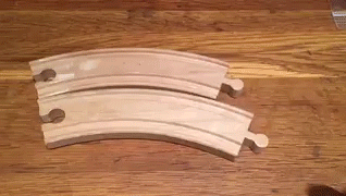
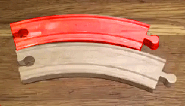
It looks smaller, right? Now everyone is telling you this is just an illusion. It's quite true that the Jastrow illusion makes the bottom piece look bigger. But in this image (and the video) the bottom piece actually IS bigger. It's bigger because it's closer to the camera:


This may seem like a minor point (after all the Jastrow Illusion IS partly why it seems bigger), but I think it illustrates a very common problem of rushing to embrace an explanation - especially if that explanation is really interesting and has a cool name. A great example of this "rush to explain" was this "floating city" video:


This was widely "explained" (in many major media outlets) as being a Fata Morgana Mirage - something that was physically impossible based on the 3D structures and the camera angle. Yet people eagerly grasped this explanation and repeated it. In fact it was a hoax video, either computer generated, or done with reflections.

The lesson: just because everyone is repeating the same explanation, it does not mean that explanation is correct.
 
Last edited:
I agree that perspective makes the nearer piece bigger on screen, but normally our brains account for perspective, so that two similar objects appear the same size to us even if one is forming a larger image on our retinas.

For example, there is no illusion here, even though the nearer pen is larger if measured on the screen.

image.jpeg


image.jpeg

The illusion overrides our brain's normal ability to account for perspective. I wonder if it would still work with the pieces the other way up, so that the "lower" (i.e. "larger") piece was actually further from the camera? I have these same tracks at home, so I can try it later.
 
I wonder if it would still work with the pieces the other way up, so that the "lower" (i.e. "larger") piece was actually further from the camera? I have these same tracks at home, so I can try it later.

Faking it quickly in Photoshop by using the perspective warp, it seems the illusion still works, even when the "bottom" piece is further away, and thus actually smaller on the image:

track.jpg

Moving the image of the top piece, which (to me at least) still appears to be bigger, onto the lower one:

track1.jpg
 
The illusion is definitely there (and works very well). I think though that the combined effect makes it seem they are actually different sizes. The lower piece with perspective seems thicker, not just longer, but in the overhead view they seem the same thickness. This reinforces the illusion that they are different sizes, and stops you from "correcting" for perspective.
 
I was playing with this the other day, and if you rapidly swap the pieces over and over in front of you it really does start to make your brain hurt.
 
So, I tried it at home with the curves the other way up. The illusion still works but is much less dramatic. Video is attached, converted to GIF and (hopefully) embedded below as well.


ezgif.com-video-to-gif (1).gif
 

Attachments

  • trim.D1D05617-74B3-4408-A7EC-47E9144F1075.MOV
    12.6 MB · Views: 938
Last edited:
ttracks.gif
Yeah, perspective definitely enhances the illusion. Here is a simple animated illustration using dolly zoom.
For example, most modern phone cameras can be very wide angled. Shooting something that close usually leads to a very wide angle of view.
 
Last edited:
So, I tried it at home with the curves the other way up. The illusion still works but is much less dramatic. Video is attached, converted to GIF and (hopefully) embedded below as well.


ezgif.com-video-to-gif (1).gif
can you try turning the two so the straight edges are actually straight? i think would be a better tutorial tpe vid/gif
10pcs-lot-10cm-Short-curve-font-b-Track-b-font-Railway-slot-Pack-fit-Wooden-font.jpg

10pcs-lot-10cm-Short-curve-font-b-Track-b-font-Railway-slot-Pack-fit-Wooden-font.jpg
 
radius is the same.
 

Attachments

  • length_delete.png
    length_delete.png
    256.2 KB · Views: 413
Last edited:
The crazy thing is that even with the line drawn on there, the bottom piece still looks bigger!

Are you used to work with three-dimensional shapes? As a graphics artist I'm used to measure shapes by eye, and for me the illusion completely disappears when the base of the pieces are aligned to a horizontal or vertical plane.

I think a slanted base line, disguises the fact that the pieces are the same size The baseline provides a crucial reference. Looking at @deirdre's image with a slanted baseline puts the illusion back into the image for me.
Untitled-2.png

However, aligning the baseline of the tracks in the original video doesn't remove the illusion, which further supports the conclusion that the main reason why the top piece looks smaller is because both pieces lies flat on a floor shot in an angle, as opposed to @deirdre's image where the surface of both pieces are perpendicular to the camera.
Untitled-1.png

Sorry to be late to the party, but mrtinfoil's idea can be better seen if you also add lines to each corner (of deirdre's pic):

Blocks.jpg
 
Fat, that's what I was about to do at this point, after reading the thread. That's a nice illusion, and Mick is right in that for the tweeter the illusion is further composed by proximity to the camera.
 
Last edited:
Back
Top