The graph that Dr Shiva Ayyaduria shows is accurate. The hand-draw trendline is not at all accurate.
The downward slope is an inevitable consequence of split-ticket voting, something that we know exists, and variations in the amount of straight-ticket voting, something we also know exists. This video demonstrates this: Source: https://www.youtube.com/watch?v=BUp4uJt9TJg
The only way you'd get the flat line — which Ayyadurai asserts is "expected" — is if the correlation between split-ticket Trump votes and straight-ticket Republican votes is exactly 1:1.
In all other cases, you'd always get a negatively sloping line. Ayyadurai calls this negative slope evidence of election-fraud, but it's going to be the case 99% of the time! So he must intentionally be trying to pull one over on us, here.
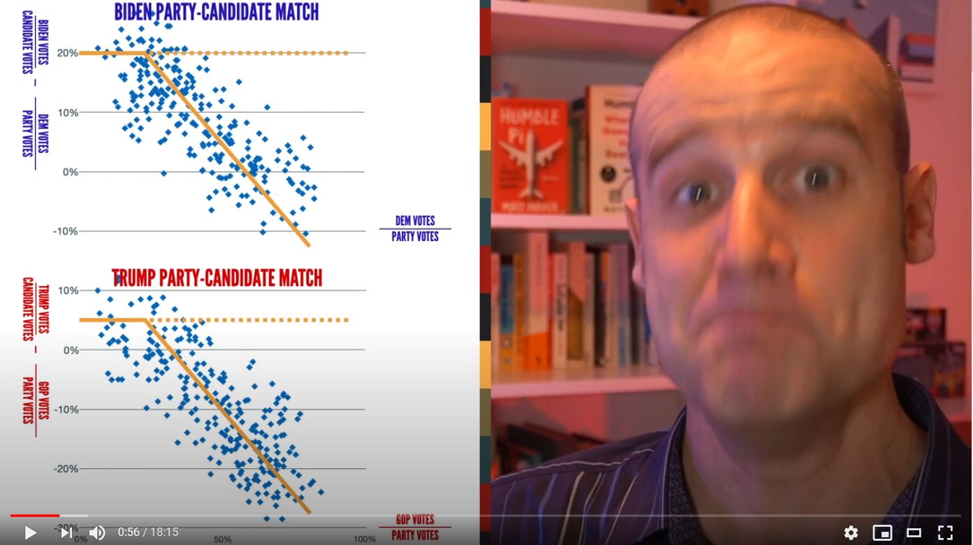
The quick takeaway is that BIDEN HAS THE SAME DOWNWARD SLOPE, which is expected, based on the above.
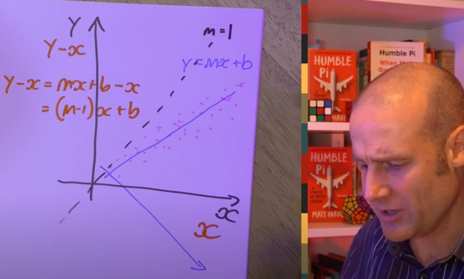
He also points out how the slope of a line y = mx + b is transformed, if the vertical axis is y-x, to y-x = (m-1)x + b, i.e it subtracts 1 from the gradient, so anything less than m=1 (essentially y=x, in this context) will result in a downward slope.
(original thread follows)
Hello! I'm glad to be here. Recovering conspiracy theorist and high school algebra teacher here. Love the podcast! Been kinda sorta backsliding into my conspiracy thinking with the US election. The things that are easy to debunk haven't really been troubling me, but this recent video from Dr. Shiva analyzing election data is something that is WAY over my head.
Hate to give him views but I would love to see this one debunked.
In Michigan, in four counties alone, 69,000 votes were transferred from Trump to Biden by a computer counting algorithm.
The article then goes on to cite a defunct blog:
Article:
This report summarizes the results of our review of the GEMS election management system, which counts approximately 25 percent of all votes in the United States. The results of this study demonstrate that a fractional vote feature is embedded in each GEMS application which can be used to invisibly, yet radically, alter election outcomes by pre-setting desired vote percentages to redistribute votes. This tampering is not visible to election observers, even if they are standing in the room and watching the computer. Use of the decimalized vote feature is unlikely to be detected by auditing or canvass procedures, and can be applied across large jurisdictions in less than 60 seconds.
The latter article is from 2016.
Why do weighted races exist? Sacramento uses weighted voting on some issues.
Article:
The passage of Proposition 218, the Right to Vote on Taxes Act in 1996 established new balloting procedures that allowed all property owners who would have to pay a proposed assessment to decide if it should be imposed. Examples are benefit or special assessments that fund street lights, sewers, sidewalks, levees and other improvements that benefit an assessed property. Ballots are weighted according to the amount each property owner will pay.
But this is not a feature that lets you set a vote outcome.
It relies on a bunch of unverifiable assumptions, and it's not really clear what the data represents exactly. What are the numbers, and where is it from?
This is the gist of the argument
He's plotting "Republican %" against "Trump Votes - Republican votes" Which I'm thinking is the votes for Trump minus the Votes for a straight republican ticket (or at least the Senator race)?
The more Republican a precinct is, the worse Trump does relative to that precinct. He argues it should either be flat or a linear slope. The yellow line appears to be hand-draw to approximate what he feels the trend line is. That looks incorrect. He claims there's a sudden change that is suspicious. But it looks like a linear relationship to me.
There's more, I'd like to see the data before wasting much time. We don't know what the numbers actually represent, so speculating on what they mean is a bit pointless.
As I understand it, his analysis looks at the "down ticket" voting patterns in individual precincts of four counties in Michigan. The unnatural pattern is that the more Republican the precinct, the less likely they were to vote for Trump. Thousands of Trump votes were given to Biden in strongly Republican precincts. It's possible that Republican voters could be fed up with Trump and choose to vote Biden for President, and the Engineering trio consider that. The red flag that is unarguable is that the ratio of Republican voters who chose Biden over Trump should be the same across precincts, and it is in precincts which are predominantly Democrat. But these engineers found a "transistor function". After the percentage of Republicans rise in a precinct beyond a "cut off" point, this ratio changes, but it changes in a perfect and predictable linear way. The ratio depends on the percentage of Republican voters in a precinct. The more Republicans there are, the more likely they are to abandon Trump and vote a Biden-then-Republican ticket.
The dashed orange line should be a flat line, instead the downward slope "cuts in" and votes are increasingly distorted in precincts where more Republicans vote.
Adapted from the video presentation above.
The slope of that line is "too perfect" — it's almost perfectly linear. The transistor effect kicks in and shows that the same algorithm was used in different counties across all precincts. The pattern is non-random. Even if you wanted to believe that Rep voters were tired of Trump it would not happen in a perfect line that depended on the number of Rep voters around you. (45 mins.)
So most of the votes were stolen from strongly Republican areas and flipped for Biden. Unless this is fixed, in future elections, they (whoever they are) will just change the algorithm to alter down ticket votes too.
[..]
The same slope occurs in Early voting patters as well as Election Day voting patterns.
Trump in Macomb County is 12% to 22% more popular than the Republican party candidates in predominantly Democratic areas. In Republican dominant areas this effect reverses.
In WAyne County there was no cheating and there the pattern is totally different. Trump is universally more popular than his Rep colleagues, not less. Trump is leading people to vote Republican who otherwise chose non-Rep candidates.
First of all, this is not "a perfect line". The average line is perfect because it was modeled to be that way, but the data points are all around that in a random pattern, and a non-straight line as average would work just as well. Just because you chose a straight-line trend curve doesn't mean the underlying process is linear.
Secondly, the graph is misleading, because with its "- 20%" it obscures the actual numbers of ballots. How many straight Republican tickets were there atcually in these districts? That matters.
Third, this shows that some people will vote for Trump and not vote a straight Republican ticket; and there are relatively more of these in a non-Republican precinct than in a Republican one. Logically, that's actually not surprising, but it's hard to spot with the way this data is presented.
How does he know how many straight-ticket voters there are in the first place?
Without the data I can't really compute a trend line. But here, I've put the end points at the vertical centers (eyeballed averages) of the left and right ends and hand-shaped a trend that looks anything but linear. There's only a corner in the trend if you want there to be one.
An additional consideration is that in a precinct with 0% Republicans, you can't have fewer votes for Trump than there are Republican votes. So simply by the way the graph is set up, the left side data must all be above the red line.
If I look at it like this, I'm thinking that there's a fixed proportion of Republicans that didn't vote for Trump, because the deviation from the "Party Score" is proportional to how many Republicans there are; and then there's a number of Trump voters who are not identified as Republican on top of that.
I'm not saying that is the correct way to look at it because I don't know what the "Straight Republican Party Score" actually means. But what I'm saying is that there is a lot of room to see what you want to see, because the data visualization chosen is very unusual, and the data isn't "perfect" by any means.
22:07 "So in the normal case, if you look at this, if the center line, if the red line, is Republicans, ok, straight line, because the reality is, that anyone who voted Republican probably voted for Trump, so if you look at all these precincts, they should hover around zero, right? So for example, any of the Republican straight party votes, if you looked up, and if you looked up what the Trump vote was, it should be close to zero.
That's the fallacy. He's assuming that the non-straight-ticket vote follows the straight Republican vote, and there's no evidence that it would, except in a very general sense. I'd certainly not be expecting the ratio of independent voters for Trump or Biden to follow the ratio of the Republican or Democratic base in a precinct, which is what the straight party voting approximately measures.
In the case of fraud, what this also seems to assume is that straight-party ballots were not affected, but non-straight ballots were? What's to say it wasn't the other way around, with the Republican straight-party vote being cheated up? And if both were affected, this analysis should not show a difference at all.
I've made 4 different graphs. All of them have the Republican straight ticket vote percentage as their X-axis. For convenience, I've used the 2-Party-Rate = Rep/(Rep+Dem) throughout.
Upper left: same graph as in the video
Upper right: same data, but not computing the difference
Lower left: same as above, but only the Trump votes that weren't on straight Rep ballots
Lower right: same as above and left: Ballots with X for Trump vs. Ballots with X for straight Republican
My trend line is a 2nd-degree polynomial. The most succinct graph is the one in the lower right: it shows that the Trump voters outside the Republican base kinda get more in more Republican districts, but it's not a direct proportion. The other graphs just kinda muddle that information by mixing it up with the straight-ticket votes in two different ways. There is no statistical anomaly.
I made an account to respond to this, because these guys have wasted my whole evening. I believe the relationship is even simpler than people trying to speculate the difference between what "straight ticket" voters do vs independents.
TLDR: The graphs basically tell you the following: The more republican a county is, the more likely its voters are to chose the "Straight Republican" voting option rather than choosing the "Individual Candidate Option". That's it.
Before talking about this video, I want to briefly mention that I first watched a video showcasing Bennie Smith's finding about votes being stored as decimal values. I won't provide a link to it, but it is pretty easy to find(search for "Fraction Magic"). It was posted 4 years ago and attempts to prove voter manipulation by showing how the voting software can display values as either decimal values or rounded whole numbers. In that video, they literally just show a before and after of this feature (ie. 31% being displayed as 30.61%) and say you can use this fact to change the results of an election somehow. The reason decimal values are used at all is probably because of the weighted voting feature discussed in this video. Now, if weights were applied during a non-weighted election that would surely be fraudulent, but that ability to represent the numbers as decimal values is not.
In the video this post is actually about, the graph they show actually seems intuitively obvious to me based on the values being graphed.
They confuse the viewer by trying to make it seem like they are graphing Trump votes vs republican votes, but it is actually a graph of "people who voted straight republican" vs "people who did not vote straight republican, but voted for Trump. It makes sense that these values would linearly deviate as they do in these graphs. The more republican a county is, the more people in that county are going to choose the "straight ticket" ballot over the one that lets them choose democrats. The mysterious "20% threshold" is literally disproven in their own video. Some of the graphs have a constant downward trend and some have a turning point that is much farther to the right. The lines they added to represent the average(as you can see in screenshots above) clearly do not represent the average even from eyeballing it. Since we only get to see a couple of graphs, they could have easily cherry-picked the best ones to prove their point.
It has been a long day, so I could be interpreting the graphs wrong. If I am wrong about this interpretation I would love to know what I am missing.
TLDR: The graphs basically tell you the following: The more republican a county is, the more likely its voters are to chose the "Straight Republican" voting option rather than choosing the "Individual Candidate Option". That's it.
That's a good way to put it.
And even the graphs they cherry-pick don't actually show any anomalies.
I think the decimals argument is that, by finding alleged rounding errors they try to prove that this feature is turned on, and then they surmise that it's turned on to manipulate the vote. But I don't see how that feature can work with anonymous ballots: you need a table of voters and weights, and a way to match ballots to voters, and there just isn't one.
It's different, with more Biden voters choosing the split ticket. That's not really surprising as we know many Republicans have announced they would support Biden, so I'd expect split-ticket voters to have a Biden choice more often.
I've graphed the "split ballot proportion" for both candidates. The blue dots show how many Biden voters in a district cast an individual ballot. I've sorted the districts along the X axis by how many straight-ticket democcrat voters there are, so predominatly Republican districts are on the left and predominantly Democrat districts are on the right. I've chosen that because I expect fewer Democrat voters to have switched sides.
It is very obvious that the voters who chose Trump are choosing split tickets with a fairly constant proportion of around 30%-40%. But the Biden voters in predominantly Republican districts are much more likely to split their ticket. This is pretty much exactly what I would expect.
And that is the reason why the proportion of individual ballots in predominantly Republican districts is swinging towards Biden: because the Biden voters in those districts are Biden-supporting Republicans who won't vote a straight democratic ticket.
What the mathematicians in the video are really doing (and also obfuscating very well) is comparing the individual vote split to the straight ticket vote split, and taking a difference where it's apples and oranges. And that's why they don't understand what they're seeing; and not understanding something is always a solid basis for a conspiracy theory.
But it's very clear if you look at the numbers the right way: Republican voters choosing Biden create an excess of indivdual Biden tickets in predominantly Republican precincts. And that's what their graph shows. Their assumption that the individual vote share should equal the straight ticket vote share is wrong, and we know why, and we can show it.
By "Split Ticket", you mean just not choosing a straight-ticket option? Being significantly split (voting Trump for Pres and a Democrat for Senate) would be way lower than that.
Hmm, I'd typed a longer reply, but it vanished. Anyway, fixed my graph. It's a percentage of the class, not a percentage of the total.
Here's a way of looking at it the downward slope, just in terms of two parties.
There are two types of voters, Republicans and Democrats, defined as being generally inclined to vote for that party for Senate, the House, and local politicians.
Both though have a fraction that will vote for the opposite side. It's higher for Republicans, let's say 5% (Republicans voting for Biden) vs. 1% Democrats voting for Trump.
So then the straight-ticket option comes along, and that that acts like a great filter. That 5% of republicans can't do straight ticket, so they always end up in the non-straight group.
So if, say, 50% of Republicans pick a straight ticket, then in the remaining group the 5% that will flip becomes 5/50 = 10%
If 70% of the Republicans pick a straight ticket, then it's 5/30 = 16%
Hi everyone
I got here after reading Mick's debunk of the Shiva data. Nice post! I dowloaded the data myself and took a look ... I'm puzzled. Can someone explain to me how the Michigan accounting works. For example, Kent County has 501k registered voters and 362k ballots were cast. There are two sets of votes reported, one for the straight ticket and one for the Presidential ticket. (These are recorded on two separate spreadsheets). I count 186k votes for Biden and 165k votes for Trump on the Presidential ticket and 102k votes for Biden and 106K votes for Trump on the Straight Party ticket. This adds up to more than the number of ballots cast and indeed its also more than the number of registered voters. It's not just in Kern County ... the same feature occurs in all the counties I looked at. I'm pretty sure I'm reading the tables incorrectly ... but a pointer from someone else who's looked at the data would help a lot.
Thanks
Roger
I count 186k votes for Biden and 165k votes for Trump on the Presidential ticket and 102k votes for Biden and 106K votes for Trump on the Straight Party ticket.
By "Split Ticket", you mean just not choosing a straight-ticket option? Being significantly split (voting Trump for Pres and a Democrat for Senate) would be way lower than that.
Yes. I assumed a voter who does that votes a Republican in some of the races further down the ballot, not necessarily Senate -- could just be local politics. But yes, it also includes ballots that just have the presidential race on them, which aren't really considered split. I like PerfectTwenty calling them "individual votes".
Sometimes, as in this case, a statistical analysis looks unusual. Dr Shiva's scatterplot looks unusual because nobody normally analyses vote shares that way. As a skeptical observer, the question you need to ask is, how did he hit on performing exactly that analysis?
It's a problem that exists in research in general. Imagine somebody has collected a large amount of data, maybe run a big trial, does their analysis, and finds nothing, not the effect they were looking for; they could write that up as a research paper, but it won't be very interesting, and it'll be hard to publish. So what the researcher might do then is look for other effects in the data than the one they were expecting. The choices that a researcher can make in which analyses to run, and how to run them, is what Andrew Gelman calls "researcher degrees of freedom". To the layperson, it sounds legitimate: you have all this data, why not do some data mining?
The problem with that is that if you have data with a random component, if you look hard enough, you're always going to find something interesting. It's like throwing two dice: we're excited when we get a double six throw; usually, we won't get one, but if we're persistent, we're going to see one eventually. If you then write your research paper on just the double six that you got, and fail to mention all of the other throws that you did, that's going to be misleading; and if another researcher decides to duplicate your research, they will fail, because you didn't see an actual effect, but just random chance.
In modern science, good studies are pre-registered; that way, studies that don't show an effect are still on the record. And ideally, the researchers also pre-register the analysis they're planning to do; that prevents them from looking around for something that looks good when the original analysis doesn't pan out.
And then there's another issue that sometimes comes up: the original graph has a discontinuity, two yellow lines that meet in a corner. Some research has other types of discontinuities: there may be a point where a researcher says some effect happens, and they'll compute a trend line left of that point and to the right of that point, and there will be a "jump" because these lines don't meet. That's another random effect: trend lines are unreliable at the ends, so if you introduce an end artificially, you're more likely to see a random fluctuation. This is even easier to achieve if you have the "researcher degree of freedom" to choose that point at will. When you remove the assumption of a discontinuity, and compute the trend, and there is no anomaly, meaning the data is within the limits that we'd expect from random chance, that means that this discontinuity doesn't really exist.
So as a skeptic, when you see a graph that purports to show a discontinuity, have a look and see if the data doesn't look just as convincing when you assume that there isn't one.
Issues with this Scatter Plot
Knowing that, the scatter plot produced by Dr Shiva is already suspicious. Why choose this type of analysis specifically? Why show the numbers in such an unusual way? What do they actually mean? And is that corner in the trend lines an actual effect, or just a discontinuity artifact?
The graph shows a difference of two percentages:
a) the "Republican party score", which is the share of straight-party republicans among all straight-party tickets (Republican+Democrat)
b) the Trump vote share, which is the share of Trump votes among all votes.
These percentages are of different quantities: the number of votes that make up 100% is different in both cases, and therefore the difference has no meaning in reality. If the "Republican Party Score" had been just the number of Republican straight ticket votes, then 100% would be all ballots for both a) and b), and then the difference would simply be the share of individual Trump votes. That has meaning; the quantity that Dr Shiva is graphing doesn't. Nobody understands what exactly this graph is showing, because it doesn't actually show anything real.
I've talked about why that Dr Shiva's graph shows a nonzero difference; the main point is that he has no actual reasoning for why that difference needs to be zero. The idea that straight-party ticket voters behave the same as individual ballot voters has no evidence going for it, so showing that the difference is not near zero doesn't actually prove or disprove anything.
In short, Dr Shiva produces a graph that means nothing; and while he claims it means something, that's based on no evidence.
Vote Analysis
What you're looking at in the scatter plot is an unavoidable mathematical consequence of a core observation of this election: some voter groups who voted for Trump in the last election switched. Here's what that looks like for Kent County:
The graph on the upper left shows all of the Trump and Biden votes in all of the precincts. Every bar is a single precinct. I sorted the precincts by presidential vote share to get a "clean" dividing line. You can see at a glance that Democrat and Republican bases, the straight-ticket voters, are approximately symmetric. You can also see that the individual voters, the more lightly shaded area in the middle, is not: there's disproportionately more blue than red. These are the voters who decided the election for Biden, after all.
If you look at it like that, it feels normal: you know that there must be people who switched from voting Trump in 2016 to voting Biden in 2020; they're probably still going to want to support some Republicans in local politics, so their ballots aren't going to be straight-party ballots. You have less of these in strong Republican areas, because fewer voters switched there; if more did, that precinct would no longer show up as strongly Republican. You have less of these in strongly democratic precincts, because you have fewer 2016 Trump voters there to start with. And that leads to an "abundance" of individual ballots voting for Biden in the precincts in the middle of the spectrum.
This "abundance" creates a difference in vote proportion: if you compare Rep straight/Dem straight to Trump individual/Biden individual, that's not going to be the same; and that's what Dr Shiva found. It's perfectly expected, if you think about it.
I've produced 3 more graphs. The red and the blue graph in the upper right corner work the same as the big graphs, but I've limited them to Trump and Biden votes only, respectively. The edge is a bit ragged, but if you squint your eyes a little, you can see that the proportion of individual votes for Trump is a fairly steady 30-40%, regardless of whether Trump did poorly or well in that precinct. But for Biden, that demarcation line is slanted, going from ~45% straight-party in Republican precincts to ~65% in predominantly Democrat precincts. This suggests that the Democrats disproportionally picked up individual votes from Republican voters.
The graph at the bottom is similar to the big graph in that it shows the same four voter groups stacked the same way. The big graph is a bar graph with a bar for each precinct, and because there are more precincts voting "in the middle" than at the edges, the dividing line between blue and red is an S-shape. In the bottom graph, I've put each precinct where their Biden vote share is, which makes the divider perfectly straight; it's like I squashed the big graph sideways to get rid of the S-shape and its accompanying distortion. This also allows me to plot trend lines in my software; I couldn't get them to show for the stacked bar graphs. We can see the steady proportion of straight ticket Republicans vs. individual Trump voters; and we can see that the Biden proportion is curved and more random.
I've included the same analysis for Oakland in the spoiler above, and while it looks somewhat different because Oakland has more strongly democratic precincts, what I've said about Kent above is approximately true for Oakland as well.
I've attached the LibreOffice spreadsheet I used to create these graphs; it looks like this:
The first five columns A-E are raw data sourced from the county election offices; https://www.michigan.gov/sos/0,4670,7-127-1633_8722-103241--,00.html is a good starting point for counties in Michigan.
Columns G and H are individual votes, computed as D-B and E-C.
Column I is the Biden vote share D/(D+E); I'm using this column to sort the precincts.
The big bar graph is just stacking columns B, C, G and H to 100%; the software does the scaling automatically.
The smaller graphs are the same, but with C, H and B, G respectively.
For the scatter plot, I computed the percentages, because scatter plots can't be stacked automatically. K = B/(D+E), L = (D+E-C)/(D+E), giving the percentages where the bar graphs stack.
The dividing line on the scatter plot is just column I plotted against itself; the other data are columns K and L plotted against column I.
Setting the spreadsheet up for another county involves copying over the raw data; then adjusting the formula columns for the proper length; sorting on column I; and adjusting the data sources for the graphs to the proper lengths, and changing the graph captions.
Skewed distribution of straight-ticket voters, more based on total party vote (i.e. where lots of people vote R, a larger percentage of those people vote straight-R)
The only way you'd get the flat line — which Ayyadurai asserts is "expected" — is if the correlation between split-ticket Trump votes and straight-ticket Republican votes is exactly 1:1.
In all other cases, you'd always get a negatively sloping line. Ayyadurai calls this negative slope evidence of election-fraud, but it's going to be the case 99% of the time! So he must intentionally be trying to pull one over on us, here.
Notice the x-axis only goes up to 35, and the majority of the precincts have the republican split-ticket under 10%. Wayne county went 68% for Biden. Kent county was a much more even split. Very different situation. I suspect the setup was something like this.
The upward slope comes from a lower proportion of republican straight ticket voters than democrat straight ticket voters.
I'm always in two minds about this. Yes, something like that can be engineered, for fame or profit. But also, sometimes you're just in good faith looking for something and stop thinking once you found it (and then, when you eventually do find out you were wrong, you're committed with your community and don't have the courage and integrity to retract).
So, yes, there is definitely an agenda -- if that wasn't there, you wouldn't put that much effort into something; but I don't know how I would decide if that "evidence" is put forth in good faith to support that agenda, or whether it's intended to deceive. We all tend to stop looking when we think we found what we expected to find; it's hard and takes practice to still be self-critical after that.
It's much easier when you see something like the solicitations for the "Official Election Defense Fund" where the fine print states that the first $8000 of any contribution go to the "Save America" PAC and the RNC before they go to legal teams; you know that fund raiser is intentionally deceptively represented to the potential donors because you know that that's what they'll give you money for, while that's not where you need it. But with the professional conspiracy theorists, you never really know whether they still believe what they're spreading or not; and their behaviour often makes sense in both contexts.
I like him pointing out how the slope of a line y = mx + b is transformed, if the vertical axis is y-x, to y-x = (m-1)x + b, i.e it subtracts 1 from the gradient, so anything less than m=1 (essentially y=x, in this context) will result in a downward slope.
The strongest argument in that video is that if you do the analysis for Biden, you see the same thing: so if their reasoning was correct, you'd have to conclude that the election was rigged in favor of both Trump and Biden -- which is clearly absurd -- and that proves their reasoning is wrong. (reductio ad absurdum is a legitimate mathematical proof technique.)
Tip: If you've followed this thread, you can skip forward to 6:30 when watching, as you'll already be familiar with the general setup of the analysis.
The strongest argument in that video is that if you do the analysis for Biden, you see the same thing: so if their reasoning was correct, you'd have to conclude that the election was rigged in favor of both Trump and Biden -- which is clearly absurd -- and that proves their reasoning is wrong. (reductio ad absurdum is a legitimate mathematical proof technique.)
He claims that "Biden is gaining 20% in highly republican districts." However, as seen above these results can be attained with a constant ratio of swing votes.
The strongest argument in that video is that if you do the analysis for Biden, you see the same thing: so if their reasoning was correct, you'd have to conclude that the election was rigged in favor of both Trump and Biden -- which is clearly absurd -- and that proves their reasoning is wrong. (reductio ad absurdum is a legitimate mathematical proof technique.) View attachment 42147
Tip: If you've followed this thread, you can skip forward to 6:30 when watching, as you'll already be familiar with the general setup of the analysis.
I don't agree with Dr Shiva's conclusions but Matt is also not correct on this particular point. For the Biden plot, the way he does it, you would not expect it to be an up slope because he uses the Dem straight party % on the x axis. To compare the plots, he should use the Rep straight party % also on the Biden plot and this will then show an up-slope.
This video ( Source: https://www.youtube.com/watch?v=qyLAy6uECQc&t=362s
) explains this at 20.55 and the reason (from the comments on that video) is:
"If you consider a single precinct, on the Trump-centric plot a high percent Republican precinct would be on the right of the plot with a negative vote shift. On the Biden-centric plot, the same precinct would be on the left of the plot and you would see the corresponding positive vote shift. So even Matt's two plots do both show the vote shift if you interpret them correctly. By [using the same x axis on both plots] you can more easily see this. This doesn't change any data as it's just a reflection, because Rspv% = (1-Dspv%)"
Dr Shiva should accept that his analysis has been debunked but Matt should also accept that part of his logic is flawed, otherwise it might appear that his (Matt's) analysis is not impartial.
I don't agree with Dr Shiva's conclusions but Matt is also not correct on this particular point. For the Biden plot, the way he does it, you would not expect it to be an up slope because he uses the Dem straight party % on the x axis. To compare the plots, he should use the Rep straight party % also on the Biden plot and this will then show an up-slope.
I don't agree. Imagine a "Blue Dr Shiva" who tries to prove that the Trumpers rigged the election. He'd just do everything in blue that the real Dr Shiva did in red. He'd compute the votes Biden would expect from the individual ballots, and then find that there are less of those than there ought to be. And given the actual election data, he would!
The video you've been posting makes it very clear early on that there's a fundamental assumption:
[5:55] The assumption in Dr Shiva's video is that you would expect that trend to continue as the rest of the votes are counted in the candidate voting.
This assumption is unproven, but it's also not questioned.
Blue Fish also uses words like "anticipate" or, in this quote, "continue", as if the straight party votes were counted first and the individual ballots were counted later, and I don't think that is true. If there were separate batches, they were more likely to be split between absentee ballots and poll station votes. There is no known percentage of party votes that you can use to rig the individual votes, because that percentage is not known when the individual ballots are being counted.
The observation that you can distinguish between the two models by looking whether they are curved or straight is true, at least in theory.
Let me call the Republican straight party vote ratio x; 100%-x is the Dem. straight party vote ratio.
Let's call V the number of individual ballots; then x*V is the expected number of Trump individual ballots.
The formula for switched Trump votes takes two shapes:
in 15:07, it comes down to x*V*25%*x = 0.25*V*x² (curve = parabola)
in 16:51, it comes down to x*V*25% = 0.25*V*x (straight line)
Blue Fish then claims it's impossible to choose between the two; that's not true, as you could do a linear and a quadratic regression and then see which one fits the data better. And that's what he spends the middle part of the video on, without addressing the elephant in the room: that the data doesn't look like either of these.
The data always has a big chunk of votes over the "expected" line; now why would Trump get *more* votes than expected if the democrats rigged the election? That defies the assumption in a way that is never explained, and therefore it's apparent that neither model describes the election well.
So if in 23:40 Blue Fish says that it's impossible to "distinguish between the two types of vote switching", he ought to really have asked if either of these types of vote switching was really going on. The data doesn't support that it did.
So, to recap:
* the assumption that the "vote switching" models are build on is unfounded
* neither model fits the data, so both should have been rejected
* misleading: the video is framed such that we should choose one when we could simply choose none
* misleading: the use of "time sequence" language such as "anticipate" and "continue" that implies a straight party percentage is known, and then individual ballots are miscounted afterwards, when both types of votes are counted simultaneously.
Neither analysis is able to show vote fraud; and we don't need these complex diagrams to see that the individual voters have shifted towards Biden more, see my own diagrams above.
If I'm following the analysis in this thread correctly, the critique Mick B brings up actually is valid if we are imagining votes were flipped at the precinct level. The same precincts that showed up low on the Trump graph would be high on the Biden one, they would just be on the opposite side of the graph (right to left) so the shape wouldn't be inverted. The problem is that we would also see this in any situation where there was any amount of ticket splitting so it tells us nothing. The thing Matt says about how we should expect the opposite slope on the Biden graph does seem technically wrong, but it's irrelevant. It is true though that seeing the same slope for Biden votes is a clue the analysis is wrong, as unless we want to believe Biden's votes were also being stolen, we must look for an alternate explanation. The explanation is that "vote stealing" is just ticket splitting, and as long as there is ticket splitting, the line of correlation is going to be less than 45 degrees in slope, and therefore we will get a negative slope whenever we introduce the negative term.
If I'm following the analysis in this thread correctly, the critique Mick B brings up actually is valid if we are imagining votes were flipped at the precinct level. The same precincts that showed up low on the Trump graph would be high on the Biden one, they would just be on the opposite side of the graph (right to left) so the shape wouldn't be inverted. The problem is that we would also see this in any situation where there was any amount of ticket splitting so it tells us nothing. The thing Matt says about how we should expect the opposite slope on the Biden graph does seem technically wrong, but it's irrelevant. It is true though that seeing the same slope for Biden votes is a clue the analysis is wrong, as unless we want to believe Biden's votes were also being stolen, we must look for an alternate explanation. The explanation is that "vote stealing" is just ticket splitting, and as long as there is ticket splitting, the line of correlation is going to be less than 45 degrees in slope, and therefore we will get a negative slope whenever we introduce the negative term.
I think you're following correctly.
I won't respond in detail to Mendel's response yet but I may respond later once I've had chance to digest it. For now I would just make two comments.
1. Mendel, thanks for the "Blue Dr Shiva" analogy. Now I see what Matt was getting at but I didn't understand it correctly. The video linked above shows how the plot should be shown to do a direct comparison but you are of course correct, two other plots could be produce to show the exact opposite.
2. The conclusion in the earlier video I linked was basically that Dr Shiva is saying the curve shape could only have been created by fraud but the analysis in the Blue Fish video shows another potential "non-suspicious" way that a similar shape would result and therefore undercuts his smoking gun argument. The Blue Fish video does not say that the vote switching was like that, just that it could be. Also, I may be wrong and it's badly described in the video but I understood the term "vote switching" to be used for both the fraudulent type suggested by Dr Shiva and the "normal" type where some Republicans just switched their vote to Biden - no fraud implied.
2. The conclusion in the earlier video I linked was basically that Dr Shiva is saying the curve shape could only have been created by fraud but the analysis in the Blue Fish video shows another potential "non-suspicious" way that a similar shape would result and therefore undercuts his smoking gun argument. The Blue Fish video does not say that the vote switching was like that, just that it could be. Also, I may be wrong and it's badly described in the video but I understood the term "vote switching" to be used for both the fraudulent type suggested by Dr Shiva and the "normal" type where some Republicans just switched their vote to Biden - no fraud implied.
Yes. And I'm saying that neither model of vote switching reflects reality, based on how the data is not matching the model.
I also agree that there is no case that either thing is evidence for fraud.
There are several reasons for that.
(1) First, no evidence from past elections is used. Dr Shiva does not know what election data is supposed to look like, so he can't really tell whether what he is seeing is normal or not.
(2) Secondly, if something is abnormal, it's not necessarily evidence of fraud: the logic is not reversible. All fire engines are red trucks; but not all red trucks are fire engines. Maybe election fraud causes abnormal data; but then, maybe Trump's unprecedented presidency also caused voters to behave differently than before, which could also cause abnormal data. You can't just find abnormal data (which he didn't because he didn't establish a baseline for what's normal, see point 1) and cry fraud.
Both points apply to many conspiracy theories, by the way. See lights in the sky, and (1) think they're abnormal because you don't know what a landing airliner in low clouds looks like, and then (2) believe it must be an alien spacecraft. See a JPEG artifact in a scan of a moon landing picture, and (1) think it's abnormal because you don't realize that images get processed when converted to that format, and (2) believe that therefore the moon landing is fake. See a picture of an oil rig that shows more than it geometrically should, and (1) think it's abnormal because you don't know about atmospheric refraction close to water, and (2) jump to the conclusion that the globe is a lie.
And then, once the belief in that conclusion has asserted itself, it becomes ingrained. "I saw these big Trump rallies, and Biden had these small rallies, so there is no way Biden could have won" establishes a belief, and that closes the rational mind against seeking the alternatives that (1) and (2) require: that if you look further, under the correct conditions, the observation isn't actually abnormal; and that there's another perfectly sensible explanation for it.
Showing these two things--that a supposedly abnormal phenomenon is not unique and has a sensible explanation--is Metabunk's bread and butter.
If you're open to the idea that there might be another explanation than the one you believe in, Metabunk can be helpful. If you have a phenomenon that seems abnormal that you don't have an explanation for, Metabunk can be very helpful! But to decide that you're open for a different explanation is something you need to do yourself.
I don't agree. Imagine a "Blue Dr Shiva" who tries to prove that the Trumpers rigged the election. He'd just do everything in blue that the real Dr Shiva did in red. He'd compute the votes Biden would expect from the individual ballots, and then find that there are less of those than there ought to be. And given the actual election data, he would!
I thought about this again. Looking at the Dr Shiva and "Blue Dr Shiva" plots in Matt Parker's video at time 0:45, what do you think about this logic?
Trump plot: Matt draws a horizontal line at +5% to Trump showing some kind of "baseline expectation" and then indicates the down slope showing a loss of votes relative to that baseline.
Biden plot: Matt draws a horizontal line at +20% to Biden that sets the baseline expectation and then indicates a down slope showing a loss of votes relative to that.
The problem is, the baselines are not the same, so Blue Dr Shiva has NOT done the same plot as Dr Shiva.
In fact, both down sloping lines do show a loss to both Biden and Trump simultaneously, relative to the respective baselines that Matt set with the horizontal lines he drew. The lower plot shows a loss from Trump relative to an expected +5% and the upper plot shows a loss from Biden relative to an expected +20%. Both of these can be simultaneously possible (e.g. if the result was +10% to Biden) so there is no conflict.
The baseline should be set the same on both plots, then both Dr Shiva and Blue Dr Shiva would both conclude the same vote shifts relative to the baseline.
I think I'm back to my original opinion. We risk looking impartial if we don't critically assess the logic even on arguments that support our point of view.
The trouble is that the original Dr Shiva didn't care to set a balanced base line. The original analysis is biased, and Matt Parker simply shows that it is. Mat does NOT argue that the "Blue Shiva" plot has meaning; he uses it to show that the "Red Shiva" plot does not.
If you're arguing "well, the Blue Dr Shiva should have done it differently", then you're also conceding that the actual Dr Shiva should have done things differently. And that's the whole point!
"If you're arguing 'well, the Blue Dr Shiva should have done it differently' "
No, I'm not arguing that. I'm arguing what I said in my previous post. I'm sorry, I'm not making it very clear.
I'll have one more go using your analogy but I don't want to waste your time anymore, so here goes my last attempt.
The red Dr Shiva plots his chart and says "my expectation is that my candidate will get this result" He plots a horizontal line to show his expectation.
The down sloping line in the actual results shows that relative to his expectation, his candidate has lost votes and not done as well as he expected.
The blue Dr Shiva plots his chart and says "my expectation is that my candidate will get this result" He plots a horizontal line to show his expectation.
The down sloping line in the actual results shows that relative to his expectation, his candidate has lost votes and not done as well as he expected.
Both Dr Shivas have done exactly the same thing and they are both correct. Both candidates have lost votes relative to their expected results.
The actual result was between their expectations. The two plots are consistent.
The problem is expecting a horizontal line here, when this analysis should usually give you a downslope.
If you have x on the horizontal axis, and then graph b-x, you will always get a downslope if b is constant; and you will get a downslope trend if b is random. And that's exactly what Dr Shiva did. So getting a downslope means nothing, no lost votes; because it is mathematically wrong to expect a horizontal line with this analysis.
You are reasoning that the downslope has a meaning, but it doesn't have that in reality. It only has a meaning if you set an unrealistic expectation in the first place, bu then the result is also unrealistic.


")