Optical illusions

Mendel

Senior Member.
Metabunk has a tag for optical illusions, https://www.metabunk.org/tags/optical-illusion/ , but all 4 threads in it are rather specific.

Optical illusions are interesting for us because they demonstrate how "normal people" (aka all of us) can be mistaken about what they're seeing; and that is a major reason why we can't rely on witness reports alone.

Source for these is
https://imgur.com/gallery/illusions-1VRl3k9
Imgur is currently blocked in the UK; I've put some of the files in the spoiler below. On the imgur embed, there's a right arrow that appears near the right edge that you can use to browse the image set; or click through to imgur to scroll.

This is from the comments:
Q2Z0EVb.jpeg


YT5V707.jpeg
JOxG7WB.jpeg
 
I had never seen this one and it's amazing, I had to copy the image in an editor and play with it, it works also with multiple copies:
Interesting, to me it falls apart when I scan my eyes across it from side to side, as each pair that becomes the pair closest to the center of vision looks less extreme, and more like what the original "just two pictures" illusion. But that's maybe just me...
 
Interesting, to me it falls apart when I scan my eyes across it from side to side, as each pair that becomes the pair closest to the center of vision looks less extreme, and more like what the original "just two pictures" illusion. But that's maybe just me...
What I see is the road in the leftmost picure is a little inclined to the left, in the second picture it starts leaning to the right, and leans more to the right in each following picture. And I can't avoid seeing it that way,
 
What I see is the road in the leftmost picure is a little inclined to the left, in the second picture it starts leaning to the right, and leans more to the right in each following picture. And I can't avoid seeing it that way,
Same.

It's a very powerful illusion, but even when I look at it and understand why I am seeing it, I can't stop seeing it.

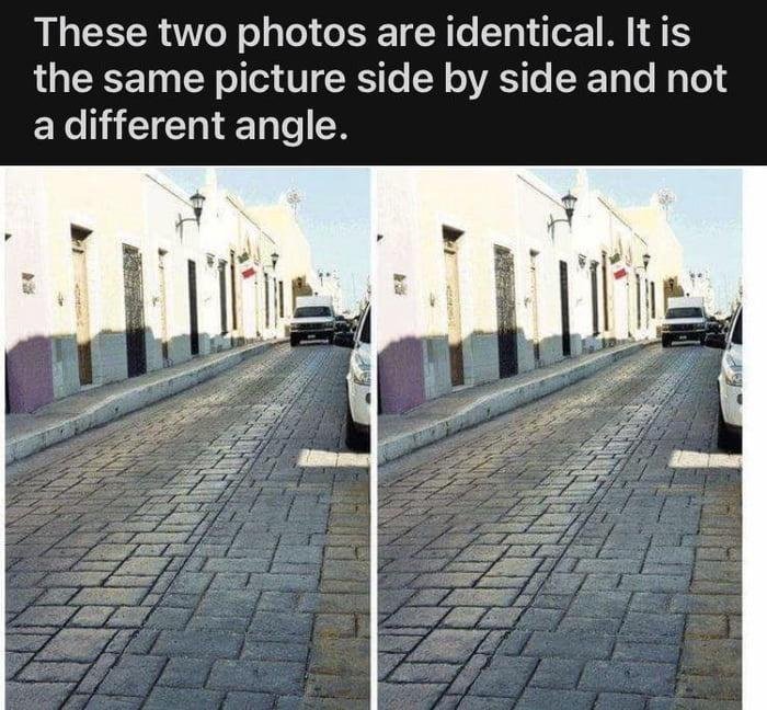
The source of the illusion, of course, is that our brain knows that the lines of the kerb and paving are meant to be parallel, even though on the screen the angle they make from vertical becomes smaller across the image from left to right. So we mentally compare the angled line on the left edge of the next photo to the perspective of the previous photo to the left. The perspective doesn't work, so we see that line as being out of parallel.

1792060935531.png


Applying a perspective transform to make the red lines parallel, this is what your brain's mental overhead map of the scene looks like:

1792061161767.png


Of course, we can see that it's the same street, so our intuition tells us that the viewpoint must have shifted in the second image, to make the line of paving appear with a steeper angle – even though it doesn't!

Interestingly the part of the image that looks most "wrong" to me is the broad stripe of worn paving in the middle of the road, rather than the kerb, even though the kerb has even more of a difference in angle.
 
The perspective doesn't work, so we see that line as being out of parallel.
The perspective does work, and that's the reason for the illusion.

In vanishing point perspective, any set of parallel lines converges on the same point on the horizon; conversely, any set of lines that converge on a point on the horizon are perceived as parallel. That means you can choose ANY horizon point as vanishing point, and how far off center that point is determines the angle at which we perceive the lines to be.

With the side-by-side photos, the vanishing point of the right photo has moved farther from the center, so that road is perceived to be at more of an angle than the left road with its vanishing point closer to the center.

It works because our brains have learned to process perspective.
 
The perspective does work, and that's the reason for the illusion.

In vanishing point perspective, any set of parallel lines converges on the same point on the horizon; conversely, any set of lines that converge on a point on the horizon are perceived as parallel. That means you can choose ANY horizon point as vanishing point, and how far off center that point is determines the angle at which we perceive the lines to be.
I think that's pretty much what I said, isn't it? It's certainly what I meant to say.
Our brains are comparing the lines in the right photo with the vanishing point in the left photo, which makes them appear to be angled. As I labelled here:

1792072090806.png


The purple line has a different vanishing point, because it's part of a different image. If your brain treats them as part of the same scene, then the lines cannot be parallel.

(There's a kind of additional layer to the illusion when the scenes are clearly identical like this, as the only explanation your brain can come up with to explain two views of the same street having non-parallel lines is that there must have been a shift in your perspective. So at first glance it appears that the second photo must have been taken from a vantage point further to the right.)
 
I was thinking about what level of perspective cues are needed to maintain the illusion.

Here I just traced two of the lines on the side by side images. With the background, the illusion is there - the purple line in the road looks more slanted that the red one.

1792073170884.png


Removing the background, the illusion disappears, at least for me. The brain doesn't recognise it as a perspective image, it's just two identical lines.
1792073297789.png


What if we add a third line to the image on the left, tracing the edge of the more yellowish paving stones, to hint at vanishing point perspective?
Does that main diagonal look more slanted on the purple side? To me, yes it does.

1792073495204.png


But wait! If you add the same line to both sides, the illusion disappears again!

1792073562872.png
 
The angle you marked is arbitrary; you could've chosen other lines (e.g. ones that are parallel). So that doesn't explain anything.
It's not arbitrary - it's the visual angle between that line and what that line would look like if it was subject to the same vanishing point as the equivalent lines on the left image. That is what is forcing it to look "too angled": it is pointing to the right relative to the vanishing point that our brain has already established from the image on the left.
And I don't understand your argument about the camera position ("vantage point").

As in the caption at the top of the illusion image: "It is the same picture side by side and not a different angle"
At first glance it does appear to be two photos of the same street taken from different angles – that's the whole illusion!

It looks like the street is more angled in the right-hand image, which would imply that the camera was further to the right - but then you look at the paving and the car, and so on, and realise that it can't be. That's the disconnect that makes the illusion more powerful than if it was just some straight lines.
 
It looks like the street is more angled in the right-hand image, which would imply that the camera was further to the right - but then you look at the paving and the car, and so on, and realise that it can't be.
If these were two streets that are angled, that's how it'd look, though. The street doesn't look different just because you need to turn your body a little bit to look down it. (There is some distortion because the image is projected on a flat plate, but it's minor here.) Because of this, smartphones can stitch a pan together to make a panoramic shot.
 
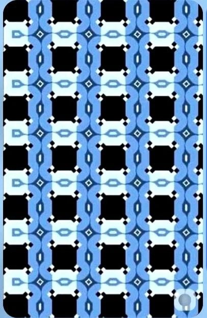
The top two rows seem slanted toward each other, but they're not.
Thank you.

My instinct is "but they ARE sloping towards each other!!!" (as in individual pieces), then I see the whole and I'm "ohhhhhhhhhhhhhhh".

I like how you can almost see the effect passing through as you concentrate on more and more pieces. Damn good. Love it.
 
Last edited:
What I see is the road in the leftmost picure is a little inclined to the left, in the second picture it starts leaning to the right, and leans more to the right in each following picture. And I can't avoid seeing it that way,
Refer to @Ravi 's illustration, post #3 again. The white diamonds have a black line and the black diamonds have a white line in exactly the same position, but the top row of lines slants downward while the others slope upward.
 
Thank you.

My instinct is "but they ARE sloping towards each other!!!" (as in individual pieces), then I see the whole and I'm "ohhhhhhhhhhhhhhh".

I like how you can almost see the effect passing through as you concentrate on more and more pieces. Damn good. Love it.
I made another variant on the illusion idea some time ago. It is drawn a little messy, but here you go. It looks like it has spirals, but there are none.

1792091500180.png
 
Trailblazer said:
The perspective doesn't work, so we see that line as being out of parallel.

The perspective does work, and that's the reason for the illusion.

The error you are both making is assuming there's one single "the perspective".

Back to the Big Ben example, as it's simpler to explain:
The most likely interpretation of the two individual structures you see as upright towers is locally correct - to interpret the clock tower of the palace of Westminster as some non-rectilinear parallelepiped would be an error. That intended interpretation leads one to conclude - correctly - that they are oriented differently within the global space of the whole image. In order to perceive them as actually parallel, you would need to incorrectly interpret their individual perspective clues and make them as non-rectilinear parallelepipeds, with a slathering of other local errors on everything beside them.
 
Back to the Big Ben example, as it's simpler to explain
That's why I posted it. Along with the original post showing the roads, I like illusions based on real things, and to me, that's where ghosts and UFOs hide. Illusions on paper are great for demonstrating mind trickery, but they don't translate to the real world. Nature's illusions are the best. At the end of this month, I'm hoping to recreate a cracker of a mind illusion I had this time last year (if I'm right, it needs the Sun and Autumn conditions). However, I'm fearful, like the Moon illusion, that once you know, you don't see it again
 
Here's another example I just saw on Twitter X. It's two different photos, but the camera is in the same position (you can see that by pasting one over the other). Stacking them one above the other gives the illusion.

1792116281888.png


(edit, here's the overlay I did to show they are the same)
1792116563320.png
 
The error you are both making is assuming there's one single "the perspective".

Back to the Big Ben example, as it's simpler to explain:
The most likely interpretation of the two individual structures you see as upright towers is locally correct - to interpret the clock tower of the palace of Westminster as some non-rectilinear parallelepiped would be an error. That intended interpretation leads one to conclude - correctly - that they are oriented differently within the global space of the whole image. In order to perceive them as actually parallel, you would need to incorrectly interpret their individual perspective clues and make them as non-rectilinear parallelepipeds, with a slathering of other local errors on everything beside them.
Yeah, but the simple explanation is that the obvious vanishing point (the "perspective clue") in the Elizabeth Tower photo is the zenith; and iuxtaposing the photo to itself creates 2 different vanishing points within the same scene, leading our brain to conclude that the towers must be oriented in different directions; same as the roads going in different directions because their iuxtaposition creates separate vanishing points.
 
The error you are both making is assuming there's one single "the perspective".
I don't agree that that's an "error". It's the explanation for the illusion. Our brains are trying to apply a single vanishing point to two side-by-side objects that have different vanishing points. And that is why we see the lines as being angled differently, even though they make the same physical angle on the screen.
 
I don't agree that that's an "error". It's the explanation for the illusion. Our brains are trying to apply a single vanishing point to two side-by-side objects that have different vanishing points. And that is why we see the lines as being angled differently, even though they make the same physical angle on the screen.
But you both used the term that I quoted - "the perspective", a definite article and a singular noun phrase - which implies there is a single perspective (one of you saying it "does work" and the other saying it "doesn't work"), which I consider an error. Rewording perspective in terms of interpretation of "vanishing points" proves my point - you both used the plural there.
 
But you both used the term that I quoted - "the perspective", a definite article and a singular noun phrase - which implies there is a single perspective (one of you saying it "does work" and the other saying it "doesn't work"), which I consider an error. Rewording perspective in terms of interpretation of "vanishing points" proves my point - you both used the plural there.
When I say "the perspective works", I mean that the composite scene could be modeled in reality to look like that. The composite image contains no "perspective errors" if we accept that the second road is more slanted and the second tower is more tilted. "Perspective" would only not work if there is no possible real interpretation of the scene, like in some M.C.Escher works.
default.jpg

Source: https://www.artic.edu/artworks/118144/waterfall
 
Just a small remark from my side. With my contribution of my drawings, I did not intend to claim they are the same kind of illusion/effect. In my drawings it is an illusion caused by contrasting shapes etc. There is technically an explanation (how our brains interprets it), but I forgot what that was.
 
When I say "the perspective works", I mean that the composite scene could be modeled in reality to look like that.
But that's a meaningless predicate - everything 2D image can be modelled an uncountably infinite (an infinity *more* infinite than the real numbers, it's the number of |R^n->|R^m mappings, Beth_2) number of ways, as long as you accept there can be arbitrary "realities".
 
I recently revisited David hackney's work on the use of a camera camera obscura in art and the Tim Veeners documentary which lead me to "The Eye as an Instrument: TIM'S VERMEER". This talk was given by Dr. Tim Chupp a professor of the Department of Physics at the University of Michigan and Dr. Celeste Brusati a professor of art history at the University of Michigan. While they all great works and interesting to this topic just linking would fall outside the "No Click" policy I feel.

Here are some interesting well reference optical illusions I gleamed from the last talk.
You may have to click on the external links to get the full effect of some illusions.

1. Müller-Lyer Illusion — Perceived Line Length
1793018857035.png
1793018931441.png


What you see: Two horizontal lines with arrow-like fins pointing in different directions. One line appears longer than the other, although their central horizontal segments are approximately the same length.
What makes it work: The visual system uses the angles and surrounding fins when judging length. These additional features distort our perception of the horizontal lines, creating a misjudgment of length.
Main perceptual effect: Misjudgment of line length.
Reference: Müller-Lyer Illusion — The Illusions Index

2. Orbison Illusion — Distorted Square
1793019196298.png


1793019255718.png


What you see: A square superimposed on a series of concentric circles. Although the square has straight sides, its edges may appear curved or distorted.
What makes it work: The surrounding curved lines interfere with the visual system's perception of the square's straight edges. The orientation and curvature of the background influence how the square's shape is interpreted.
Main perceptual effect: Apparent bending or distortion of straight edges.
References:
Orbison Illusion — The Illusions Index
Orbison's Illusion — Wolfram MathWorld

3. Ebbinghaus Illusion — Relative Size Perception
1793019379312.png


What you see: Two central circles of identical size, one surrounded by smaller circles and the other surrounded by larger circles. The central circle surrounded by small circles appears larger.
What makes it work: The brain judges an object's size partly by comparing it with nearby objects. Smaller surrounding circles make the central circle appear relatively larger, while larger surrounding circles make it appear smaller.
Main perceptual effect: Misjudgment of relative size.
Reference: Ebbinghaus Illusion — The Illusions Index

4. Hermann Grid Illusion — Phantom Dark Spots
1793019537432.png

1793019790666.png


What you see:
Rows and columns of black squares separated by white channels. Grey or dark spots may seem to appear at intersections of the white channels, especially when looking away from them.
What makes it work: The visual system processes brightness and contrast differently across the image. Interactions between neighbouring visual signals can make some intersections appear darker than the surrounding white channels. The effect is particularly noticeable in peripheral vision.
Main perceptual effect: Illusory dark spots at white grid intersections.
Center-Surround Receptive Fields Light stimulation of central receptors activates excitatory synapses, increasing neural activity recorded by an electrode. In contrast, stimulation of surrounding receptors activates inhibitory synapses, reducing neural activity. This demonstrates how the visual system processes light through opposing excitatory and inhibitory responses.
References:
Hermann Grid — The Illusions Index
Hermann Grid Illusion — York University
York University – Receptive Fields

I think 4 is enough for now, my main propose was to highlight illusions in relation to the artwork I briefly referenced at the start of this post. While also highlighting what a great resource the Illusions Index appears to be. Maybe other users can post other optical illusions from there that are relevant to other real-world observations

https://www.illusionsindex.org/home

External Quote:
Our senses are remarkable. They have evolved to enable us to accurately perceive a huge variety of things in very different conditions. However, occasionally our senses let us down, and we fail to perceive the world accurately. The resulting illusions give us great insight into how our senses work, and how they usually manage to do so astonishingly well.
External Quote:
The Illusions Index is a fully searchable, interactive, curated collection of illusions brought to you by the Centre for the Study of Perceptual Experience.

 
Genuinely had to check that out!
I had to do the same and below ill try to tie this all up in a nice little bow.

Following on from the content I was revisiting which led to "The Eye as an Instrument: TIM'S VERMEER" This Ebbinghaus Illusion is likely part of the explanation as to why observers report the large apparent size of the moon size when it rises.

From approx. 7.24 to11.24.
There was no available transcript so I have quoted it by hand, there may be some small error made by me and the speaker.

External Quote:
first of all the moon is not changing sizes and is best expressed as an angle and that angle that is just about 1/2 a degree in the sky.............when you you do the math that angle is .56 degrees when it closest and when its close(sic furthest way) it just under 1/2 a degree
External Quote:
here's a cloud here a above us and it big right? and here's a cloud here on the horizon it takes up a much take up a much smaller part of our field(sic of vision)..a smaller angle
External Quote:
there is the moon up in the sky as we expect to see it, looks fine, and the moon near the horizon ,well mhmm... because those clouds seem so much smaller than the moon but when the moon is there(high in the sky) it small compared to the clouds that is why is why we perceive the moon to be so large when is rises.
The visuals of the actually moon aren't great in this video and my attempts to find some haven't been successful, but I did find some other resources discussing the topic in relation to optical illusions.

This article from NASA "Why Does the Moon Look Larger at the Horizon? We Asked a NASA Scientist: Episode 50"
states
We've been talking about this for 2,000 years. Aristotle mentions it. And in our own time, scientists are designing experiments to figure out exactly what's going on. But there's no consensus yet.

and mentions later

External Quote:
One popular idea is that this is a variation on the Ponzo illusion. Everything in our experience seems to shrink as it recedes toward the horizon — I mean clouds and planes and cars and ships. But the Moon doesn't do that. So our minds make up a story to reconcile this inconsistency.
another article from Scientific American "Why Does the Moon Look Bigger Near the Horizon?-The rising moon looks huge on the horizon, but it's all in your head"

states:

External Quote:

It's been around a while, too: the illusion is shown in cuneiform on a clay tablet from the Assyrian city Nineveh that has been dated to the seventh century B.C.E. Attempts to explain it are as old as the illusion itself, and most come up short. Aristotle wrote about it, for example, attributing it to the effects of mist.

This isn't correct; the illusion manifests even in perfectly clear weather. A related idea, still common today, is that Earth's air acts like a lens, refracting (bending) the light from the moon and magnifying it. But we know that's not right, because the moon is measurably the same size no matter where it is in the sky.
It later references the Ponzo illusion again:

External Quote:
So what's the cause? Like with so many things in science, two effects are at play. One is the Ponzo illusion (not to be confused with a Ponzi scheme, an investment illusion). It's a very simple yet overwhelming illusion. In its simplest forms, two parallel horizontal lines of equal length (like an equal sign) are placed between two lines that are nearly vertical but converge slightly near the top. When you look at the horizontal lines, the top one appears longer even though they're the same length. It's almost impossible not to see them as unequal.
And links the https://www.illusionsindex.org/home website again.
1793112445844.png


it finishes by stating:

External Quote:
Amazingly, this explanation, at least in part, was determined around 1,000 years ago. The brilliant medieval philosopher Ibn al-Haytham studied vision and optics and made major contributions to both. He examined the moon illusion and correctly noted that an object of fixed size will look smaller if it's perceived as closer and will look bigger if it's farther away
the NASA article linked at a short video on the topic and in which it concludes:

External Quote:

So why does the Moon look larger on the horizon? We don't really know, and we're still waiting for the experiment that will convince everyone that we understand this. So why does the Moon look larger on the horizon? We don't really know, but scientists are still trying to figure it out.
It turned out not be the short concise reply I was hoping for and I wish I had of found documented actual real photos of the effect but overall I found it interesting at least. I also seem to be having a bad typos day so apologises for any errors
 
Last edited:

Trending content

Back
Top