
I've digitized hundreds of old family photos from 35mm slides from the 1960s and 1970s. There is in general a very vivid oversaturated look to all the colours, not just the sky. Primary colours likes reds, yellows, greens, blues, etc. just pop out. Which is actually great for photos of your childhood holidays, etc. No-one wants dull grey photos of that kind of thing. I suspect that the film makers did that deliberately, kind of like how old Technicolor movies have a very vivid saturation to the colours.
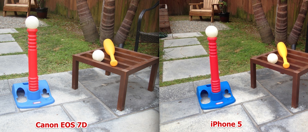
I've noticed that the cheaper the camera nowadays, the brighter the colors. The more expensive digital SLRs now produce much flatter, but more accurate colors, but small pocket cameras often have a "vivid" setting more as a default. It simply makes your vacation photos look better.
Comparison - look especially at the blue of the base.
Last edited:


")


 ....
....
