Explained: Roy Moore Two Color Yearbook Signature [Depth of Field Chromatic Aberration]

Mick West

Administrator
Staff member
Roy Moore Yearbook Chromatic Two Color Metabunk.jpg

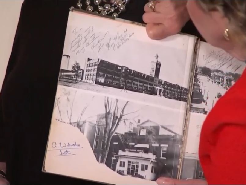
The Gateway Pundit notes that in this image from CNN some of the writing is in a different color.


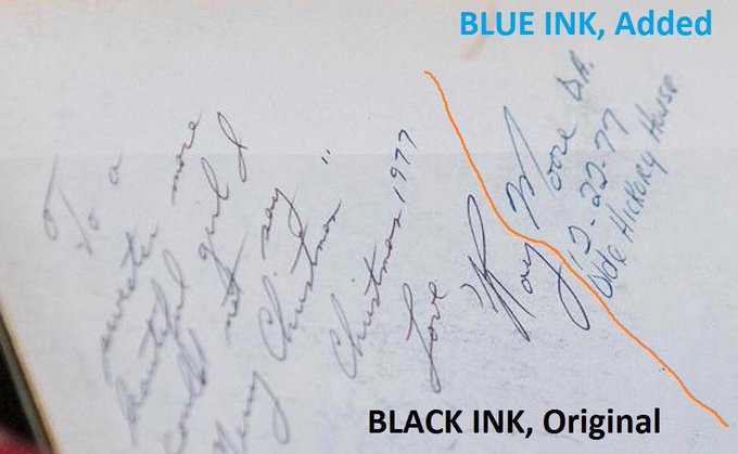
However in this image from the Telegraph the ink is all the same color, even when you zoom in and increase the saturation.

20171116-091407-laoqb.jpg

20171116-090355-yp2db.jpg

20171116-090522-71zdj.jpg

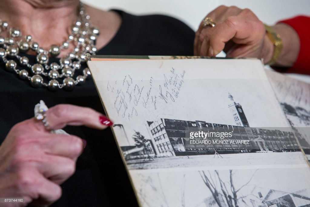
The two color image comes from an official CNN tweet:

Source: https://twitter.com/CNN/status/930205088299257859

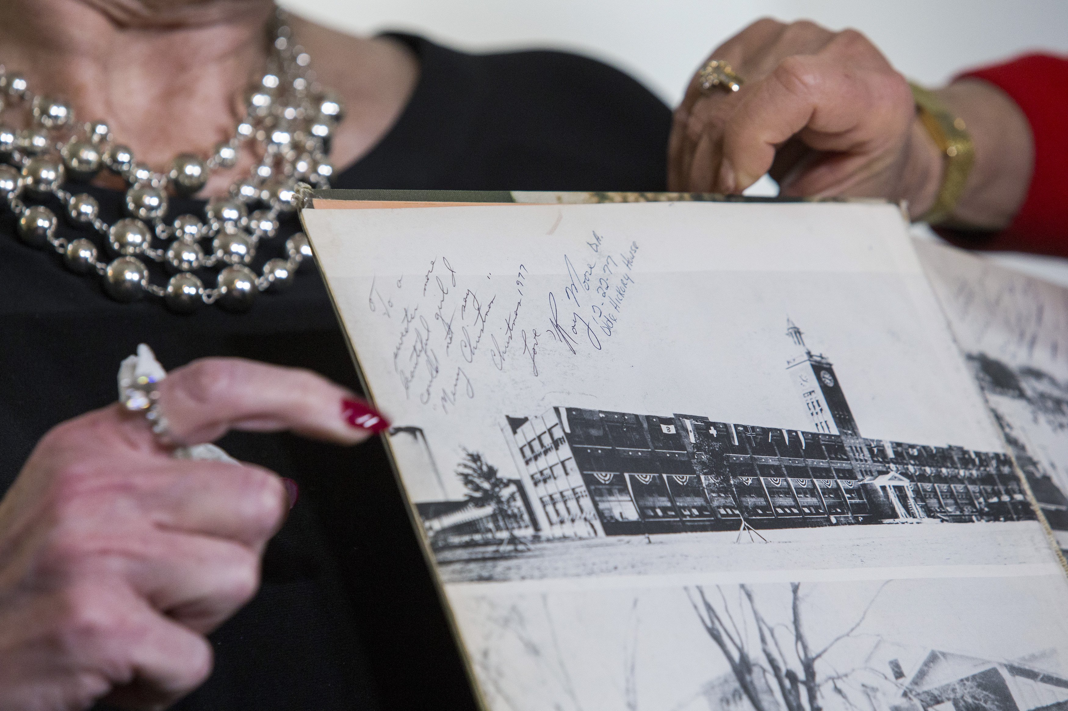
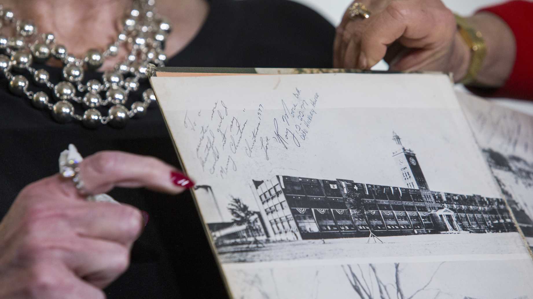
Here's the raw image from that Tweet
upload_2017-11-16_9-50-44.png

Notice the text on either side is blurred, indicating a shallow depth of field (i.e. only the middle is in focus). The color change is also not as abrupt as suggested, bleeding into the R of "Roy", the first 1977 and o of "olde".

20171116-103325-c01y8.jpg

In fact such color changes are an artifact of depth of field.

I've duplicated the CNN color change effect with a photo of black ink on white paper, shot with 50mm f/1.4 to get a similar depth of field as in the CNN. I've attached the RAW image for this photo, so you can check it for yourself.
20171116-120241-l089d.jpg
Zooming in, there's a very distinct blue/black change in color across the image as the ink lines are in or out of focus.
20171116-120047-sw7wt.jpg


Scanned to demonstrate the actual ink color (black) and consistence, with a video game cover stuck in there for color calibration (it's part of the same scan)
20171116-105846-qencz.jpg


Head on, with the exact same lighting and exposure settings, the ink is all black (as it is in straight-on photos of the yearbook):
20171116-120205-73l0m.jpg

For more discussion on the signature, including handwriting analysis, see:
https://www.metabunk.org/roy-moore-yearbook-signature-faked.t9252/
 

Attachments

  • IMG_4376.CR2
    20.6 MB · Views: 1,252
Last edited:
The whole CNN shot has a blue tint. Wonder why? And if this plays a part?
There were very dark blue pens, at least back then. I only remember because I had a quirk about that in high school(hated blue pens and didn't like black either). Not sure if that is still the case as I got over my quirk a long time ago.
 
There were very dark blue pens, at least back then. I only remember because I had a quirk about that in high school(hated blue pens and didn't like black either). Not sure if that is still the case as I got over my quirk a long time ago.
I mean the whole picture. The white background. The building. It all has a blue tint compared to the one next to it.

blue tint.JPG
 
I don't know much about digital cameras, but I think the answer might involve something explained here...

https://www.rogerdeakins.com/camera/influence-of-white-balance-in-a-digital-sensor/

Question:
What happens inside a digital image sensor when we change the white balance.


Answer: Technically nothing happens to the actual sensor when you do white-balancing. The sensor itself is monochrome, it just responds to the amount of light hitting it. The color filter array in front of the sensor, usually in a Bayer pattern, filters out certain wavelengths of color so that the value of red, green, or blue wavelengths per pixel can be recorded. This monochrome raw signal then has to be converted at some point into a color image. White balance involves adjusting the signal level of each color channel individually (after conversion from raw to RGB) to create a certain color bias, or remove a certain bias.

Most sensors themselves have a "native" preference for near-daylight balance in that being less sensitive to blue wavelengths, they "prefer" a scenario where they receive more blue wavelengths, so when shooting in 3200K (tungsten) light, for example, in the conversion for raw, the RGB channels have to boost the blue signal more heavily than they would if you had shot in 5500K (daylight). For the most part, the results are fine depending on the camera but if you looked closely, you often find that the blue channel is a bit noisier for 3200K scenes than in 5500K scenes if both were shot at the same ISO setting.

In some ways, there is an analog film equivalent in that tungsten-balanced stocks have a faster blue layer to compensate for lower amounts of blue wavelengths in 3200K lighting, so if there had been such a thing as Kodak making both a 200T and 200D stock, or a 50T and 50D stock, you would mainly see that the blue layer would be finer-grained (i.e. slower) in the daylight stock.
Content from External Source
 
Last edited:
Something I've noticed: the difference in colour between the letters either side of the line isn't so much in the ink itself, but rather in the pixels that surround the ink. Zoom in on the letters and the colour of the ink looks the same - but around those which appear somewhat blue, there are many very light blue coloured pixels, which affect the way the colour appears overall.

blue pixels.jpg

Again: it's not so much the colour of the ink that has changed, it's the colour of the paper around the ink. We do see that the paper overall appears more blue - as it does in Mick's test - though why the effect on the letters is so localised is someone else's guess.
 
Last edited:
For the purposes of invalidating the "two color ink" claim it's sufficient to show that the effect happens. But it's interesting to consider why it happens.

What we are seeing is chromatic aberration. Light is made up of many different wavelengths. When a lens is used to focus light on the camera of a sensor it has to bend it. It's difficult do design a lense where all wavelengths of light are bent the exact same amount. So sometimes once color of light is bent more than another, and so it ends up shifted over a bit. This creates very small colored fringes around the edges of objects.

Specifically here it's Longitudinal Chromatic Aberration, as explained by Photography Life:
https://photographylife.com/what-is-chromatic-aberration

Longitudinal Chromatic Aberration, also known as “LoCA” or “bokeh fringing”, occurs when different wavelengths of color do not converge at the same point after passing through a lens, as illustrated below:
upload_2017-11-18_8-10-31.png

Content from External Source
You can see here that focus is a factor. The actual colors that show up are going to vary by the configuration of the lens.

Here's a 100mm f/2.8
20171118-083219-9k8lx.jpg
Boosted the saturation a bit:
20171118-083301-pcnww.jpg
And blurred:
20171118-083338-vrapm.jpg

Notice a fairly distinct blue region.
 
The actual colors seem also to be a function of the line thickness, which means the exact effect is quite difficult to duplicate. I did the above with lines of constant width:

20171118-090535-8exkx.jpg
Boosting color
20171118-090602-xzeri.jpg

Blurring and enhancing color regions:
20171118-090631-tdblc.jpg
 
Anecdotal here, but back in my commercial print days this was a known issue when we would have customers approving color proofs or comparing color proofs to a job on press, on larger pieces we would regularly have to remind (or inform) people to look at the same areas at the same angle. When a customer thinks you aren't matching the color proof they signed off on or aren't hitting their signature color on a four color press, it can lead to long, costly delays.

Of course, this was back when good printing was a thing and anybody cared. /soapbox
 
The post explaining chromatic aberration can be seen two different ways. The first way is there is one set of ink, and it explains why it seemingly shifts from black to blue. The second way is that there are two sets of inks, and it explains why one of them looks looks despite both looking very similair in color when viewed straight on. I believe the later is the better explaination given all available evidence.

During the recreations (refering to the photos in the above post) the part of the line that's out of focus because it's too close to the lens is light purple, then transitions to black the further away from the lens the lines go. The CNN photo doesn't do that. Well, it might. To my eyes it looks like the "D.A." and "House" looks closer to black than the "M" in Moore does. Now obviously I don't know enough about this effect, but it would make more sense if it went from light blue to black the further from the lens the writing was. And if it did go from black to blue I would expect the "D.A." and "House" to be a lighter shade of blue than the "M" in Moore. Conclusion: Without any more information it's most likely two sets inks, one of them going from blue to black.

When I look at the highest resolution photo of a signiture head on to me it looks like two different inks to me. The effect is extremely subtle, and I have to turn the saturation full blast on my monitor to see it well. The way it looks to me the "R" in Roy is more like a shade of deep navy blue, and the "M" and "D.A." look like a shade of charcoal. The difference is so subtle that I doubt anyone would be ever be enough to overcome political biases alone. I'm sure many will call me crazy. pic: https://i.imgur.com/Aaq3zKe.png
upload_2017-11-19_13-21-21.png

[off topic material removed]
 
Last edited by a moderator:
When I look at the highest resolution photo of a signiture head on to me it looks like two different inks to me. The effect is extremely subtle, and I have to turn the saturation full blast on my monitor to see it well. The way it looks to me the "R" in Roy is more like a shade of deep navy blue, and the "M" and "D.A." look like a shade of charcoal. The difference is so subtle that I doubt anyone would be ever be enough to overcome political biases alone. I'm sure many will call me crazy. pic: https://i.imgur.com/Aaq3zKe.png

I'd call you wrong. If you invert the image and boost the contrast you can see clearly it's the same ink color.
20171119-132437-yxfxt.jpg
20171119-132421-yix2j.jpg
20171119-132259-iriry.jpg

You have to consider the entire stroke of the letter, not pick two different parts.
 
The post explaining chromatic aberration can be seen two different ways. The first way is there is one set of ink, and it explains why it seemingly shifts from black to blue. The second way is that there are two sets of inks, and it explains why one of them looks looks despite both looking very similair in color when viewed straight on.
Also, it's not just about the angle that it's viewed at, or being viewed straight on, but that particular photo. Other photos and videos from an angle don't show the same effect.

cnn video screenshot.png


Source: www.youtube.com/watch?v=trjO9e9YOtA&t=1m58s
 
Here's a comparison of the writing from the yearbook with some actual blue-black ink:

bbb.jpg

And applying Mick's technique of inverting:

bbb2.jpg

And boosting the saturation to 85%:

bbb3.jpg
 
This forum is very helpful. The blue-black difference makes the yearbook look like an obvious fake, and I was wondering why nobody was paying attention to it, but this gives an explanation. I still have questions, though.

1. I don't know much about chromatic aberration, but I thought it produced false violets, as in the re-creation in this post, but in the yearbook we see blue.

2. Resizing the blue-black yearbook inscription to make it closer up, the blue goes away eventually and it all looks black, with maybe a difference in the pixels on the edge of the letters. Resizing the re-creation in the same way, the violet persists. I wonder if this is due to the re-creation being a bigger file, but it's only 178K. Why the difference?

I'm trying to write something up on this for an on-line article (though I may just give up), so any comments would be greatly appreciated.
 
1. I don't know much about chromatic aberration, but I thought it produced false violets, as in the re-creation in this post, but in the yearbook we see blue.

There's different types of aberration, and the names sometimes vary. This page divided them into chromatic and achromatic.
http://richardrosenman.com/shop/dof-pro/
Achromatic Aberration is the result of using an achromatic lens to focus two of the three (typically red and blue) wavelengths to the same convergent point. This minimizes the effects of chromatic aberration. Because the red and blue wavelengths are corrected, the result is visible magenta and green color fringing. Achromatic aberration can occur longitudinally, transversely or both.

Chromatic Aberration is the result of the inability of a lens to focus all wavelengths to the same convergent point. The result is visible red, green and blue color fringing. Chromatic aberration can occur longitudinally, transversely or both.
Content from External Source
This is going to vary a lot by lens. The more achromatic it is (i.e. correcting for chromatic aberration) the less aberration you will have. but the more likely it will be to be purple or green.

In my test you see different regions of color corresponding to different line thicknesses and focus. Kind of blue and yellow, but also a tinted bit purple and green.


And blurred:


A different lens would likely give different results, because they use different type of glass (with varying achromatic qualities) and in different configurations of elements. You might be able to replicate it if you knew what the lens was for the CNN photo, but it's also dependent on the distance, the zoom level, the angle of the book, and the thickness of the lines.
 
2. Resizing the blue-black yearbook inscription to make it closer up, the blue goes away eventually and it all looks black, with maybe a difference in the pixels on the edge of the letters. Resizing the re-creation in the same way, the violet persists. I wonder if this is due to the re-creation being a bigger file, but it's only 178K. Why the difference?

I don't see that effect, there's still a color difference in an enlarged version of the blue/black CNN image.

20171121-141055-ra36i.jpg
 
Thanks---what a quick reply! Yes, I see something like the image in your number 18 image above--- I call them both the Roy and the Moore black rather than black and blue, but I see that they are not quite the same. Do you know why the blue looks like black when shown close up?
 
Thanks---what a quick reply! Yes, I see something like the image in your number 18 image above--- I call them both the Roy and the Moore black rather than black and blue, but I see that they are not quite the same. Do you know why the blue looks like black when shown close up?

Probably an optical illusion. Color perception is based on context. You'd have to point to something specific for me to give a better answer. You can always find the RBG values of the pixels.
 
The cropped version of the image has also been oversaturated, which makes the effect more apparent than it is in the full sized original.

Drag the slider here to see the original colors (where the effect is less), and the more saturated colors of the cropped image.
 
The cropped version of the image has also been oversaturated, which makes the effect more apparent than it is in the full sized original.

Drag the slider here to see the original colors (where the effect is less), and the more saturated colors of the cropped image.
I think that's more a function of how the image was embedded and resolution. The image viewed directly on Getty Images site looks really close to the Daily Wire image, which shares the same file name.Capture.PNG
 
Last edited by a moderator:
I think that's more a function of how the image was embedded and resolution. The image viewed directly on Getty Images site looks really close to the Daily Wire image, which shares the same file name.

No, they are both embedded the same way on the Daily Wire (WebP images). The zoomed image has more contrast and more saturated colors. Look at the finger.
20171121-170821-qt6t5.jpg
 
Can I try to summarize some of this discussion? First, it seems the original of the blue-and-black photo is here, from Getty Images:

http://media.gettyimages.com/photos...=n3mM7PuJrWQuQZMAcUPv6Mc1GAsBjuakOltaj4X34jw=
1. The black-blue CNN photo was taken at a press conference by [ photographer Eduardo Munoz Alvarez]
an independent press photo company, Getty, which must have sold it to CNN.

2. Somebody along the way upped the “saturation” of the photo to make all the colors more extreme.

3. Somebody along the way also cropped the photo, so only Mrs. Nelson’s red-painted fingernail showed, not the rest of her.

4. Chromatic aberration, depth of field focus stuff may have made the right part of the inscription blue instead of black. (But why isn’t it purple instead of blue? )

5. It looks like some of the blue “bleeds” into the “1977” and the “R” and that the “O” has some of the features of the black. This is not completely clear, though potentially decisive.

6. Shallow depth of field would make the middle better focussed than the edges, and the best focus is between Love and Hickory. (But why then is the left edge black and the right edge blue? And why is the left middle black and the right middle blue?) The unpainted fingernail to the right of the inscription in the original photo (cropped out of the CNN photo) is well-focussed too. It is flesh-colored, and so would not show blue. The picture of the building does not show blue. It is not very clear anyway, since the yearbook used an unclear photo.
 
Last edited by a moderator:
I can't tell what the original image is. The one that Mick refers to as "the original" in #22 is this one:


Source: http://www.gettyimages.com/license/873744160

Although The Daily Wire has the same image in higher resolution:


Source: http://www.dailywire.com/sites/default/files/uploads/2017/11/gettyimages-873744160.jpg

The "grey finger" version is also on The Daily Wire, with the same file name:


Source: http://www.dailywire.com/sites/defa...lic/uploads/2017/11/gettyimages-873744160.jpg

I can't currently locate that at Getty, so not really sure which came first.

Here's an interesting one I hadn't seen before, showing more of the yearbook:


Source: https://c1.legalinsurrection.com/wp...d-Accuser-Beverly-Nelson-teenage-yearbook.jpg

Unfortunately it's only available in medium resolution - though there is this one from Getty, taken by Spencer Platt at what looks to be the same time, from a slightly different angle:

inscription high res.jpg
Source: https://heavyeditorial.files.wordpress.com/2017/11/gettyimages-873745342-e1511049431531.jpg

That one appears to show a bit of colour variation across the bottom of the inscription, especially at the second "Chris", "Love", and "Olde":

platt1_crop_enlarged.jpg
 
Last edited:
That's the same as the one I posted above. What I mean is, how do we know which came first: the "grey finger" version, or the more colourful one? Mick said "grey finger" was the original; but without being able to find it on Getty I can't confirm.

Is it because we'd expect the original to be prettified and adjusted?
 
Last edited:
Mick said "grey finger" was the original; but without being able to find it on Getty I can't confirm.
I don't understand what you are saying. Mick gave the link to the photographer's original photo. Eduardo Munez Alvare took the photo and uploaded it to Getty for licensing.

when I click on Mick's link.. my finger does look different on my computer than it apparently looks on Micks.
upload_2017-11-24_21-52-29.png


That shows what I was saying about trying to determine color from a computer screen.
 
I don't understand what you are saying.
In Post #29, the first three pictures are 'the same photo', but the third one is coloured slightly differently - most noticeably in the tone of the skin and the colour of the fingernail. Mick demonstrated this is in Post #23 and in Post #26 with direct comparisons.
 
Mick demonstrated this is in Post #23 and in Post #26 with direct comparisons.
yea Mick's computer is more blue than mine. he's on a Mac. (if we can find out the name of her polish, we'd know which computers are 'right' :) .. Mick's polish is better. )
1.JPG
 
Back
Top