Rory

Closed Account
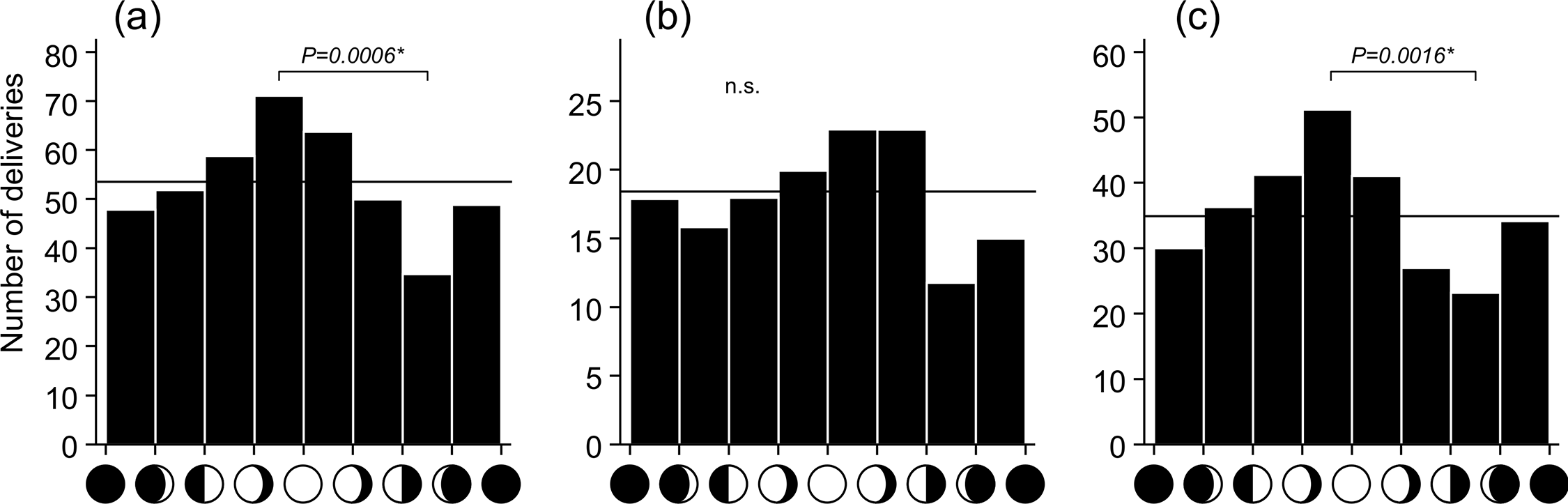
Often described as an old wives' tale, the idea of a connection between the phase of the moon and an increase in birth rates still persists today, including among those who work in childbirth, as exemplified in this article at The Huffington Post:
An incredible 45 babies entered the world last weekend in Sacramento, California. But some say the mini "baby boom" was no accident. While some doctors joke that the high number of births could be attributed to the full moon, hospital officials hint that the speculation might not be that far out.

"I think if you talk to anybody on the front lines of the hospital, emergency room doctors, labor and delivery, etc. it’s always like that on the full moon, everyone for some reason is really busy," Matthew Guile, a doctor at Sutter Memorial [said].

https://www.huffpost.com/entry/full-moon-babies-lunar-effect_n_927703
Content from External Source
While some early studies appeared to support the idea, later large scale analyses - one looking at over half a million births - found no correlation between birth dates and any particular phase of the moon.

The study using the largest amount of data, however - some 50 millons births - did propose a correlation, concluding that:
Our plots all show a general sinusoidal shape (with a few large deviations), with a peak birthrate around 21 days (third quarter) and a minimum near day 7 (first quarter). The overall shape of the distribution and general agreement with the next largest study [of 5.9 milion births] (Guillon et. al. 1986) suggests that there is indeed a correlation between lunar phase and birthrates. It does not, however, peak at full moon.

Nativity and the Moon: Do Birthrates Depend on the Phase of the Moon? (Caton and Wheatley, I.A.P.P.P., 1998)
Content from External Source
Despite contradicting other analyses, as well as scientific understanding, given that the source of the study was the Astrophysics Department at Appalachian State University, it seemed worth looking at again. So...

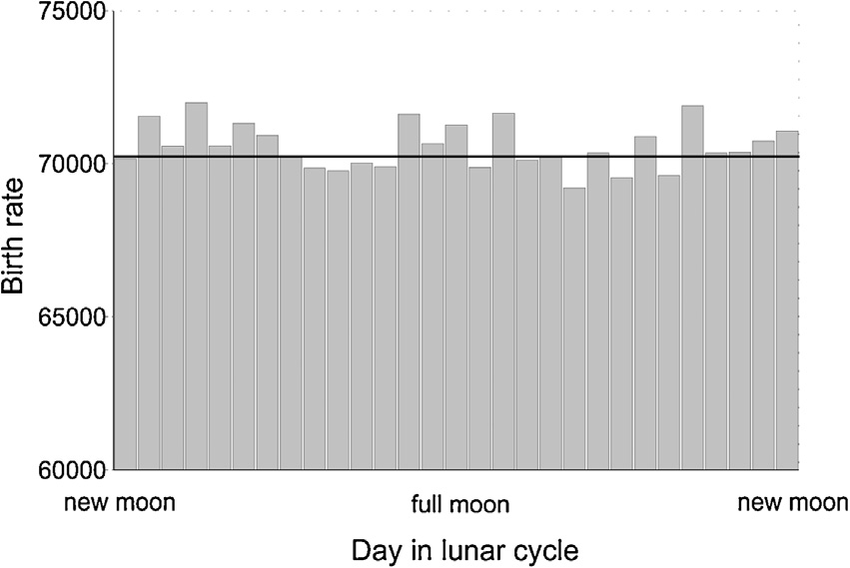
I downloaded 21 years worth of daily birth data, totalling some 89.5 million births, and plotted this against the phase of the moon. While I didn't think it strictly necessary, Caton and Wheatley had performed some data cleansing to eradicate anomalies such as weekends and holidays (substantially lower rates) and Tuesdays (higher rates), so I did this as well (as expected, with such a huge supply of data over a large timescale, it made no significant difference).

These are the results:

upload_2018-12-5_0-32-4.pngupload_2018-12-4_21-57-28.png
Key: Day 0=new moon; average births per day excluding weekends, holidays and Tuesdays; 13500/+1 in chart=full moon, 11500/-1=new moon; second chart repeats to better represent the lunar cycle

Some conclusions:
  • There is no pattern or correlation with the lunar cycle
  • The largest daily variation from average is only 0.74%
  • The majority of points lie less than 0.21% from average
  • There is no significant increase or decrease in any phase of the moon
  • Births on the full moon, and in the three-day period around the full moon, are almost exactly average (-0.03 and +0.14% respectively)
  • There are no 'peak' or 'minimum' birth rates, just very slight random variations, as would be expected
This, I believe, is the largest analysis to date on the subject, and, I would imagine, pretty conclusive.

If anything further were needed, though, I did find - after completing everything - that Caton and Wheatley had followed up their earlier paper and run an improved model using data for around 70 million births.

This time they found no correlation.
 
Last edited:
Caton and Wheatley had performed some data cleansing to eradicate anomalies such as weekends and hospitals (lower rates) and Tuesdays (higher rates), so I did this as well
why do you have 34 pink points on your chart? and since you still have 29 days in your left hand side, what kind of 'cleansing' did you do? also where did you get your initial data from?
 
Why do you have 34 pink points on your chart? And since you still have 29 days in your left hand side, what kind of 'cleansing' did you do? Also where did you get your initial data from?

Good questions. :)

1. Because the lunar cycle is a cycle, the chart is slightly repeated, to better represent it (I should probably mention that)
2. What's been removed are Tuesdays, weekends, and holidays. The way this works is: let's say there are 7670 data points - i.e., individual day records - then once the aforementioned are removed, we're left with about 4000. This equals to about 140 daily records for each day of the lunar cycle. It's not days of the lunar cycle that are removed, but rather occasional daily records. This removal doesn't affect the final results, in the sense of altering the relationship of one day of the cycle to another, given that they're averages. And, as I mentioned above, the same general result is shown whether these are included or not: there are just so many records and data points that each day of the lunar cycle will fall on more or less the same number of weekends, holidays, and Tuesdays.
3. There's a link above. That says it's from the Centers for Disease Control and Prevention's National Center for Health Statistics.

I'll attach my spreadsheet if anyone wants a peruse. Probably a bit higgledy-piggledy in places, but it should make sense.
 

Attachments

  • birth data.xls
    1.8 MB · Views: 734
the chart is slightly repeated
oh i see. you just mirrored it for some reason.
upload_2018-12-4_16-10-58.png

2. What's been removed are Tuesdays, weekends, and holidays.

then why are there 29 days on the left hand chart?

3. There's a link above.
ok. you went through both those pages and manual added all the days for each day of every year then averaged them? while simultaneously correlating which is a weekend, sunday and tuesday?
 
Why are there 29 days on the left hand chart?

I might be misunderstanding your question, but are you thinking that because there are no Tuesdays in the data - forgetting holidays and weekends for the time being - that there should be one (or more) less days in the left-hand column?

If so, the answer is because over the course of 21 years there will be around 260 lunar cycles. Each day of the lunar cycle will occur 260 times and 'collect' 260 points of data. The spread of the week is even. Remove Tuesdays and you remove 260/7 data points. That leaves 223 data points. When holidays and weekends are similarly removed that leaves around 140 data points.

Even with so many removed, this still generates around 1.83 million live births for each day of the lunar cycle.

Here's a chart to show the difference removing each 'significant variable' makes:

upload_2018-12-4_22-40-51.png

The reason it doesn't change the overall picture is because all the variables - weekends, holidays, and Tuesdays - will be averaged out over the lunar cycle, so that each day receives its 'fair share'. On the micro level, the picture may change a little, but overall each day remains within touching distance of the average - that is, whichever way we look at it, there are no significant peaks, troughs, or variations.

Hope that helps to clarify. :)
 
Last edited:
If so, the answer is because over the course of 21 years there will be around 260 lunar cycles
sorry. i wasnt thinking those were days of the lunar cycle (even though i see now it says 'cycle). i forgot the moon changes calender days. airhead moment.
 
The reason it doesn't change the overall picture so much is because all the variables - weekends, holidays, and Tuesdays - will be averaged out over the lunar cycle, so that each day receives its 'fair share'.
that's what i was thinking. why remove or 'normalize' them at all.
 
That's what I was thinking. Why remove or 'normalize' them at all?
It makes sense if you only have a small data set, as some entries may correspond with a higher number of 'outliers' than others, and that would throw it off. But on something this massive it doesn't make any significant difference.
 
Been looking at this again, just to make sure I'd done everything right, and I can see a few places for improvement.

Number one, I've figured a much better way of calculating the lunar cycle, including one way which factors in for 'Day 29', which only 'appears' half the time.

Mainly, though, it's with regard to the 'normalization' - I was totally wrong about that, and it doesn't 'average out', even over 21 years and 260 lunar cycles. Some 'lunar days', then, fall much more often, or more seldomly, on low birthrate days such as holidays, weekends, Mondays, etc, and it makes a massive difference: Day 21 after a full moon, for example, returns 173,000 more births than Day 22 when Mondays are excluded.

It was quite striking till I tallied up and found that Day 22 fell on 4 less Mondays than Day 21, while Day 21 landed on four Tuesdays, the most popular day.

The spreads are as follows:
  • Mondays and Tuesdays - minimum 34, maximum 39
  • Weekend days - 71 to 76
  • 13th of the month - 4 to 12
  • Holidays - 3 to 13
  • Non-weekend holidays - 1 to 9
  • Valentines Day - 0 to 2 (higher birthrate)
Caton and Wheatley also suggested factoring in for seasonal variations. Broadly speaking, there are two 'seasons' for birth rates:
  • June-October - with a spread of 108 to 110
  • November-May - 149 to 152
Seasonal variations seem to be less of a factor than holidays, etc. Tuesdays, also, though the most popular day, are not so much at variance as Mondays - Tuesdays are +2% on Tue-Fri, while Mondays are 8% down. Probably due to more holidays falling on a Monday, as well as 'long weekends'.

'Normalization', then, looks rather tricky. But probably I'll have a go at a big long equation to give it the best shot. And still prove the same thing as was shown in the beginning. ;)

(Spreadsheet attached)
 

Attachments

  • Lunar cycle birth data.xls
    1.1 MB · Views: 664
It sure makes me think how important it is to go through stats with a fine toothcomb. Sneaky anomalies are waiting around every corner. :)
 
Strangely, two studies on a possible correlation between the lunar cycle and birth rates were published within a few months of each other in 2016 - only this time involving cows.

One study was carried out by Professor Tomohiro Yonezawa of the University of Tokyo, and quite widely reported on, at places like Live Science, Agriland (Ireland), ABC Australia, Asian Scientist, and, of course, The Daily Mail.
There is a popular belief that the lunar cycle influences spontaneous delivery in both humans and cattle. To assess this relationship, we investigated the synodic distribution of spontaneous deliveries in domestic Holstein cows. There was a statistically significant peak between the waxing gibbous and full moon phases compared with those between the last quarter and the waning crescent. These data suggest [...] that monitoring lunar phases may facilitate comprehensive understanding of parturition.


Lunar Cycle Influences Spontaneous Delivery in Cows
Content from External Source
Good university. Smart professor. Very low probability of chance. Looks convincing, right?

Except...they only studied birth records for 428 deliveries.

I personally find that kind of shocking, that a presumably reputable establishment such as the University of Tokyo would not only put that out, but think there might be something in it in the first place.

The other study, meanwhile, published a few months earlier, looked at records involving over two million births and found no correlation with any particular day or phase of the lunar cycle:
All cattle births in Switzerland between 2008 and 2010 (n=2,091,159) were related to detailed matched weather recordings [and the lunar cycle]. Although the daily birth rate was unevenly distributed across the lunar cycle, no clear pattern could be identified. Compared to the mean birth rate across the lunar cycle the highest daily birth rate was detected on day 4 after new moon (+1.9%) and the lowest on day 20 (−2.1%).


Effects of meteorological factors and the lunar cycle on onset of parturition in cows
Content from External Source
This study, however, seems to have received little or no press.

It was quite striking till I tallied up and found that Day 22 fell on 4 less Mondays than Day 21, while Day 21 landed on four Tuesdays, the most popular day.

Correction: that should read "Day 21 landed on four more Tuesdays."
 
Last edited:
'Normalization', then, looks rather tricky.

I'm having a go at the normalization - and it's definitely more intricate than would first appear, what with birth rates changing depending on which day of the week holidays fall on, days surrounding holidays receiving a boost, and even whether particular days happen to randomly coincide more often with fallow or productive years.

Checking for anomalies revealed one interesting non-holiday that needs normalizing - post-2001 September 11th:

upload_2018-12-9_22-4-23.png

This chart shows the difference in average daily birthrate for each of the above dates compared to the September weekday average. Before 9/11, the 11th was an almost exactly average day - now, it's about 6% down, and even less popular than Friday the 13th.

I'm not sure if this has been confirmed before, but a 2013 analysis and anecdotal evidence suggested as much.
[The doctor] said he recently asked a patient of his who was 39 weeks pregnant [...] to come in for an induction on Sept. 10, which could have meant she would give birth on Sept. 11.

"She would not come in," [he] recounted. "If a patient's due date is 9/11, I’ll tell them it's 9/12 or 9/10."

When Sept. 11 fell on a weekday, there were 29 fewer births than on Sept. 12 and 34 fewer births than on Sept. 10 on average.
Content from External Source
 
In finishing off this study I continue to be amazed by the way some people - academics, university professors included - handle statistics.

Needless to say, I don't know all the Fancy Dan stuff they do - about chi-squares and p numbers, etc - but I do know you need more than 400 people to figure out what the most popular day of the month to be born is (for example).

To this end, I managed to find some information about the study by Guillon quoted by Caton in the OP - the "next largest study [of 5.9 million births]" - which claimed to show that birth rates were increased during the last quarter to new moon. The information comes from a secondary source, but, assuming that it's been reproduced accurately, is as follows:
Lansac and Guillon conducted a study of 5,927,578 births [and] obtained a slight (0.07%) but significant increase in the number of births occurring in the new moon:

upload_2018-12-14_18-25-19.png

Cited at http://theses.vet-alfort.fr/telecharger.php?id=684 (translated from the French)
Content from External Source
It's quite extraordinary that such a minute, almost non-existent 'difference' - a completely expected one - could be seen by anyone as "statistically significant" - especially given the arbitrary parameters they use. Unless, of course, they had a predetermined agenda.

I also wrote to the author of the Japanese study on cows, suggesting that 428 wasn't a large enough sample size. He acknowledged this, but also stated that "the data is the data" and suggested he was working on a hypothesis as to why bovine births might be affected by the moon.

When I pointed him to a study analysing 2 million bovine births which showed zero correlation, he sent me a human study undertaken by Masahiko Fujiwara from the University of Ochanomizu, which also claimed to show a correlation between increased birth rates and the lunar cycle (this time, novelly, -2 and +4 days from both the full and new moons).

They analysed the probability of their findings occurring by chance, and returned results of p<0.0069 and 0.4%. This was seen as fairly conclusive.

Problem number one, however, was that their sample size was only 2531 subjects spread across seven years - roughly one birth per day, or 86 births per day of the lunar cycle.

Problem number two, their probability analysis seemed to be to determine the chances of obtaining their specific set of random results.

This seems akin to dropping seven letters out of a Scrabble bag; reading the 'word' "KWIJIBO"; calculating the chances (slim); and concluding that you'd just witnessed a miracle.

And then repeating it, this time getting "AAEIKLU", and concluding the same, since it's such a low probability.

The key in all these studies is sample size and timescale. Even with 85 million births spread over 21 years, the data has to be looked over extremely carefully to ensure accurate representation of reality. As noted above, it doesn't 'even out', even with such large numbers. Random variations should always be expected. I think we ought to be looking for quite a bit more than a 0.07% deviation before we start declaring findings as 'statistically significant'.
 
Last edited:
Thanks for this @Rory. It seems so unlikely that births correlate with lunar cycles so it’s great to see someone put some effort into a proof.

It would be interesting to find a dataset that reports scheduled (planned Caesarian and induced) births and subtract that from the raw birth data. That would leave only the “natural” (scheduled by nature instead of people) births which should be somewhat immune to holidays and weekends. I found statistics on those numbers, but not actual daily data. I’m not sure if that data even exists but a search of the ICD-9/10 codes should tell me that.

Since you dropped holidays and weekends and it had no real effect on the results suggests that the above may make no difference, either.
 
So i looked up the ICD codes for Caesarian births and it would be difficult, but challenging, to work up births by this method. However, that assumes that one can find the data that contains that information at the daily level. While I found aggregate data in a variety of studies (annual numbers only), the ICD-level data that matches @Rory’s data, and that lists the diagnostic code for every birth, may not be publicly available. The ICD9 codes are available here, if anyone is interested. http://www.icd9data.com/2012/Volume1/630-679/660-669/669/669.7.htm.

I’m going to do some more searches for the data, but I’m not convinced I’ll find it, or that it would make a difference in the random birth distribution.
 
I shall check that out. On a quick note, I have looked at birth methods (2007-2017) split by day of the week and it comes out (iirc) at about 36% c-sections on a weekday, and 24% on a weekend.

I also looked at gestation ages and there's an incredible range either side of 39 weeks.

It's all so variable I'm not sure it matters too much to go that far into it. Though ideally I suppose non-induced natural births would be the best. But then if it's always a standard rate on top of that, it shouldn't have any bearing on the results.

I got my recent data from the Wonder portal at the CDC website; it's very useful. Then there's the main CDC database that has truly enormous zip files in .pub format; I'm guessing that's where my data set comes from, via fiveeighty.com, though I haven't looked at those original files.

Currently working up my findings into a proper(ish) paper - and going way overboard on it, of course. But why not? Do it right once maybe no one'll ever have to do it again. ;)

Let me know if you want any stats and I'll see what I've got mañana. :)
 
I'm guessing that's where my data set comes from, via fiveeighty.com
*fivethirtyeight.com - was on t'phone last night and writing from memory.
It would be interesting to find a dataset that reports scheduled (planned Caesarian and induced) births and subtract that from the raw birth data.
Does this help?

upload_2018-12-16_9-34-27.png

That's vaginal vs caesarean for each day of the week by gestational age. It shows the marked difference in caesareans between weekends and weekdays - though it's not as big a difference as I might have expected, given the drop in overall figures.

I'm not quite sure how best to present this, as far as a chart goes, but I think there might be some interesting points to pull out. For example, at first glance I notice that Monday is the highest day for 39-week c-sections, even though it's the lowest weekday overall (and lowest for 38- and 40- weeks). And Friday is the highest day for all pre-39 week c-sections, but generally the second lowest weekday for 39 weeks and longer.

Spreadsheet attached with the raw data included if you want to go at it (obtained from the CDC database).
 

Attachments

  • c section breakdown.xls
    8.5 MB · Views: 691
I wonder if this is more representative (data from 2007-2017)?

upload_2018-12-16_14-24-26.png

I can't remove holidays for the data showing c-sections, or calculate by a daily average, but I can for the 'all births' figure:

upload_2018-12-16_15-42-32.png

I guess from that I can arrive at a rough daily ratio for a non-holiday, non-caesarean, 38-40 week pregnancy.
 
Last edited:
I downloaded your spreadsheet(s) and just started looking at ways to visualize your summary table, with an emphasis on getting a feel for the data. Here's my first thoughts. This graph is your summary of all births by day of week:
upload_2018-12-16_7-43-46.png
It's a little cluttered, but there is a clear pattern in number of births by day.
After I did that, I went back an reviewed the ICD9 instructions and the rule for the ICD9 code for Caesarian is that "planned" Caesarians only occur during 38th week. All the others are coded differently with what amounts to some kind of medical necessity.

Here is the chart with all vaginal births removed and only week 38 showing.
upload_2018-12-16_7-52-5.png
In theory, these are the planned Caesarians and can be subtracted from the daily totals. This assumes the source data counts only "planned" (IDC9-649.8) births on week 38, with all other weeks being medical necessities. This is probably a bad assumption.

If you do that, you get this:
upload_2018-12-16_7-57-18.png
The entire weekly curve is flattened and the peaks, Tuesday and Friday, move around a bit.

Just before posting, I had another thought, so here is the graph of ONLY vaginal births:
upload_2018-12-16_8-15-33.png
This one is flatter still (flatter curve, I suppose). I'm a little surprised that this is skewed so much into the work week. With two children of my own, day-of-week didn't seem like an option at the time. I wonder if there are other codes in the CDC data that reflect planned vaginal births....

So, on to the raw data.
 
After looking at the data, and picking up an additional data source from the CDC, here are some additional thoughts.

When looking for more detailed data, I found an article that you may find interesting. It has detailed graphics on births, by minute, hour, and day of week. Its short on details, but also mentions that that 50% of all births are induced. Assuming that's correct, then half the data is not part of a natural pattern. We have to figure out which half.

I found and downloaded the 2017 Natality Public Use File from the CDC Vital Statistics Online Data Portal, along with the user guide and it appears to have what I'm looking for, including type of birth, vaginal attempt before cesarean, and various induction methods. The data is fairly large (over 5 GB for 2017 alone), and requires extensive reformatting before use. That's probably going to take a few hours so I'm going to have to look at converting it another day.

If I were to make a prediction though, halving the number of data points by removing any form of induced birth is going to do nothing but flatten out the daily variances until they look like your initial correlation graphs. i.e. more evidence that this is debunked.
 
Looks like a few folks are following this so I thought I’d post an update.

First, let me say that I now understand why studies like the 538 and others are conducted by organizations with money. Converting this data to something useful has been challenging. I need a bunch of grad students or interns....

I’ve managed to extract about a million records into Excel, which should give us three months of 2017 birth records. There are actually 1.4m records but that load cuts off part of April so my next task is to pare that back to 3 months, deconstruct the relevant flags (non-induced, natural), and produce data aggregations that can be merged with @Rory’s data to see if it confirms or refutes the hypothesis.

As a side project, I’m trying to use some industrial-strength data management software to deconstruct the whole data set but I had some compatibility issues between the various components and had to uninstall/reinstall current versions after crashing my (work) server earlier this week. While I manage data scientists, it’s obvious to me that there are valid reasons why I manage them instead of contributing to their efforts. :)

I’m working this in parallel with Excel, but the Excel proof will be first.
 
This is becoming personal.... TLDR is that I can't use the 1.4 million Excel records because the month data is not complete. :(

Turns out that the source data is not sorted by month. The Excel conversion grabbed the first 1.4 million records. When I looked at the first thousand or so records, they were all January. When I looked at the last thousand, they were April. I mistakenly thought they were in date order. When I sorted them by month, however, I got records for all 12 months! At that point, about 25% of the total records are in Excel, which is roughly 25% of the total 3,864,754 births in the continental US (plus 29,851 in the territories), the data seemed OK, but with all 12 months represented it is safe to assume that we do not have all the records for even a single month in Excel. I can upload this sheet (or maybe not, as it's 403MB) if anyone is interested in a failed Excel experiment.

So, back to square one. I was able to read the data into an ETL (extract-transform-load) tool, but there are challenges in deconstructing the huge records into usable data elements. In other words, I can't generate a graph until I can figure out how to break out the data fields from the 1300-byte records. The format the CDC used appears to be an old mainframe COBOL fixed record data format and they did not include the header (FD) record which would allow the read to be automated. I have at least three ideas to try over the holidays, so I haven't given up yet.

Edit: The "TL":"DR" in the first line gets turned into a smiley!
 
Good news everyone! (insert Farnsworth image here). I have managed to waterboard the the raw data into confessing its' secrets. I was so excited with the initial data reads that I had to post something. The first is 2017 total births by month in the US, and I believe that includes US territories.
upload_2018-12-28_21-7-21.png
Looks like folks get friendly in December but not so much in June.

This one is more interesting. It totals and breaks out births by "final" method, by day of week.

upload_2018-12-28_21-10-2.png

The legend should read:
0=missing (zero in raw data)
1 = Spontaneous (natural)
2 = Forceps (assisted)
3 = Vacuum (assisted)
4 = Cesarean (red bar)
9 = Unknown or not stated (not visible, tiny percentage)

In line with expectations, if you eliminate the cesareans(red) the graph is more level across days. Much more work to do here to go back and address the initial hypothesis. There is a lot of data about incoming status and pre-conditions that may be relevant. I'd also like to try to match this to Rory's data so that he can apply the lunar cycles to the outcomes.

I think I have the data portion of this under control and can generally produce whatever data anyone wants on this topic.
 
This is probably my final post on this topic. First, the good news. The following chart shows all births in the US, 2017, by day of week. Induced births are green and non-induced (natural) are blue.
upload_2019-1-2_17-33-10.png


This covers a total of 2,303,235 natural births, which are surprisingly flat across the M-F timeframe, suggesting an consistent random distribution across the day of the week. The induced births total 872,879 across the 7 days of the week. There are also about 350 births on W-F that are marked unknown.

The data are very consistent across the workweek (M-F). The surprise to me is that the weekends are so different. If the blue is really "natural", then how can this be? While I can't say for certain, there are choices that one can make with regards to labor that are not random. Many have been mentioned earlier, so I'll just add that at 9+ months, my wife decided she was tired of pregnancy and, having heard that jogging can induce labor, decided to chase our loose dog at a run one afternoon. She went into labor several hours later. Millions of choices like this and the ones mentioned above can skew the results away from the weekend, but I'm still surprised at the magnitude.

The births in the graph represent roughly 3.2m of the reported 3.864m births that year. Why are we missing 664,000 births? It appears that the discrepancy comes from the roughly 1.2m cesarean births. Roughly half of these were induced naturally, but ultimately resulted in cesarean. In other words, attempted natural, labor induced, but cesarean was the final delivery method, which is what is illustrated in the graph.

The bad news is that the source data does not contain complete birth dates. Day of month is missing. I have no idea where 538 found the birth dates for the original source of @Rory data, but this data source is not it. This is disappointing to me as I could not separate out natural births by day-of-month so as to correlate to lunar cycles, as that was the original intent of this exercise.

On the other hand, my hypothesis that separating out natural from induced births would create a nearly flat day-of-week birth distribution is proved, and so I'll take comfort in that. I also have a strong data set which can be used for a lot of birth statistics and I'm willing to provide extracts or reports, if anyone is interested. If you want this, please make sure it's on topic for this thread, otherwise, just PM me.
 
This is really beautiful work - I'm well impressed, and will no doubt find it super useful when I get back to my own project on this. Bit busy with other things at the mo but I'm planning to get stuck in again once that passes.

Thanks so much for taking up the baton with such aplomb! :)
 
Maybe one day before death I'll actually get to writing all this up properly and presenting it as a 'paper'.

Attached is as far as I got with that - not looked at in over two years (other things took precendence) - and, gee, reading the posts above makes my head swim.

It's wild how we can get so into something and understand it so/quite well, and then just forget the whole thing with the passing of time, such that it looks like Greek (which I did once know also, but not any more).
 

Attachments

  • Statistical analysis of the idea that the phase of the lunar cycle affects birth rates.doc
    80.5 KB · Views: 270
I also wrote to the author of the Japanese study on cows, suggesting that 428 wasn't a large enough sample size. He acknowledged this, but also stated that "the data is the data" and suggested he was working on a hypothesis as to why bovine births might be affected by the moon.

Thinking about the other lunar thread and the way even university professors with their fancy p-numbers can make a total hash of statistics and probability, I decided to make a quick little spreadsheet to demonstrate this:

https://tinyurl.com/yonezawas-fallacy

To refresh: a Professor Yonezawa of the University of Tokyo compared birth rates of cows with the lunar cycle and believed he had found a correlation between an increased rate and certain days of the cycle (first mentioned in this post above).

The problem was, however, that he only had data for 428 births, which means only around 14 births for each day of the lunar cycle. A cursory glance should tell us this is nowhere near enough - but even the esteemed professor believed it was: he and his team concluded that they had found "a statistically significant peak between the waxing gibbous and full moon phases (p=0.0016)" and set about working on a hypothesis to explain why.

Anyway, five minutes in Excel is enough to show why they're wrong: not enough cows. To wit:

1. In the linked spreadsheet above I created 428 'virtual cows/births' and used a random number generator to assign each birth a day of the lunar cycle (1-30).

2. The test was run ten times and days of births were tallied up and charted, as follows:

1620059194960.png

This shows the "high" and "low" number of births per lunar day, and the "difference from average". So the spread for ten randomly generated herds of 428 cows was 6-24 births per day of the lunar cycle, with some days 68% above the average and some days 58% lower ("variation from the mean" is probably the more academic way to do that, but for a quick blast I think "DFA" works fine).

3. "Total" in the above chart is for all herds combined. This shows that if Yonezawa had sampled a herd of 4280 cows the random noise is much reduced, down to around 15% variation due to chance.

4. On another tab. I generated data for 10,000 random births, which gave as maximum DFAs around 10%:

1620062299548.png

5. Finally, I created 100,000 fake cows and had them give birth. Plotted against the fake lunar cycle, the maximum DFAs were:

1620062357984.png

And shown as a chart we can clearly see that there is no significant variation in any lunar period or day:

1620060650864.png

6. Conclusion: the more data you have the less variance due to chance. 428 births is nowhere near enough data to detect a significant pattern (especially spread over 30 days). 4,280 and 10,000 are also not enough, but better. 100,000 is quite good, but will still produce up to around 4% of variance.

Reminder: the Swiss study which contradicted Yonezawa's paper and found no correlation or pattern used the data for two million births.

Hence, p-numbers and university credentials can be highly misleading, and sample size is all important and needs to be massive, and that's "Yonezawa's Fallacy".
 
Last edited:
The problem was, however, that he only had data for 428 births, which means only around 14 births for each day of the lunar cycle.[...]
"a statistically significant peak between the waxing gibbous and full moon phases (p=0.0016)"

Thanks for these examples - they clearly show the expected 1/sqrt(N) distribution of deviation around the mean, specifically the huge variation possible when you're only sticking ~13 samples in each bucket - you'd expect +/-4 pretty frequently, and +/-8 (so <5 or >21) should also be expected in at least one of the 30 buckets.

I can't imagine anything that could be concluded as p=0.0016 from 428 samples that wouldn't be so true that it would be a well known thing that practically almost always happens, and barely worthy of the title "hypothesis". It's hard to get low p's with small samples, you either have to have something extremely strongly correlated, or you need to cheat or be utterly incompetent. And we know he doesn't have something strongly correlated, so some cheating or incompetence must have taken place somewhere - is it known exactly where?

If you put your (unbiased random) dataset into his formulae, do his techniques find a pattern in your data too?
 
Don't know how/if cross-posting works here, but some of this stuff would be useful over in the "Highly Trained Expert Fallacy" thread...
 
Thinking about the other lunar thread and the way even university professors with their fancy p-numbers can make a total hash of statistics and probability, I decided to make a quick little spreadsheet to demonstrate this...

It's quite interesting running the 'test' several times: this can be done quickly by pressing backspace in any empty cell.

For 428 cows/births it doesn't take too many runs to arrive at figures of up to 33 births per day (+131% above the average) and as low as 3 bpd (-79%).

This seems to me like a good way to demonstrate the fallacy of "chance" - I also like the idea of physically dropping something like grains of rice into a grid of containers and counting them - but I'm sure proper statisticians would do it another way, with fancy equations involving Greek symbols.

This makes me wonder if I might be missing something. Can anyone think of any problems with the spreadsheet I made? (Beyond the question of whether a randomly generated number really is random?)
 
It's quite interesting running the 'test' several times: this can be done quickly by pressing backspace in any empty cell.

For 428 cows/births it doesn't take too many runs to arrive at figures of up to 33 births per day (+131% above the average) and as low as 3 bpd (-79%).

This seems to me like a good way to demonstrate the fallacy of "chance" - I also like the idea of physically dropping something like grains of rice into a grid of containers and counting them - but I'm sure proper statisticians would do it another way, with fancy equations involving Greek symbols.

Chi-Squared's your man.
A chi-squared test, also written as χ2 test, is a statistical hypothesis test that is valid to perform when the test statistic is chi-squared distributed under the null hypothesis, specifically Pearson's chi-squared test and variants thereof. Pearson's chi-squared test is used to determine whether there is a statistically significant difference between the expected frequencies and the observed frequencies in one or more categories of a contingency table.

In the standard applications of this test, the observations are classified into mutually exclusive classes. If the null hypothesis that there are no differences between the classes in the population is true, the test statistic computed from the observations follows a χ2 frequency distribution. The purpose of the test is to evaluate how likely the observed frequencies would be assuming the null hypothesis is true.
Content from External Source
-- https://en.wikipedia.org/wiki/Chi-squared_test
 
Yonezawa wrote (in the abstract, no less):
Article:
Spontaneous birth frequency increased uniformly from the new moon to the full moon phase and decreased until the waning crescent phase.

This is only true if you divide his data into 8 bins. The paper also has the image for 16 bins:
When the lunar cycle was separated into four phases, a significant alteration was observed (Fig 3A). However, when it was separated into 16 phases, no significant difference was observed, although a peak in deliveries was observed around the full moon phase (Fig 3B).
cows pone.0161735.g003.png
Content from External Source
and suddenly the frequency change is no longer "uniform", and the peak is no longer significant under the chi-squared test.

Also, the bins are not centered on the phases.

This means Yonezawa had what Andrew Gelman calls "researcher degrees of freedom": he can choose the size of his bins and where exactly to put the borderline so that his results look the most significant; if you want to compute how like his finding is, you need to take that freedom into account, but their maths did not do that.

The best way to prevent these kinds of effects is to pre-register your study including the methods you are going to use; basically, a researcher needs to specify in advance how they want to analyse the data, and can't choose their methods "as they go along".
 
Back
Top