In June 2020, an acquaintance made the claim that Google's logo 'G' was a reference to Freemasons. I have been unable to find discussion linking Google's 'G' to Freemasons online, but I did find similar conspiracies about the Gmail icon. I will address both the 'G' and the 'M' conspiracy below.
Claim
https://www.ancient-code.com/we-are...-modern-logos-are-linked-to-secret-societies/
"We Are Surrounded by Masonic Symbols - How Modern Logos Are Linked To Secret Societies" by Janice Friedman
Friedman claims
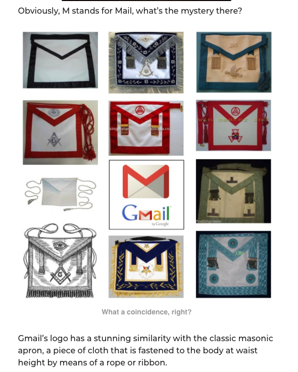
Masonic Symbol History
G
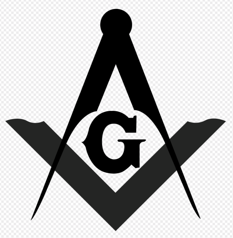
The Freemason G is paired in the logo with a square and compass. According to the Masonic Lodge of Education:
M
The M symbol Friedman is referring to is the M shown on the Master Mason apron. It's history is described as:
Google Symbol History
According to https://about.google/our-story/ Google was started as a search engine called Backrub which was later renamed to Google. Google's name come from Googol and is:
G
Google's logo has changed over the years though the changes have grown less dramatic as they've settled into their brand.
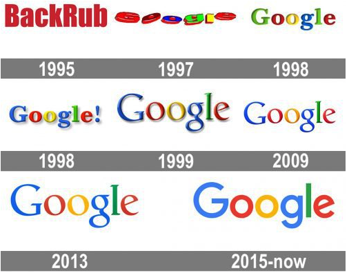
The Google logo can also be shorted to G.

M

The Gmail logo has been shorted over the years from "Google Mail" to "Gmail" to the envelope "M" logo used today.
Debunking
1) Just because designs are similar does not mean that there is a link of providence.
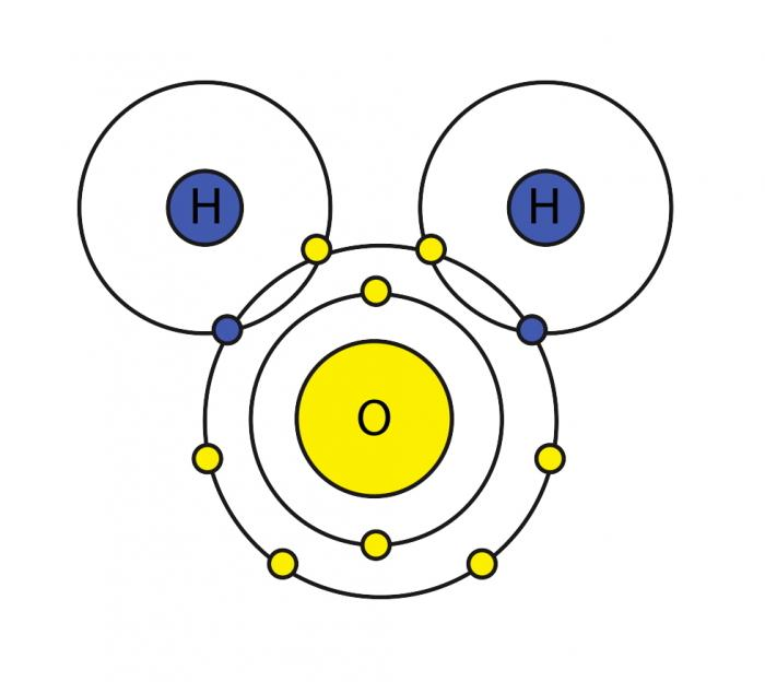
As humans, we're prone to seeing pattern in our surroundings. For example, I can see Disney's Mickey Mouse logo in this image of the chemical structure of water even though there is no connection between the two.
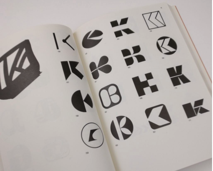
Designs will be even more similar if they are pulling from similar sources such as the alphabetical letters M and G. An excellent book covering similar thinking for logo design is "Trademarks & Symbols of The World" by Yasaburo Kuwayama. It's a design book which covered company logos and you can see how different designers came up with similar logos for different companies. Here is an image of the K section where you can see how people split the K into two pieces in similar ways. There are only so many ways you can split a K and still have it be recognizable.
2) It is common for a company with a lettered logo to shorten their logo to the first letter.
Company logos need to be representative, distinct from other brands, clear in print, and readable at different scales. Longer words interfere with scalability so companies with longer names will simplify their logos to help branding. Such examples include McDonalds, Bing, Clavin Klein, etc.
 .
.

Whether the G stands for Google, God, or Geometry - even if they all get shortened to G you cannot use this to claim a link between them beyond all three starting with same letter.
3) Other Master Mason aprons are not similar to the Gmail logo.
According to the Mason websites I linked, aprons in the US are commonly colored with blue. The red aprons shown in the Ancient Symbols example are uncommon within the United States. The standardization of the aprons vary between different lodges and different countries. A Freemason community forum thread discussed the discrepancy of red aprons where a member pointed out that


Looking at the apron, I can see an 'M' if I squint but it is does not appear as strongly because the top fold of the apron is rounded instead of having sharp V angles. If I were to compare this Mason apron with the Gmail logo, I wouldn't see any "stunning similarity" except that they are both rectangular. And just because two different things are the same shape does not mean they are connected.
In Addition
This argument can be broken down to 'they look similar therefore there is a link.' This is a false statement. Just because two objects look similar does not mean there is always a connection between them. This is especially true since humans are good at seeing patterns even when there's none. For example 1110100 - I made this pattern by flipping a coin but looking at it now even I'm finding patterns.
Another way to approach the similarities present could be to say that both the apron with an angled M and the Gmail icon resemble envelopes. The Gmail icon is intentionally evoking an envelope with an M to represent Gmail. I do not know if the apron is coincidentally or intentionally similar to an envelope.
For more information on graphic design of logos, I'd suggest "Logo Modernism by Jens Muller and R, Roger Remington. You can find scans of certain pages and reviews online. "Trademarks & Symbols of The World" by Yasaburo Kuwayama is harder to find since it was published awhile ago.
Claim
https://www.ancient-code.com/we-are...-modern-logos-are-linked-to-secret-societies/
"We Are Surrounded by Masonic Symbols - How Modern Logos Are Linked To Secret Societies" by Janice Friedman
Friedman claims
External Quote:Gmail's logo has a stunning similarity with the classic masonic apron, a piece of cloth that is fastened to the body at waist height by means of a rope or ribbon.
Masonic Symbol History
G
The Freemason G is paired in the logo with a square and compass. According to the Masonic Lodge of Education:
External Quote:The letter G in Freemasonry stands for both the Great Architect of the Universe and Geometry....or, to be more technically correct, it stands for Geometry under the Great Architect of the Universe.
M
The M symbol Friedman is referring to is the M shown on the Master Mason apron. It's history is described as:
A common descriptor of the apron in the US is:External Quote:The lambskin Master Mason apron derives from the working apron of the ancient stone masons. It is an Emblem of innocence and the badge of a Freemason.
External Quote:Most American Freemasons wear a Master Mason Apron which is 14 inches by 16 inches and is made of white, synthetic leather with Masonic symbols embroidered onto them in blue thread.
Google Symbol History
According to https://about.google/our-story/ Google was started as a search engine called Backrub which was later renamed to Google. Google's name come from Googol and is:
External Quote:...a play on the mathematical expression for the number 1 followed by 100 zeros and aptly reflected Larry and Sergey's mission "to organize the world's information and make it universally accessible and useful."
G
Google's logo has changed over the years though the changes have grown less dramatic as they've settled into their brand.
The Google logo can also be shorted to G.
M
The Gmail logo has been shorted over the years from "Google Mail" to "Gmail" to the envelope "M" logo used today.
Debunking
1) Just because designs are similar does not mean that there is a link of providence.
As humans, we're prone to seeing pattern in our surroundings. For example, I can see Disney's Mickey Mouse logo in this image of the chemical structure of water even though there is no connection between the two.
Designs will be even more similar if they are pulling from similar sources such as the alphabetical letters M and G. An excellent book covering similar thinking for logo design is "Trademarks & Symbols of The World" by Yasaburo Kuwayama. It's a design book which covered company logos and you can see how different designers came up with similar logos for different companies. Here is an image of the K section where you can see how people split the K into two pieces in similar ways. There are only so many ways you can split a K and still have it be recognizable.
2) It is common for a company with a lettered logo to shorten their logo to the first letter.
Company logos need to be representative, distinct from other brands, clear in print, and readable at different scales. Longer words interfere with scalability so companies with longer names will simplify their logos to help branding. Such examples include McDonalds, Bing, Clavin Klein, etc.
Whether the G stands for Google, God, or Geometry - even if they all get shortened to G you cannot use this to claim a link between them beyond all three starting with same letter.
3) Other Master Mason aprons are not similar to the Gmail logo.
According to the Mason websites I linked, aprons in the US are commonly colored with blue. The red aprons shown in the Ancient Symbols example are uncommon within the United States. The standardization of the aprons vary between different lodges and different countries. A Freemason community forum thread discussed the discrepancy of red aprons where a member pointed out that
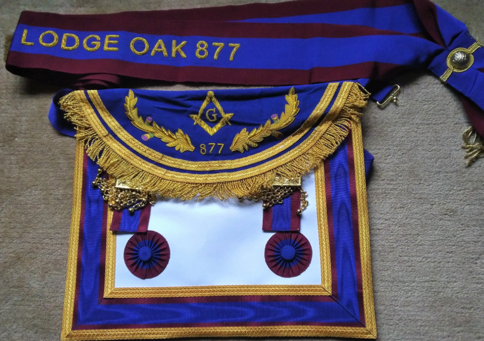
The member later posted a picture of his own apron and sash.External Quote:Here in Scotland the apron is different for almost every Lodge. It's great to see the variations you get on a meeting night when you get many visitors.
Looking at the apron, I can see an 'M' if I squint but it is does not appear as strongly because the top fold of the apron is rounded instead of having sharp V angles. If I were to compare this Mason apron with the Gmail logo, I wouldn't see any "stunning similarity" except that they are both rectangular. And just because two different things are the same shape does not mean they are connected.
In Addition
This argument can be broken down to 'they look similar therefore there is a link.' This is a false statement. Just because two objects look similar does not mean there is always a connection between them. This is especially true since humans are good at seeing patterns even when there's none. For example 1110100 - I made this pattern by flipping a coin but looking at it now even I'm finding patterns.
Another way to approach the similarities present could be to say that both the apron with an angled M and the Gmail icon resemble envelopes. The Gmail icon is intentionally evoking an envelope with an M to represent Gmail. I do not know if the apron is coincidentally or intentionally similar to an envelope.
For more information on graphic design of logos, I'd suggest "Logo Modernism by Jens Muller and R, Roger Remington. You can find scans of certain pages and reviews online. "Trademarks & Symbols of The World" by Yasaburo Kuwayama is harder to find since it was published awhile ago.
