TheNZThrower
Active Member
A common claim you see among the Global Warming contrarians is the postulation that since the greenhouse effect is logarithmic, as in it has a diminishing effect in proportion to an equal rise in CO2, it therefore must implicitly follow that any global warming experienced will not be significant, or that it won't get severe enough to have a significant adverse effect. To quote fossil fuel stan Alex Epstein again:

The first major issue is that Epstein fails to elaborate on the expertise of the scholar he mentioned. Is she a climatologist or meteorologist? Does she have any relevant expertise in climate issues? Even if she does, it is a fallacy of hasty generalisation to assume that the relevant experts often don't know just because one scholar of unverified expertise doesn't know. This is a rhetorical sleight of hand meant to cast doubt on the relevant climate experts by making it seem like they don't even know the basic fact that CO2 is logarithmic, which makes them intellectually inferior to Epstein and his grand wisdom.
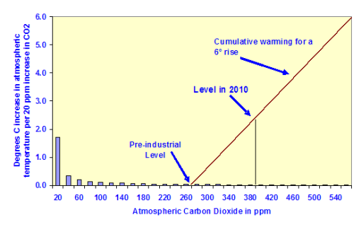
Assuming that it is valid for the sake of argument, it still does not prove his thesis at all in any way. This is because the bulk of the logarithmic effect occurs within CO2 concentrations at preindustrial levels and below. As CO2 rises above preindustrial levels, the logarithmic effect vastly diminishes. In effect, any logarithmic effect after rises in CO2 concentration above preindustrial levels is so small as to be insignificant, rendering any warming experienced roughly linear.
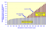
But all that aside, just because greenhouse forcing is logarithmic does not mean that whatever forcing there is won't have a significant if not adverse effect on the climate. It could be the case that forcing above preindustrial levels will decrease with each unit increase, as in it could be the case that an increase in CO2 from 280 to 560ppm will increase temperatures by 5 degrees, and an increase from 560 to 940ppm would increase temperatures by 3 degrees. Though the greenhouse effect is logarithmic in this case, it still results in a significant increase in global temperature by 8 degrees. This also isn't even factoring into the fact that CO2 has increased exponentially; so exponentially that even when graphed on a logarithmic scale, the increase in CO2 is still an upwards curve when it should, like all other exponential lines, be flat according to SkepticalScience:

So even if Epstein was right about the logarithmic greenhouse effect, this still does not imply that future warming won't be severe enough to have adverse effects on human civilisation. Double the current CO2 levels any number of times, and you will begin to see a significant warming trend.
So that's my take for today, and as Epstein would make a few more points in the article I linked, I will be following up with another post in this thread soon. Did I miss out on any important details? Let me know.
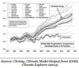
This is the graph Epstein cites:While I've met thousands of students who think the greenhouse effect of CO2 is a mortal threat, I can't think of ten who could tell me what kind of effect it is. Even "experts" often don't know, particularly those of us who focus on the human-impact side of things. One internationally renowned scholar I spoke to recently was telling me about how disastrous the greenhouse effect was , and I asked her what kind of function it was. She didn't know. What I told her didn't give her pause, but I think it should have.
As the following illustration shows, the greenhouse effect of CO2 is an extreme diminishing effect–a logarithmically decreasing effect. This is how the function looks when measured in a laboratory.
The first major issue is that Epstein fails to elaborate on the expertise of the scholar he mentioned. Is she a climatologist or meteorologist? Does she have any relevant expertise in climate issues? Even if she does, it is a fallacy of hasty generalisation to assume that the relevant experts often don't know just because one scholar of unverified expertise doesn't know. This is a rhetorical sleight of hand meant to cast doubt on the relevant climate experts by making it seem like they don't even know the basic fact that CO2 is logarithmic, which makes them intellectually inferior to Epstein and his grand wisdom.
Assuming that it is valid for the sake of argument, it still does not prove his thesis at all in any way. This is because the bulk of the logarithmic effect occurs within CO2 concentrations at preindustrial levels and below. As CO2 rises above preindustrial levels, the logarithmic effect vastly diminishes. In effect, any logarithmic effect after rises in CO2 concentration above preindustrial levels is so small as to be insignificant, rendering any warming experienced roughly linear.
But all that aside, just because greenhouse forcing is logarithmic does not mean that whatever forcing there is won't have a significant if not adverse effect on the climate. It could be the case that forcing above preindustrial levels will decrease with each unit increase, as in it could be the case that an increase in CO2 from 280 to 560ppm will increase temperatures by 5 degrees, and an increase from 560 to 940ppm would increase temperatures by 3 degrees. Though the greenhouse effect is logarithmic in this case, it still results in a significant increase in global temperature by 8 degrees. This also isn't even factoring into the fact that CO2 has increased exponentially; so exponentially that even when graphed on a logarithmic scale, the increase in CO2 is still an upwards curve when it should, like all other exponential lines, be flat according to SkepticalScience:
So even if Epstein was right about the logarithmic greenhouse effect, this still does not imply that future warming won't be severe enough to have adverse effects on human civilisation. Double the current CO2 levels any number of times, and you will begin to see a significant warming trend.
So that's my take for today, and as Epstein would make a few more points in the article I linked, I will be following up with another post in this thread soon. Did I miss out on any important details? Let me know.