TheNZThrower
Active Member
It seems like a fairly well known advocate for the use of fossil fuels, Alex Epstein, has published an old 2015 Forbes article (yah, I'm beating another dead horse again) postulating that there is no 97% consensus on anthropogenic global warming.
Epstein writes:
The second fallacy that Epstein commits is claiming that the warming has ceased in the last decade from 2015. This is another example of the cherry picking fallacy, which is a common climate contrarian tactic: select tiny periods where warming has stopped or ceased and use that to prove that the warming is non-existent, or not CO2 driven. Well then by that logic, it must therefore be the case that divorce rates in Australia are increasing because they increased within a few years after Y2K:

The reason why cherry picking tiny periods of data to infer a longer trend is faulty is, as everyone surely knows, because real life trends rarely are linear.
The third fallacy that Epstein commits is that of distorting the visual representation of the data in two manners. Though the main critique of this graph comes from a software developer by the name of Sam Fiddis on his blog, I still feel it is a valid critique overall and I will briefly summise it as follows:

And if he were to keep the grid aspect ratio the same between the two graphs, this would be the result:

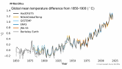
And if we were to look at the source for his data from the Met Office Hadley Centre (or HadCRUT4) and many other reputable sources, we get this graph:

And if we look at the updated HadCRUT5 from the same source, we get this:

Both dataset, as observed, show a much more glaring and consistent warming trend than Epstein's graph does. So Epstein is either dishonest, or dumb, or both, and I will be continuing this in the next post.
Epstein writes:
To answer Epstein's question that certainly wasn't made in bad faith, we shall turn to a 2014 survey of the American Meteorlogical society by Stenhouse et al. and correct him by saying that climate scientists agree that global warming is occurring and that it is predominantly driven by humans. To quote Stenhouse et al.Here are two questions to ask anyone who pulls the 97% trick.
1. What exactly do the climate scientists agree on?
Usually, the person will have a very vague answer like "climate change is real."
Which raises the question: What is that supposed to mean? That climate changes? That we have some impact? That we have a large impact? That we have a catastrophically large impact? That we have such a catastrophic impact that we shouldn't use fossil fuels?
In addition, Stenhouse et al. noted that greater expertise in climate science predicted a greater likelihood that anthropogenic global warming is harmful, though the perception of consensus was the strongest contributing variable:Climate science experts who publish mostly on climate change and climate scientists who publish mostly on other topics were the two groups most likely to be convinced that humans have contributed to global warming, with 93% of each group indicating their concurrence.
Unfortunately, Stenhouse et al. didn't give a precise percentage of the scientists who thought global warming would be harmful, but his findings still do cast doubt on Epstein's thesis and agenda. But Epstein still claims the following in ignorance of Stenhouse et al.'s findings.Confirming all four hypotheses, the regression analyses showed that greater expertise, more liberal ideology, greater perceived consensus, and lower perceived conflict each predicted higher levels of certainty global warming was occurring, higher likelihood of viewing it as mostly human caused, and greater ratings of future harm. Together, the independent variables explained 37% of the variation in certainty that global warming is occurring and 29% of the variation in views on global warming harm.
Epstein then makes the following statement:What you'll find is that people don't want to define what 97% agree on--because there is nothing remotely in the literature saying 97% agree we should ban most fossil fuel use.
The first fallacy that Epstein commits is the implication that the effects of warming can't be significant because 0.8 degrees of warming is a relatively small amount. This is both an appeal to intuition and an argument from personal incredulity. Just because one cannot intuitively conceive of how such a small change in warming could have a significant effect does not mean it can't have such an effect. An increase in the blood alcohol level from 0% to 0.4%, according to Healthline, may seem like a small number, but it still doesn't mean it isn't lethal.If you look at the literature, the specific meaning of the 97% claim is: 97 percent of climate scientists agree that there is a global warming trend and that human beings are the main cause--that is, that we are over 50% responsible. The warming is a whopping 0.8 degrees over the past 150 years, a warming that has tapered off to essentially nothing in the last decade and a half.
Sources: Met Office Hadley Centre HadCRUT4 dataset; Etheridge et al. (1998); Keeling et al. (2001); MacFarling Meure et al. (2006); Merged Ice-Core Record Data, Scripps Institution of Oceanography
The second fallacy that Epstein commits is claiming that the warming has ceased in the last decade from 2015. This is another example of the cherry picking fallacy, which is a common climate contrarian tactic: select tiny periods where warming has stopped or ceased and use that to prove that the warming is non-existent, or not CO2 driven. Well then by that logic, it must therefore be the case that divorce rates in Australia are increasing because they increased within a few years after Y2K:
The reason why cherry picking tiny periods of data to infer a longer trend is faulty is, as everyone surely knows, because real life trends rarely are linear.
The third fallacy that Epstein commits is that of distorting the visual representation of the data in two manners. Though the main critique of this graph comes from a software developer by the name of Sam Fiddis on his blog, I still feel it is a valid critique overall and I will briefly summise it as follows:
- Epstein deliberately used a differing aspect ratio for the grid of the temperature graph than for the CO2 graph, which makes the warming trend look flatter than it really is as to make the CO2 and temperature trend seem out of sync with one another.
- Epstein also deliberately cut off the CO2 graph at 275ppm mark to eliminate any empty space underneath the trend line, while leaving the same empty space beneath the temperature trend intact to give the illusion that the latter is flatter
- Epstein deliberately and arbitrarily connected the successive record temperature highs and lows with dotted lines to give the illusion that the trend fluctuates more than it actually does. If he were to draw a proper line of best fit for each arbitrarily long section he connected, they wouldn't link up with each other at all.
And if he were to keep the grid aspect ratio the same between the two graphs, this would be the result:
And if we were to look at the source for his data from the Met Office Hadley Centre (or HadCRUT4) and many other reputable sources, we get this graph:
And if we look at the updated HadCRUT5 from the same source, we get this:
Both dataset, as observed, show a much more glaring and consistent warming trend than Epstein's graph does. So Epstein is either dishonest, or dumb, or both, and I will be continuing this in the next post.