COVID-19 Coronavirus current events

GAVI funds vaccinations on a global scale, they're an alliance of the biggest players in the field.
Article:

RUNNY NOSE

According to Prof Tim Spector, the researcher behind the ZOE COVID Symptom Study app, which collects daily data on people’s symptoms, infection and vaccination status, this is one of the most common symptoms being seen now.

I haven't seem a recent ZOE press release yet, but this was the current ranking in June 2021:

Content from External Source
Source: https://covid.joinzoe.com/post/new-top-5-covid-symptoms , reformatted by me

Note that fever was already off the top 5 for vaccinated people back then.
I'm a part of this study, and Tim releases a new video on the ZOE YouTube channel every week which usually goes over any changes in the symptom rankings.
 
I'm confused... what difference does it make if headache or runny nose is more prioritized? All of these are symptoms of a common cold...
Maybe it's "Forests v Trees" syndrome. AKA getting lost in details? Or the advanced version: '"How many leaves on the seventh branch of the fourth tree?" is meaningless when you are in the wrong forest'.
 
I'm confused... what difference does it make if headache or runny nose is more prioritized? All of these are symptoms of a common cold...
yes, that's the point
right now, early Covid feels like a cold (and sometimes not even that)
the coughing and the fever are way down the list
it's the motivation for people to wear masks even if they don't feel really sick
 
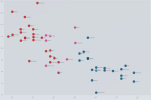
Vaccinations vs. deaths vs politics by US State
This is data from when vaccines became widely available to anyone in the US (May 2021) up until 10 february 2022.
X-axis: Current vaccination rate, Y-axis: Deaths per 100k
Red: Voted Trump in 2020, Blue: Voted Biden in 2020, Pink: Swing states
Note that neither axis starts at zero!

Source: https://m.imgur.com/gallery/EPiO0Cx

High resolution version is attached.
 

Attachments

  • vq1X3NH.png
    vq1X3NH.png
    335.9 KB · Views: 232
Last edited:
Vaccinations vs. deaths vs politics by US State

That's a pretty clear correlation. Hmmm, my surprise-o-meter seems to need a new battery.

Related - I've been maintaining for many months now a list of states, coloured by various attributes, but sorted by the covid death rate for that state, the intention being that you can just visually judge whether one colour seems to be higher in the table than the other colour. Presently, the attributes I monitor are politics (very grainy, simply coloured for strong blue, weak blue, weak red, strong red), religiosity (fine-grained), and adult obesity (fine-grained). It makes sense to do vaccination rates too, so I shall hunt out a table I can copy-paste into my template - I think I've found one and shall try to slap it into shape tomorrow (it's late).
The current tables are here: http://fatphil.org/CoViD/politics.html , http://fatphil.org/CoViD/religiosity.html , and http://fatphil.org/CoViD/obesity.html ; there was no plan or intention to impose any particular conclusion from such presentations of data, the interpretation is purely in the mind of the viewer. After many months of manually moving the rows around every couple of weeks, I've finally written a script to do that for me, so I plan to keep them more up-to-date.
 
Article:
covidhospitalizationsinfographic_jan24_012422.jpg

The U of Michigan trend with the ICU numbers declining continues. It kinda looks like unvaccinated patients stay in the ICU longer, but it's hard to tell if that's really true.
Article:
covidhospitalizationsinfographic_feb07_020722_0.jpg

Michigan hospitalisations are going down. My guess is that the last vaccinated Delta cases have left the hospital, while some of the unvaccinated patients are there for the long term.

coronavirus-data-explorer-8.png
Case numbers seem to be improving in most places, but only Australia sees a strong reduction in deaths so far.
coronavirus-data-explorer-7.png
 
the point of having 3 groups in the original graph is to have categories that correspond to T>>B, T≈B, T<<B voters, coloring the swing state group red or blue removes information.

Maine had a 9% margin in the popular vote (despite the electors it sent), so it needs to be in the T<<B category. And Nebraska had a 19% lead for Trump.

It's not the electors that get sick, it's the population.
 
Last edited:
That's a pretty clear correlation.
Here's another one:
SmartSelect_20220211-004939_Samsung Internet.jpg

I've been maintaining for many months now a list of states, coloured by various attributes, but sorted by the covid death rate for that state
A problem is that Covid correlates geographically, and the first wave hit the North-East unprepared, so you have some states higher up in table than they'd be if you started counting deaths somewhat later.
 
A problem is that Covid correlates geographically, and the first wave hit the North-East unprepared, so you have some states higher up in table than they'd be if you started counting deaths somewhat later.
he did start counting deaths a whole lot later. May 2021.

3 groups in the original graph is to have categories that correspond to T>>B, T≈B, T<<B voters, coloring the swing state group red or blue removes information
ok so pink is not "swing states". pink is "states with a close margin Trump to Biden". gottcha.


I don't doubt conservative leaning areas have higher death rates since the vaccine. But they also likely had lower mask mandates and restrictions. just saying. (and ps connecticut has 85% of adults vaccinated... the younger kids in all states are dragging the vax numbers down which im not sure is fair if we are looking at deaths.)

green dots here are west coast and east coast states. that is one problem with America.. people who live on the coasts are different then people who live in the middle. I personally believe vaccines help keep death numbers down, but we (coastal peoples) also live our lives differently....


I still highly recommend people get vaccinated! but just pointing out limitations to the chart.

1644542663380.png
 
So using @Mendel 's graph, it looks like North Dakota hit the anti-vax sweet spot by keeping the death rate just below 80 per 100,000 while keeping the vax rate just above 50%.

But it's hard to control for all variables.

North Dakota has a population of ~762,000, a little less than San Francisco's ~874,000. SF has a foot print of ~46 sq miles vs North Dakota's ~70,000 sq miles. So for San Francisco that's 19,000 people per sq mile as opposed to North Dakota's ~10 people per sq mile. Just by virtue of living in North Dakota, one tends to practice Uber-social-distancing.

And Florida proved itself the most purple of states with the highest death per highest vax rate.


1644546824879.png
https://www.google.com/search?q=pop...j0i22i30l2.9113j0j15&sourceid=chrome&ie=UTF-8
https://www.google.com/search?q=pop...0i22i30l4.12377j0j15&sourceid=chrome&ie=UTF-8
https://www.google.com/search?q=are...j0i22i30l7.7178j1j15&sourceid=chrome&ie=UTF-8
https://www.google.com/search?q=are...q=area+of+north+da&aqs=chrome.2.69i57j0i512j0
 
he did start counting deaths a whole lot later. May 2021.
Where do you see that? http://fatphil.org/CoViD/politics.html
sorted by the statewide death rates on Worldometers, dated February 09, 2022, 13:59 GMT, from the "Yesterday" tab, using the assumption that that data is now finalised.
Content from External Source
ok so pink is not "swing states". pink is "states with a close margin Trump to Biden". gottcha.
that's the meaning of 'swing state'
Article:
a state where the number of Democratic and Republican voters is about the same, that has an important influence on the result of the election of the United States President :

Article:
US politics : a U.S. state in which Republican and Democratic candidates have similar levels of support and which is considered to play a key role in the outcome of presidential elections


I agree there are other factors; e.g. Florida has a bigger proportion of old people which makes the State more death-prone. Vaccination is clearly a big factor, though, and we know why.
 
Where do you see that? http://fatphil.org/CoViD/politics.html
sorted by the statewide death rates on Worldometers, dated February 09, 2022, 13:59 GMT, from the "Yesterday" tab, using the assumption that that data is now finalised.
Content from External Source
[...]
I agree there are other factors; e.g. Florida has a bigger proportion of old people which makes the State more death-prone. Vaccination is clearly a big factor, though, and we know why.

Restricting a date range would certainly skew the data. Some states, two in particular, made a complete pigs ear of the early days, and that will stay in their stats (as I present them) forever.

I've kinda got the vax rate data up: http://fatphil.org/CoViD/vaccination.html (but the auto row numbering needs reining back in!)
I'll have a peek for some population density and average age data too. Now the table row re-ordering is scripted, I don't mind how many tables I have to maintain as long as the source data's in a vaguely sane tabular form (I'm a huge fan of zero-effort).

And yes, I'm colourblind. :/
 
sorry you posted the original graph just before that, so i thought you were referring to that.
Hmmm.
ive never in my life heard the term used the way your graph is using it.

The graph won't look much different if you use another definition of "swing state". I just looked up a Fox pre-election article; they had 12 states, but that basically adds some pink dots near where the other pink dots are on the graph.
 
The graph won't look much different if you use another definition of "swing state".
as i said you are the expert on all things American, so i wouldn't expect you to consider someone else's input.

i dont care if Trump supporters (ie Americans) dismiss your graph because you won't use reasonable language and it looks like you are arguing so hard to hide blue dots. no skin off my nose.
 
as i said you are the expert on all things American, so i wouldn't expect you to consider someone else's input.
you haven't provided constructive input

and it's both insulting, ignorant and disrespectful to say I won't consider someone else's input when I just wrote that I looked up what Fox (Americans!) think the swing states were, and how that would affect the graph.

you're not using facts to debate me, you're using my nationality to discredit me
I don't think that's ok

and it's not "my graph", I just reported on it
 
and it's both insulting, ignorant and disrespectful to say I won't consider someone else's input when I just wrote that I looked up what Fox (Americans!) think the swing states were, and how that would affect the graph.
then why are ohio and Iowa red?

Fox's list is states they were hoping to grab or were afraid to lose in the election. Pennsylvania for example only swings if it goes red. not if it stays blue.
my definition as it relates to that graph and an American ear is better. I dont expect you to agree.

pink is "states with a close margin Trump to Biden". gottcha.
 
you haven't provided constructive input

and it's both insulting, ignorant and disrespectful to say I won't consider someone else's input when I just wrote that I looked up what Fox (Americans!) think the swing states were, and how that would affect the graph.

you're not using facts to debate me, you're using my nationality to discredit me
I don't think that's ok

and it's not "my graph", I just reported on it
I think we all know that you close out every post with:
"Trust me, because I am the sole expert on everything American!"
Screen Shot 2022-02-11 at 3.23.26 PM.png
 
did i bring up that my CDC page does not show data for ages below age 50? Did i wonder aloud why the CDC would not provide this data?
The New York Times brought it up.

I'm behind a paywall till the first of the month so have to use a secondary source:
Article:
Feb. 22, 2022

The U.S. Centers for Disease Control and Prevention has only published a fraction of the data it collected about the COVID-19 pandemic, The New York Times reported, citing several people familiar with the data.

The CDC published information about the effectiveness of boosters for people under 65 two weeks ago but didn’t provide data about people 18-49 years old, the age group least likely to benefit from boosters because they’re already well protected by the first two shots, The Times said.

.....
When asked to comment, CDC spokesperson Kristen Nordlund said the agency held back some information “because basically, at the end of the day, it’s not yet ready for prime time.”

The CDC prioritizes making sure information is accurate, she said, adding that the CDC fears the public might misinterpret some information.
Language like this typically means that the sample sizes are not large enough (yet) to make statements with confidence. Statements based on that would likely need to be corrected later, a process that the public tends to hold against the CDC.
 
The Virality Project (2022). Memes, Magnets and Microchips: Narrative dynamics around COVID-19 vaccines. Stanford Digital Repository. Available at https://purl.stanford.edu/mx395xj8490

The global COVID-19 pandemic and subsequent vaccine rollout created unprecedented challenges in the online information environment. Authority figures and institutions, operating with incomplete facts and emerging consensus, struggled to communicate with the public and to assess the mis- and disinformation narratives that required response. The public, looking for accurate health information, confronted a glut of claims; the narratives with the largest reach or highest engagement were not necessarily the most reliable. Rumors, misinformation, and disinformation spread rapidly. Social media companies sought to surface accurate information about the pandemic and vaccines, but faced a challenge: What should they curate or amplify in the absence of clear scientific consensus? How should they identify, and moderate, false and misleading claims?

It was against this backdrop that the Virality Project was formed. Drawing on scholarship documenting the who, what, and how of the anti-vaccine movement, the Virality Project identified four categories of well-established narratives likely to emerge as key themes in the COVID-19 vaccine rollout: (1) safety, (2) efficacy and necessity, (3) development and distribution, and (4) conspiracy theory. This report details the narratives, actors, and tactics that shaped COVID-19 vaccine conversations within those themes from February to August 2021. In addition, it assesses the interplay between this content and social media platform policies, surfacing the recurring narratives that attempt to question the safety of vaccines and discourage vaccine uptake. Finally, drawing on these observations, the Virality Project team offers policy recommendations for academics, public health experts, government entities, and tech platforms with the goal of engendering a whole-of-society effort to address health misinformation.
Content from External Source
 
Language like this typically means that the sample sizes are not large enough (yet) to make statements with confidence. Statements based on that would likely need to be corrected later, a process that the public tends to hold against the CDC.

I don't believe you. I'm going to need a source for that.
 
The CDC published information about the effectiveness of boosters for people under 65 two weeks ago but didn’t provide data about people 18-49 years old, the age group least likely to benefit from boosters because they’re already well protected by the first two shots, The Times said.

SmartSelect_20220224-151614_Samsung Internet.jpg
Content from External Source
I don't understand why your quote says that there is no data.
 
I can't tell you why they're withholding data if I don't even see them do it
you dont have to tell us why, the spokes woman for the cdc already did.
When asked to comment, CDC spokesperson Kristen Nordlund said the agency held back some information “because basically, at the end of the day, it’s not yet ready for prime time.”

The CDC prioritizes making sure information is accurate, she said, adding that the CDC fears the public might misinterpret some information.


and i did link to my old post (Feb 5th) asking the same question
18-49change.png

unfortunately they changed their window software after October so pages (with widgets?) cannot be archived anymore. so all we've got is my screengrab
https://archive.fo/https://covid.cdc.gov/covid-data-tracker/#covidnet-hospitalizations-vaccination

this is a different page of course, as the nytimes link, but that NYTimes link is only archived in Wayback Machine since Feb 14th. (less than 2 weeks) so we cant see if it was changed. NYTimes might be lying about the link originally containing no 18-49 info, but...
 
I don't understand why your quote says that there is no data.
also.. that data doesnt actually tell us anything because only 27% of those numbers tested positive for covid. but they dont tell us which 27 %. (and its a bit weird both groups had exactly 27% test positive...hmmm)

(my only issue is that in the US many colleges are kicking kids out for not having a booster. other than that i dont care about booster numbers for young people)
age18-44.png
 
CDC tweaks vaccine interval recommendations
Article:
"An 8-week interval may be optimal for some people ages 12 years and older, especially for males ages 12--39 years," the new guidance says.

The CDC says the three- or four-week interval is still recommended for people who are moderately or severely immunocompromised, adults 65 and older "and others who need rapid protection due to increased concern about community transmission or risk of severe disease." There's no data around children younger than 11, so this group is still recommended to get the second Pfizer vaccine three weeks after the first dose.
 
Article:
(CNN)The Florida Department of Health released new guidance Tuesday that says healthy children between the ages of 5 to 17 do not need to get the Covid-19 vaccine.

"Based on currently available data, healthy children aged 5 to 17 may not benefit from receiving the currently available COVID-19 vaccine. The Department recommends that children with underlying conditions are the best candidates for the COVID-19 vaccine," it says. "Parents are encouraged to discuss the risks and benefits with their children's health care practitioner when evaluating whether their child should receive a COVID-19 vaccine, particularly for children with underlying health conditions or comorbidities."
 
Someone told me today that "The CDC admitted that what they called a 'coding error' led them to conclude that a quarter of supposed deaths of children, from COVID, never happened."
I'm guessing his point was that if only 76+% of kids died, that we thought had, hey, the pandemic is really a hoax.

Hours later I googled CDC + "coding error" and got almost exclusively dodgy social media etc. accounts that just repeated something similar,
but never any real source.

Finally one pointed to the Daily Caller...not a very good source, but at least a prominent one.
https://dailycaller.com/2022/03/18/cdc-data-kids-pediatric-covid-coronavirus-deaths/

But they actually just pointed to the Washington Examiner...
another source known more for bias than accuracy.

https://www.washingtonexaminer.com/...plummet-24-after-cdc-fixes-coding-logic-error

And the WE says that "After CDC resolved the error, the pediatric death figure reported on its COVID Data Tracker dropped to 1,339 all-time deaths, a reduction of 23.7% from the figure reported the day prior.

"On March 15, 2022, data on deaths were adjusted after resolving a coding logic error. This resulted in decreased death counts across all demographic categories," and they put in this link as proof...

https://web.archive.org/web/20220317153346/https://covid.cdc.gov/covid-data-tracker/#demographics

...but I'm not seeing anything about a "coding error" there.
I'm tired, and maybe after looking all over trying to verify this,
I'm just not seeing it.
Anyone know anything about this?
 
Well Australia seems to be coming out of the pandemic ( i may regret saying this) & my state is winding back vector controls.
We are still getting daily deaths with case numbers in 1000;s and many friends all around me have caught covid with varying degrees of sickness yet my self i dodged the bug so far

https://www.9news.com.au/national/c...19-cases/e502ee8b-3f63-442c-b922-bf38464a32a1

and Victoria are ending isolation requirements for household contacts of COVID-positive people by this weekend, with Queensland expected to follow suit.
In announcements by respective state leaders, NSW and Victoria also said it would be changing vaccine mandate rules and ending quarantine for unvaccinated travellers.
Queensland health minister Yvette D'Ath said the Sunshine State would likely follow a similar course of action regarding close contacts.
Content from External Source
 
Last edited:
Our state has gone down in cases and hospitalisations but with the more recent Omicron variant the number of infections has ticked up again along with a few more hospitalisations. It doesn't look like it is more deadly so nobody cares any more. Masks are coming off and people are getting back together again. In six more weeks we'll be back to warmer weather and more people can be outside I suspect that will be the last of this surge unless something else comes up. And I'm sure I can speak for everyone in saying I sure hope this is it!
 
you folks were lucky to be able to isolate and contain things before the worst variants got ahold in your countries. by the time the USoA knew what was going on it was already way too late.
 
you folks were lucky to be able to isolate and contain things before the worst variants got ahold in your countries. by the time the USoA knew what was going on it was already way too late.
The information was out there, and the epidemiologists knew what was happening in other countries. For political reasons, it was downplayed to the rest of us. As Trump said, "It'll just magically go away".
 
Back
Top