Explained: Odd Looking Bidens/Carters Photo - Not Fake, Just Perspective

Part of the problem is that the word “distortion” has a specific technical meaning in optics. As specific as words like “coma” and “astigmatism”.

In layman’s terms though the word can simply mean “not like I see it”.
 
The camera does not affect the picture at all
i don't understand what you're saying. we all have non-wide angle cameras and hundreds of pictures from different distances, none of our photos look like the Biden photo.
 
It is distorted if you want it to represent what you would see if you were sat with your head in that position.
I feel that I am not getting through to you. This sentence is wrong, assuming perfect optics.

Imagine a window frame between the observer and the scene. A picture represents the scene without distortion if we could put that picture in the frame and remove the scene and the observer could not tell a difference.
(We need to assume a one-eyed observer who does not move their head, and a flat window-frame.)

A perfect rectilinear projection will provide that picture without distortion.

A cylindrical projection is a compromise that allows an observer to move sideways, as viewers in a gallery would do. This is, however, distorted in the above sense, unless you used a cylindrical window-frame.
 
I feel that I am not getting through to you.
The feeling is mutual.

This sentence is wrong, assuming perfect optics.
Are you a robot? No, you've got curved eyeballs and a neural net processing the image. Humans do not see a rectilinear projection of the world.

The major distortion on very wide angle lenses is not something a human ever sees. Yes the distortion is a function of the type of projection, but it's still distorting the image from what we see.
 
This cropped version looks okay at the horizon line Nothing unusual in this cropped view --the effect happens at the top and bottom and edges as has been mentioned. Notice the curved frame of the picture above the arrow.

BidenCARTER.jpg
A lot of it is the fact that the Carters show a lot of inclined foreshortened body parts --legs and torsos, and Bidens are foreshortened very little.
 
Last edited:
This cropped version looks okay at the horizon line Nothing unusual in this cropped view --the effect happens at the top and bottom and edges as has been mentioned. Notice the curved frame of the picture above the arrow.

BidenCARTER.jpg
A lot of it is the fact that the Carters show a lot of inclined foreshortened body parts --legs and torsos, and Bidens are foreshortened very little.
That's a result of the camera being tilted down.

I looked at the original image as a result. Have any of you noticed President Carter's shoe size? That's another "distortion" caused by the viewpoint and wide angle. It could "prove" to conspiracy theorists that the "distortion" does not result from the Bidens being inexpertly photoshopped in. (Why would "the conspiracy" have succeeded in keeping their secrets so way if they employed professionals for faking images that couldn't survive in the advertising industry?)
 
It's not distorted if you assume a rectilinear pinhole projection is the perfect representation of an image.

It is distorted if you want it to represent what you would see if you were sat with your head in that position.

The world is 3D, images are 2D. All images are distorted one way or another
Let's begin with this.
We agree on the 3D objection. A 2D image has no depth, so if that was "distortion", all 2D imaged would be distorted, making the term useless. That's why I assumed using one eye (no stereoscopic vision) and no head movements (no parallax).

My claim is that a rectilinear pinhole projection (RPP) represents "what you would see if you were sat with your head in that position".

More specifically,
* what you see when you put your eye where the pinhole is and look at reality
* what you see when you put your eye where the pinhole is and look at the RPP
is exactly the same (rotated 180°).

If you preserve the projection using photographic chemicals (produce a photograph) and mount it 180° rotated and then put the observer's eye in the same geometric relation to the photograph as the pinhole was to the projection, it'll look real (except for the infidelities in color and light reproduction, which are not classified as "distortion", but as chromatic flaws).
Also, this geometric relation can be scaled up or down without loss of realism if all angles are preserved.

Are you a robot? No, you've got curved eyeballs and a neural net processing the image. Humans do not see a rectilinear projection of the world.

The major distortion on very wide angle lenses is not something a human ever sees. Yes the distortion is a function of the type of projection, but it's still distorting the image from what we see
You see the world with your eyeball and the image with your eyeball; there is no difference; this has no bearing on the issue. All that matters is what light rays reach the eye from which direction. If you can reproduce how that happens in reality by using an image, that image is not distorted.

Are we agreed on this?
 
Nope, you'd also need to manually follow a curvilinear path for the scanlines you were capturing. Otherwise, you'd get something like your Escher image above. However, I'd claim that's not what a man off the street would understand was to be done if told to take the wide angle picture in tiles.
Fun fact: rectilinear projections have the property that straight lines in reality remain straight lines in the image. "Curves" don't come into it.
Say you have a 90 degree FoV in both directions, and you want it captured on a device that has a 30 degree FoV. I assert that the typical interpretation of what is wanted would be to capture the 9 images at azimuth-altitude coordinates: 30-left-30-up, centred-30-up, 30-right-30-up, 30-left-level, centred-level, 30-right-level, 30-left-30-down, centred-30-down, 30-right-30-down. You're now capturing more than you were.
My rebuttal was that if you crop the collection to a rectangle, you'd still get the original image.

Here's the geometric proof:
rectilinear 90-30.png
The center 30° is just the center square; the four 30° edge views are shaped like the blue trapeze; the four 30° corner views are shaped like the pink kite.

Obviously the 30° images are square, and the red rectangles captured in them are distorted, because the camera is getting tilted compared to the straight-on view, which causes perspective distortion. This is why I said you'd need to do a trapeze transform (two transforms for the kite) to re-align the perspective, "un-tilt" the sub-pictures, and thereby make the red rectangles rectangular again.
 

Attachments

  • rectilinear 90-30.pdf
    9.3 KB · Views: 335
The previous post makes the "wide angle magnification" apparent. It's 1/cos(x) where x is the angle from the center. At 60°, the magification is 200%, so a 120° wide angle projection would have the objects at the edges appear twice as large in the image as a same size object in the center, at the same distance from the camera.

If you don't want that, you'd have to create an isometric perspective, like oldschool RPG graphics.
murli-soogrim-magicanium-mockup.jpg

However, isometric perspective does not look realistic. (For example, it can't have a horizon.)

-----------

For the photo we're discussing, if the Carters are 30° off center and the Bidens are 40° off center, that makes the Bidens 13% larger than the Carters. This also works vertically, and contributes to Jimmy Carter's shoe size (besides the shoes being close to the camera). The Bidens' heads are actually 25% larger than the Carters', so that's not the whole explanation.

If this was not a wide-angle shot, these two angles would be smaller and closer together, which would reduce the magnification drastically. For example, 15° to 20° is only a 2.8% enlargement.
 
Last edited:
My rebuttal was that if you crop the collection to a rectangle, you'd still get the original image.

What you've missed out of that sentence is the fact that you're cropping images that you have *distorted*.

I repeat - it's not the same image.
 
The previous post makes the "wide angle magnification" apparent. It's 1/cos(x) where x is the angle from the center. At 60°, the magification is 200%, so a 120° wide angle projection would have the objects at the edges appear twice as large in the image as a same size object in the center, at the same distance from the camera.

If you don't want that, you'd have to create an isometric perspective, like oldschool RPG graphics.
murli-soogrim-magicanium-mockup.jpg

However, isometric perspective does not look realistic. (For example, it can't have a horizon.)
.
This isometric perspective is what you’d get when taking pictures from very far away, where the differences in distances within the scene are very small relative to the distance to the camera. So “perspective distortion” is minimized. A great example is oblique satellite imagery. Looks just like that. 64016647-D446-4EBC-853C-CCC9924A6196.jpeg
 
My claim is that a rectilinear pinhole projection (RPP) represents "what you would see if you were sat with your head in that position".
No. The human visual system is not at all rectilinear. The light is focused and received on two curved sensors (your eyeballs) and then extensively processed in the brain into what we perceive as an image. This is then further confused by the fact that we view the world with eyeballs in motion, and multiple angles contribute to the resultant image.

All you seem to be saying is the the angular size of things at a point is the same at the pinhole and at the focal point of your eyeball. That does not make it a rectilinear pinhole projection. It's really a truism.

For something to be a rectilinear projection, it needs something flat to project the image onto.

Drawing a diagram that includes the projection surface can be helpful to understand this
 
That does seem to be a an illustration of one-point perspective; I've used a system like that to plan scenes in paintings.
 
What you've missed out of that sentence is the fact that you're cropping images that you have *distorted*.
Yes. You quoted me on the tranformation in post #37, and then I mentioned the cropping in post #38.
I am offended that you'd say I left that out.
 
I think this is the kind of distortion Mick is mentioning in a crummy hand-drawn diagram.
The picture plane is the surface the view appears on. This kind of thing is also used in illusionistic Baroque ceiling paintings too:
img.jpg
 
No. The human visual system is not at all rectilinear. The light is focused and received on two curved sensors (your eyeballs) and then extensively processed in the brain into what we perceive as an image. This is then further confused by the fact that we view the world with eyeballs in motion, and multiple angles contribute to the resultant image.

All you seem to be saying is the the angular size of things at a point is the same at the pinhole and at the focal point of your eyeball. That does not make it a rectilinear pinhole projection. It's really a truism.

For something to be a rectilinear projection, it needs something flat to project the image onto.

Drawing a diagram that includes the projection surface can be helpful to understand this
No.
Both reality and the photograph are outside of our eyes. The physiology of our eyes applies to both. It's irrelevant.
For something to look like the world outside, it is enough for it to resemble something outside.
It does not need to resemble the inside.

You are trying to make this a comparison between the retina and a photograph, and that's not the issue here.

I also conceded the point about stereoscopy ("eyeballs in motion", "multiple angles"), and I hate that you keep dwelling on that nonetheless. If that is an issue, then you'd need to call every photograph "distorted".

I really tried to make a detailed description in post #47, and it would be very helpful if you could indicate which of my statements there you agree with, and with which you disagree.

All you seem to be saying is the the angular size of things at a point is the same at the pinhole and at the focal point of your eyeball.
Content from External Source
Yes. You call that a truism, so you acknowledge that?

Do you accept this as a criterium for a distortion-free image, or not? If not, why not?
 
That does seem to be a an illustration of one-point perspective; I've used a system like that to plan scenes in paintings.
The kite shows it's really 2-point perspective. I do that because I need to do a 3D projection of the tilted 30° "picture frame" onto the "wall" that I am photographing, and that is the same kind of projection you do when drawing perspective.
 
Yes. You quoted me on the tranformation in post #37, and then I mentioned the cropping in post #38.
I am offended that you'd say I left that out.

If you are offended by me quoting you, perhaps take more care over what you write.
 
To approach this another way -- to what possible purpose would the image be faked? Would the fakers really be unable to photoshop their characters into the picture and have them look less strange? And if it were faked, so what? What would that prove? Assume that for some reason somebody wanted a picture of the Bidens and the Carters, and couldn't take one (maybe they wanted social distancing, or maybe the picture got scragged somehow and they had to mock something up. So what?)

This seems to me to be a conspiracy of a particularly pointless sort.
 
This conversation seem to be going a little sideways.

Both reality and the photograph are outside of our eyes. The physiology of our eyes applies to both. It's irrelevant.
For something to look like the world outside, it is enough for it to resemble something outside.
It does not need to resemble the inside.

You are trying to make this a comparison between the retina and a photograph, and that's not the issue here.

I'm not sure there's an "issue" here other than semantic misunderstandings. However you seem to be arguing that a wide angle rectilinear photo is the same thing as we see with out eyes, so it's not distorted. You make an argument earlier:

You see the world with your eyeball and the image with your eyeball; there is no difference; this has no bearing on the issue. All that matters is what light rays reach the eye from which direction. If you can reproduce how that happens in reality by using an image, that image is not distorted.

"All that matters is what light rays reach the eye from which direction" - All that matters to who? You seem to suggest any arbitrary projection that records those light rays is "not distorted", which does not really make sense as it means two radically different images (say, a spherical projection and a rectilinear projection) are both not distorted.

I understand how 3D -> 2D projection works. It's something I've thought about thousands of times over the last 30 years. It's usually fun to discuss. But you seem to be making a semantic argument that the stretching of the image around the sides of an image from a wide angle rectilinear lens is not "distortion" and then you've been jumping through irrelevant hoops ever since.

What do you think the actual issue is here? What's the question?
 
Looking through this discussion again, I think for the record I should correct or amplify something I said in #17:

I start from the assumption that, other things being equal, the linear size of an object in the photo is inversely proportional to its distance from the camera, so that e.g. if objects of equal size A and B are at a distance of 3 and 4 units respectively from the camera, their images in the photo will have linear dimensions in the ratio 4:3

I was tacitly assuming that the objects are more-or-less in the same direction of view. For this case I think the statement is broadly correct, but for other cases it may well be wrong. I failed to realise that if objects are not in the same direction of view (assuming the direction is fixed, as with a single shot from a camera) objects at different distances may appear of equal size, while objects at the same distance may appear of different sizes. There are examples of both cases in Mick West's #25 above. On reading this I got a vague sense of deja vu, and I have tracked it down to E. H. Gombrich's book Art and Illusion, chapter 8. Gombrich discusses various paradoxes of perspective (including the 'column' problem I mentioned in #40), and remarks that 'the ordinary results of geometric projection sometimes take us by surprise'. He gives a diagram showing that when equal flat surfaces are presented to the observer as in photo 4 of #25, they will be projected with equal size on the picture plane (which would also apply to the flat film or sensor in a camera), even though they are at different distances. But the same example also implies that if the 'outer' objects, like the left and right books in Mick's photo, are brought forward along the same lines of sight, remaining parallel to their original positions, until they are at the same distance from the observer as the central object, they will actually appear larger, in both width and height, than the central item. (The effect is similar to that of photo 1 in #25, except that there the books are also rotated somewhat relative to their original position. I am not sure whether this increases or reduces the effect.) This may not be the most important factor in explaining the Biden photo, but it should help explain why the effect is most conspicuous in 'wide angle' images, since the effect will be greater the further the objects are from the central direction of view. A wide angle lens gives more scope for this, but I don't think a lens is necessary for the effect. It could also be seen with a pinhole camera, a camera obscura, or with a painting on glass as Mendel suggested in #35. Of course it doesn't exclude other factors, most obviously foreshortening.
 
Exactamundo. I have the Gombrich book at my work. There are very complex treatises that were written on perspective for Baroque muralists, too.
 
Let's clarify what the main issue is here: Looking at a scene in real life is always a different experience from looking at a photo of the same scene.

For the sake of simplicity let's limit our discussion to perspective distortion.

A lens does not cause perspective distortion. Distance - and only distance - causes perspective distortion. But a photo can show you the perspective distortion that you don't "see" in IRL.

If the camera taking this photo were on a tripod and you rested your chin on top of the camera, the perspective would be the same for both you and the camera; and the camera does not change that. But, looking at a photo of a scene and looking at the scene IRL are two different experiences. The scene wouldn't look strange to you IRL, but the photo of the same scene does look strange.


One reason why the experience is different:

Our foveal vision (or central vision) - where things are clearly seen - is very small. (This is due to a difference in resolution, not focus.)

We constantly shift our eyes from one part of a scene to another. If we were looking at this scene with our chin resting on the camera, we would only clearly see Carter's feet OR his head... not both at the same time.

The photo shows us this scene in a way we can't see it IRL. One reason is because this photo has reduced the scene to a smaller version, which doesn't fill our field of view. We can see more of it at the same time. As Mendel says above - if you get much closer to this photo so that it fills the same space in our vision as it would IRL - it wouldn't look as strange, because we would be back to clearly seeing only a part of the scene at once.

Short focal length (wide angle) lenses are more capable of showing us the extension distortion we don't see IRL, because they can reduce nearby scenes, that fill our field of view IRL, into a photo that only fills a part of our field of view. And longer focal length lenses are more capable of showing us compression distortion, because, with their higher resolution, they can enlarge distant scenes that look small to us IRL, into images that fill a greater part of our field of view; (and with greater resolution).


Another factor:

And this one is much harder to grok. Our optic nerves do not give our brain anywhere near enough data to produce what we "see." The brain uses what little data it does get - and it is shockingly sparse... and "innate priors" (automatic assumptions, which have been learned through prior experience) to produce an "imaginary" visual experience.

What we see is produced by our brain moment by moment, and is mostly just a good guess. It's an entirely personal experience.

The farther away you get from the fovea (deeper into peripheral vision) the less resolution there is and the less real data there is... and the more "imaginary" what we see is. In other words, what we see in our peripheral vision is almost entirely "imaginary." Our brain produces an imaginary scene which is free from distortion.

Our brain can't make this adjustment to a photo. The perspective distortion in a photo is fixed in place and can't be imagined away.

The camera doesn't produce perspective distortion at all. It shows us the perspective distortion that we usually don't see.
 
Last edited:
I'd like everyone to give this a try.

Hold something in one hand off to your side. Look straight ahead, but concentrate on the object as it appears in your peripheral vision. Specifically the apparent size of the object.

Then shift your gaze to the object in your hand. Does the apparent size of this object shift from smaller to bigger when you look directly at it?
 
You can see the same effect in Vermeer's Officer and Laughing Girl:


From: https://www.johannesvermeer.org
But the reason this painting doesn't look odd to us is because of the artist's skillful use of light and shadow. (He has also made the figure in the foreground rather vague while the woman's face is sharply detailed. That makes the eye settle on her face and leaves the foreground figure in our peripheral vision.)

Another reason why the OP photo looks odd is because of the shadow-less lighting. I think the photog used a very powerful flash unit. The light bounced around the room, eliminating shadows and making the photo very "flat."

The flat lighting crosswires some "innate priors" our brain has about light and shadow. Things look as if it were on the same plane when they are not. So despite some dismissal about this prior in this thread, there is an Ames Room illusion element to this photo.

There's still another element.


As we look around our environment, we move our eyes. This enables us to orient the fovea toward what we’re most interested in within the vicinity. These voluntary eye movements are called saccades and are made about three times a second.

Eyes + brain = vision​

Given that the eyes are in constant motion, how does the picture of the world we have in our mind remain so apparently stable? Investigating this apparent discrepancy, neuroscientists have discovered that inputs from the eyes are suppressed during saccades, so we don’t register the fast motion and image blur that would otherwise occur. Furthermore, our brain corrects for movements of the eyes using information from the eye muscles that control their movement. Because the brain omits the information that comes in while the eyes are moving, our visual world is perceived mostly during fixations, the short periods of time (approximately 200-300 milliseconds long) when the eyes are stationary. While reading for instance, our eyes are in motion only 10%-20% of the time.

During each fixation, we must select the visual information most relevant to performing the task at hand. We have an ability to attend to or focus on one or several sources of information while ignoring all the rest, or at least reducing their significance. Researchers call this visual attention; they think it’s critical for helping us bind together or integrate elementary features (for instance, color, orientation) to form the perception of complete objects in the environment.
Content from External Source
As our eyes move around OP photo, different parts of the photo have different qualities. For instance the Ames Room illusion is doubled, meaning that the right side of the photo has its Ames Room illusion and the left side has its separate Ames Room illusion on a different perceived plane. The photo doesn't hang together. There's an MC Escher feel to it.

YS7hy0C.jpg

The top section and the bottom section don't hang together either. The eye is constantly moving around trying to stitch together a visual experience that just won't come together.

The unusual combination of all of these qualities makes this photo unusually unsettling.
 
Last edited:
But the reason this painting doesn't look odd to us is because of the artist's skillful use of light and shadow. (He has also made the figure in the foreground rather vague while the woman's face is sharply detailed. That makes the eye settle on her face and leaves the foreground figure in our peripheral vision.)

Another reason why the OP photo looks odd is because of the shadow-less lighting. I think the photog used a very powerful flash unit. The light bounced around the room, eliminating shadows and making the photo very "flat."

The flat lighting crosswires some "innate priors" our brain has about light and shadow. Things look as if it were on the same plane when they are not. So despite some dismissal about this prior in this thread, there is an Ames Room illusion element to this photo.

There's still another element....
Agree 100%. With Vermeer --he also used the pointillé technique to manipulate focus and used opacity and transparency to push things forward or backward visually, too. Also warm and cool colors from across the color wheel are contrasted. Great stuff. I'd add that the photographer in the OP pic was going for such an effect, too.
 
Last edited:
In #40 I mentioned that I had taken photos of a sphere (a tennis ball) showing perspective distortion near the edges of the photo, even with a standard lens. For the record, there are some examples below. The first three photos were taken with a Samsung Galaxy 10A phone camera. The second two were taken with a Canon A4000 IS. All photos were taken with standard default settings. In both the Samsung and Canon photos the balls near the edge of the image show a slight but noticeable (and measurable) distortion compared with the ball in the centre. The effect is largest when the ball is in the corner, but still noticeable in the third photo where the ball is at the edge but not the corner.
However, I was mistaken in assuming that these were not 'wide angle' photos just because they used standard settings. On checking the specifications, I see that the lenses in both cameras have a focal length equivalent to about 28 mm, which gives them a horizontal field of view of a little over 65 degrees. Various sources state that this would be regarded as moderately 'wide angle'. It gives acceptable results for a wide range of scenarios, so it is a convenient default for everyday use.

Samsung1.jpgSamsung2.jpg20210511_095242.jpgCanon1.JPGCanon2.JPG
 
The photo shows us this scene in a way we can't see it IRL. One reason is because this photo has reduced the scene to a smaller version, which doesn't fill our field of view. We can see more of it at the same time. As Mendel says above - if you get much closer to this photo so that it fills the same space in our vision as it would IRL - it wouldn't look as strange, because we would be back to clearly seeing only a part of the scene at once.
This explanation is wrong.

Look at a rectangle (perhaps an envelope or a credit card). Turn it sideways, this way and that. You can observe that its apparent size changes as you turn it. It appears largest whe the rectangle is oriented perpendicular to your line of sight (viewing it straight-on), and it appears smaller the more it is angled away from that position. I believe this is called foreshortening.

If you are very close to a large surface, you will see different parts of it at different angles, which means the foreshortening is different.

Stand next to a window, with your eyes close to the left edge of the window-frame, viewing it head-on. The right edge of the window frame looks much smaller because it is a) further away and b) angled away from your view. Both effects add up.

The same angling effect occurs when you put your eye close to a photograph. I suggested putting your nose as close to the Biden-Carter photograph as the distance between the Carters' heads (make the picture as big on your screen as you can and measure with your fingers). This position means that the edges of the photograph are a) further away and b) angled away from your view.

In order for objects that are the same distance from the camera to appear the same size to a viewer in this position, the objects closer to the edge must be "painted" larger: this compensates for the foreshortening that occurs as described.

But if the viewer is not in the correct position, then this perspective foreshortening does not happen correctly, and the image looks distorted, even if it isn't.

@Mick West A spherical projection that is reproduced on a flat surface (such as a screen) is distorted. There is no way to look at it that makes it similar to reality, unless you use additional apparatus. For a faithful rectilinear projection that is reproduced on a flat surface, there is always a viewpoint from which it looks similar to the reality it depicts = undistorted.

If the rectilinear projection is not faithful, for example because of lens distortion (e.g. barrel distortion), then it is not possible to see it as reality. The flaw in the lens distorts the image and makes it different from the view of reality.

The strangeness in the Carter-Biden image is not caused by any flaw in the projection, it is caused by the viewer not viewing it from the proper viewpoint. Because this strangeness is not inherent in the image, but is instead caused by the position that the viewer chooses to place themselves in, I am considering this image to not be distorted. When the person viewing this image places their eye in the correct position, it looks real and not strange. (@Z W Wolf and it does not matter which way you turn your eye as long as it stays in place).
 
Last edited:
The strangeness in the Carter-Biden image is not caused by any flaw in the projection, it is caused by the viewer not viewing it from the proper viewpoint. Because this strangeness is not inherent in the image, but is instead caused by the position that the viewer chooses to place themselves in, I am considering this image to not be distorted.
Again, it's essentially a semantic argument.
 
This explanation is wrong.
No, it's not wrong, but it is incomplete. And what you are saying is partially correct. But is also incomplete.

A successful photograph, or a well done painting, is a projection. And our perception of it is a species of optical illusion. The real issue here is that the Biden/Carter photo does not successfully create the optical illusion it is intended to produce.


What you're talking about is perspective anamorphosis.

https://en.wikipedia.org/wiki/Anamorphosis

Anamorphosis is a distorted projection requiring the viewer to occupy a specific vantage point, use special devices, or both to view a recognizable image. It is used in painting, photography, sculpture and installation, toys, and film special effects. The word is derived from the Greek prefix ana‑, meaning "back" or "again", and the word morphe, meaning "shape" or "form". Extreme anamorphosis has been used by artists to disguise caricatures, erotic and scatological scenes, and other furtive images from a casual spectator, while revealing an undistorted image to the knowledgeable viewer.
Content from External Source
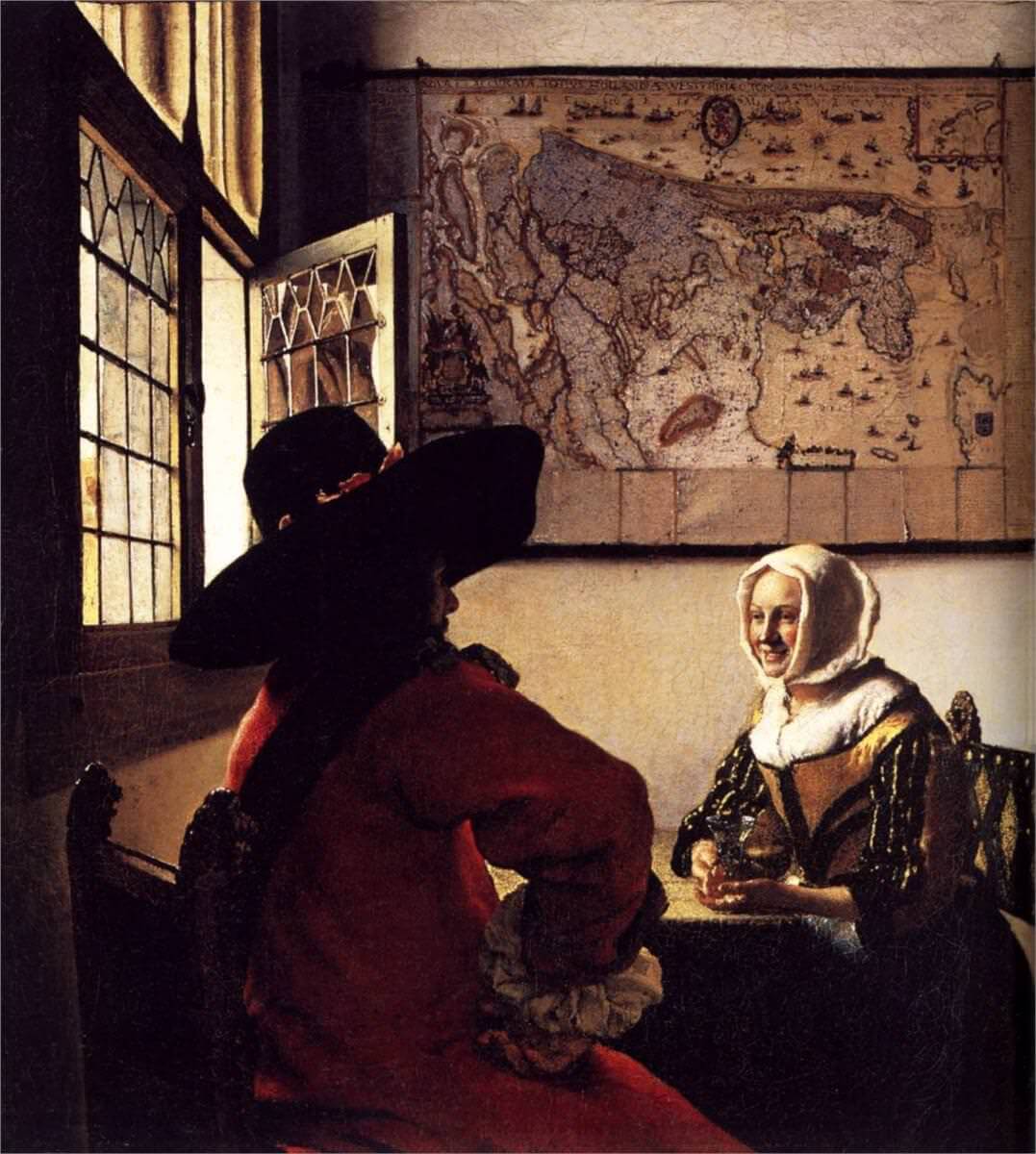
I first saw a print of Hans Holbien's The Ambassadors in the City of Orange Public Library at about the age of 14.


The Ambassadors (c. 1533) by Hans Holbein the Younger is known for the prominent gray diagonal slash across the bottom of the frame which, when viewed from an acute angle, resolves into the image of a human skull. It has been hypothesized that the painting, regarded as a vanitas – a meditation on the transience of life including the skull as a memento mori – is intended to be hung in alongside stairs to startle viewers with the sudden appearance of a skull.
Content from External Source
Note that when the skull looks like a skull, the rest of the painting looks like nonsense. A painting which, through the skill of the artist, looks realistic, creates an optical illusion. It must be seen at the correct angle to successfully do that.

And, yes, when you view the Biden/Carter photo from a certain angle Carter's feet will look more normal. I emphasize a certain angle, because it is the angle of the of view not closeness that is the critical factor.

But - and this is a big but(t) - you don't see this effect IRL.

Look at a rectangle (perhaps an envelope or a credit card). Turn it sideways, this way and that. You can observe that its apparent size changes as you turn it. It appears largest when the rectangle is oriented perpendicular to your line of sight (viewing it straight-on), and it appears smaller the more it is angled away from that position. I believe this is called foreshortening.

Have you tried this? If you turn a rectangular envelope in your hand this way and that, it will always look like a rectangle, not a trapezoid as it should according to the laws of geometry and optics.

Take a photo of the of the envelope with a short focal length lens, with the camera as close to your eye as possible, and in the photo the envelope will be a trapezoid, because the camera does "see" according to the laws of geometry and optics.

Even up close - at arm's length - we are only seeing a small part of the envelope with our foveal vision. The rest of the envelope we "see" is almost wholly imaginary. And the brain doesn't produce a trapezoidal image.

The virtual reality our brain creates for us moment by moment is a personal experience, and it is created using innate priors and a shockingly sparse amount of data.

Our brain receives data. There isn't an optical projection onto a screen in our brain. It's important not to get trapped in the homunculus fallacy.

The round shape of our eyes has little or no importance to the shape of what we "see." Focus yes, but the shape of the image, no. Don't compare our retina to a curved screen in a movie theater.

We see shapes with our foveal vision. The rest of our retina sees movement very well; shape very poorly. What we see in our peripheral vision is almost wholly "imaginary." The fovea is small. Therefore the shape of the image on our retina, as a whole, is pretty much irrelevant to our visual experience.

Over time - through experience gained from our foveal vision - our brain has been trained with "innate priors" - or assumptions. It uses these assumptions to begin the computational process of creating our visual experience.

These visual experiences can be created without sensory input - dreams and hallucinations.

This film was made was made in 1958.


It was already understood at that time that our visual experience is produced by our brain using innate priors. We should just see a trapezoid rotating. But we don't. Because, in this case, the assumption with which our brain starts its computation... is wrong.

Some people don't see this illusion. Is there anyone here who doesn't?
 
Last edited:
A successful photograph, or a well done painting, is a projection. And our perception of it is a species of optical illusion. The real issue here is that the Biden/Carter photo does not successfully create the optical illusion it is intended to produce.
I agree with that.
The reason is that the typical viewing distance for the photograph is too long.
And, yes, when you view the Biden/Carter photo from a certain angle Carter's feet will look more normal. I emphasize a certain angle, because it is the angle of the of view not closeness that is the critical factor.

But - and this is a big but(t) - you don't see this effect IRL.
I have given you the distance you need to view the image from (distance to the image approximately equal to the distance between the Carters' head at whatever size your image is), with the eye placed straight in front of it. No weird angles involved, and in fact the realism requires different parts of the image to be seen at different angles. Try it.

You emphasize a "certain angle". If you think my explanation is wrong, and yours is correct, well then what is that certain angle? The examples in the Wikipedia article on Anamorphosis always specify the direction that you need to look at to see the image correctly. What is the direction in the Biden/Carter photo? I maintain that it is "head on, position centered".
Have you tried this? If you turn a rectangular envelope in your hand this way and that, it will always look like a rectangle, not a trapezoid as it should according to the laws of geometry and optics.
I was talking about size, not shape. That the apparent (not the actual) size is changing is readily apparent to me with an envelope. (With my iPad, which has a black frame to a white screen, the shape changes are also easily noticable to me.)

@Mick West you made some factual statements that I had issues with. But maybe I misunderstood what you were trying to say.
 
This recent photo, deriving from Hillary Clinton's Instagram account, shows ex-President Clinton with ex-President Carter and their respective wives. If anything it shows even more extreme perspective effects than the Biden-Carter one. The linear size of Clinton's head appears at least twice that of Carter's (measured from chin to crown). The effect seems mainly due to simple foreshortening. I don't know what kind of lens was used, but the photo does not appear to have been taken in a small room like the other one. It is credited to Hillary Clinton, but is not apparently a 'selfie'.

https://people.com/politics/jimmy-c...ng-anniversary-marriage-bill-hillary-clinton/
image-1.jpg
 
Last edited by a moderator:
I'm satisfied with the explanation that this is a type of an optical illusion. Our brains processing of vision can give us some funny perceptions. I was hoping that someone would claim they were aliens. Then I would have said 'Agreed', only aliens could pull off all the great policies and deregulations that he did in 4 years. People incorrectly attribute him to have been on the top when it comes to bad presidents. That is just not true. Carter made craft beer possible. So if you're glad you aren't forced to drink Budweiser then give him a big old thanks.
 
I have to add something. All paintings and photographs produce an optical illusion. Successful photos give us the illusion that we are looking at the physical scene they are meant to represent. But we're still very aware that we are looking at an illusion, not the thing itself. Some photos are less successful at producing a good illusion. And some look odd to the point that it's disturbing.

We're aware that it's a photo, but it's not giving us the successful illusion we're used to seeing. At this point we're in the "uncanny valley" where things just feel wrong. It's not this or that. But it has elements of both.

In the everyday world we are so used to seeing successful photo illusions that naïve people have the unconscious feeling that it's in the nature of a photograph to look "real." If it doesn't look "real" then it can't be a real photograph. A fake.
 
Last edited:
Well argued everyone, but this is picture is clear proof that Elijah Wood is actually a Hobbit (or at least a very small person), right?Gandalf&Frodo.jpg
 
Well argued everyone, but this is picture is clear proof that Elijah Wood is actually a Hobbit (or at least a very small person), right?
It would be if he was sitting on the same seat as McKellan, but he wasn't.
The-perspective-trick-used-in-the-movie-The-Lord-of-the-Rings.png
 
I think it is also helpful if we look at just one image/subject, where parts of a "known object" seem strange behind a wide-angle lens...... but remain mostly unquestioned....

a Magpie.....

wide_angle_size_illusion.jpg


This is also a Magpie......
We know they are the same type bird and also close to the same size and shape. But we should also know they are photographed with very different lenses.


magpie.jpg
 
Last edited:
Back
Top