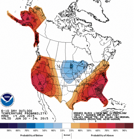
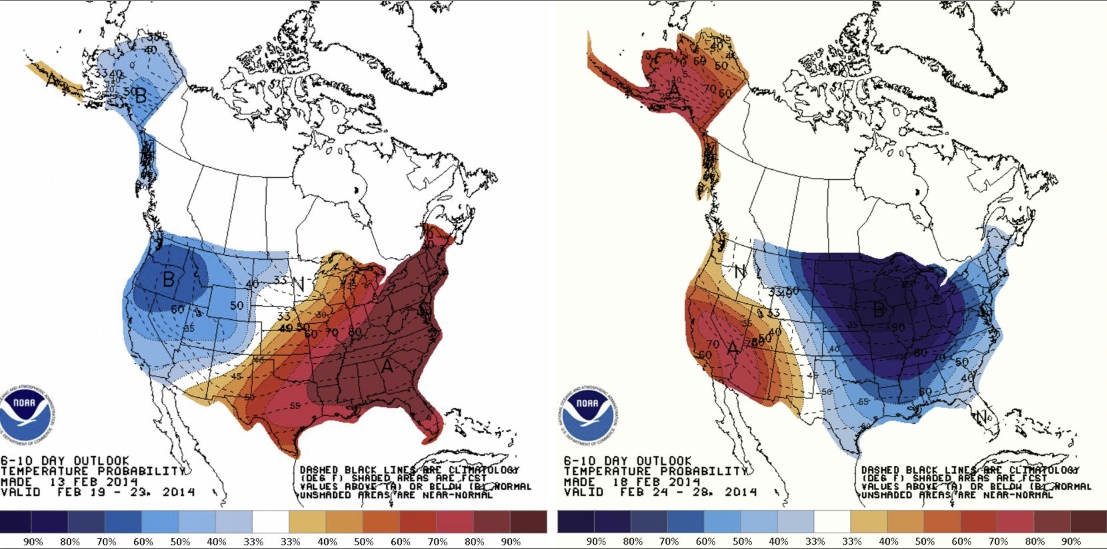
An article on Rense.com by Dane Wigington claims that the following two charts show a highly artificial and unusual change in the weather in less than a week.
This is described as:
http://www.rense.com/general96/condition.html (http://archive.is/1J73Z)
The maps just show if the temperature is likely to be above or below normal, it does not show how much above or below. And because this is the six day forecast, it's very rough. What he really should be looking at is the actual temperature.
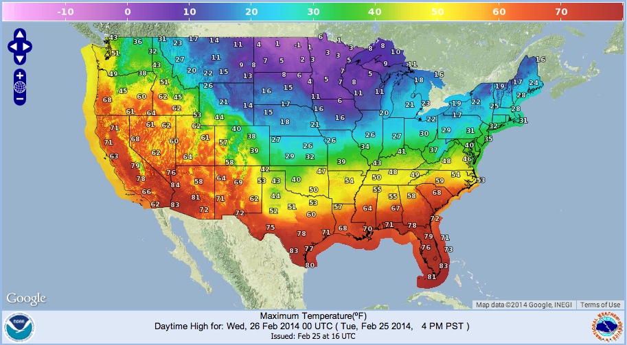
Here's the temp forecast for feb 21th (tomorrow). This is in the middle of the date range for the first chart from Rense.
http://preview.weather.gov/graphical/
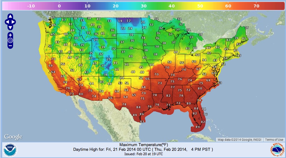
And here's five days later.

Note this is the exact same time periods as used in the Rense article. However what you see looks vastly different. This is because the Rense charts don't show temperatures, just higher/lower probabilities.
Yes, some regions of the country experience swings in temperature. Tennessee for example goes from 76°F to 46°F. But this is not really that unusual. Temperature variations are largely governed by the movement of air masses. Warm air from the south, and cold air from the north. So when the weather systems move, you get swings in temperature. To determine how unusual these are, we need to look at a historical record.
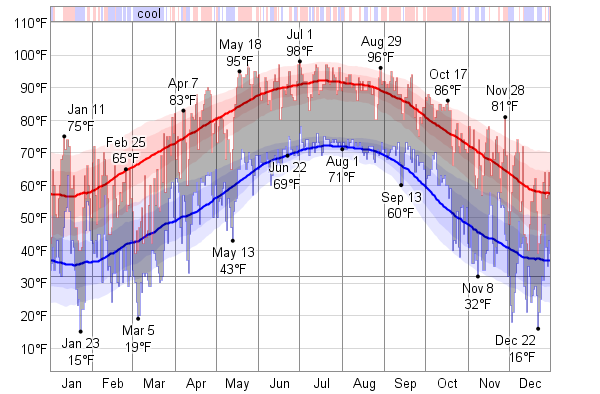
Here's a chart of temperature for 2013, Macon, Georgia, US.
http://weatherspark.com/history/30840/2013/Macon-Georgia-United-States^
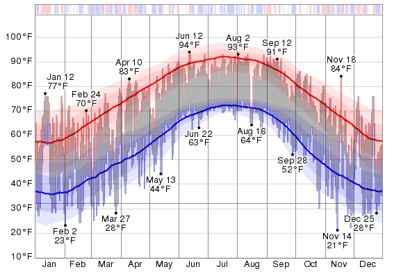
Notice the overall trend with the seasons, but then the wild swings in both high and low temperatures, and much as 30°F (or more) at times. These swings are both normal, and expected. Here's the chart for Los Angeles, in 2011:
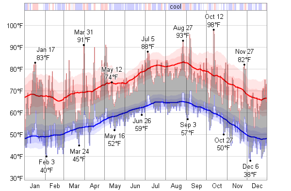
Notice the bar across the top of the above chart. It shows red, white and blue regions. This is similar to what is being forecast in the original NOAA charts. These are periods when the temperature is above average (red), normal (white), or below average (blue)
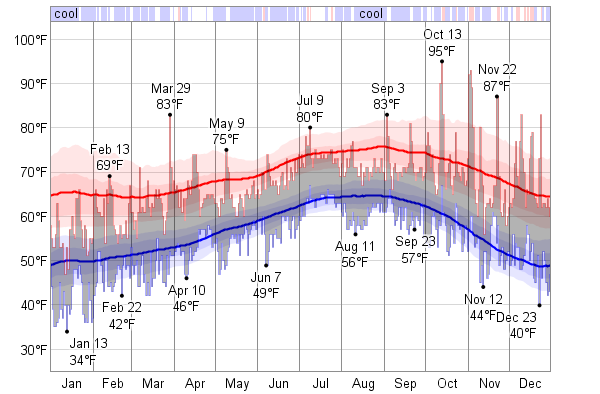
And these variations are not a new thing. Here's the chart for 1950 Georgia:
http://weatherspark.com/history/30840/1960/Macon-Georgia-United-States (http://archive.is/C9sFk)
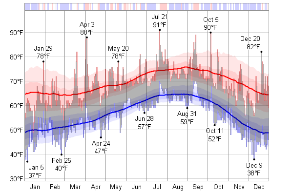
1950 Los Angeles:
http://weatherspark.com/history/30699/1950/Los-Angeles-California-United-States (http://archive.is/eyNgF)
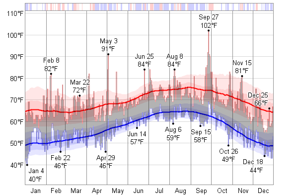
1960 Los Angeles:
1970 Los Angeles:
Large variations in temperature are not unusual.
Here's an interesting chart from the Washington post
http://www.washingtonpost.com/local/hot-hot-hot/2012/07/07/gJQA5CcnSW_graphic.html (http://archive.is/7PQRq)
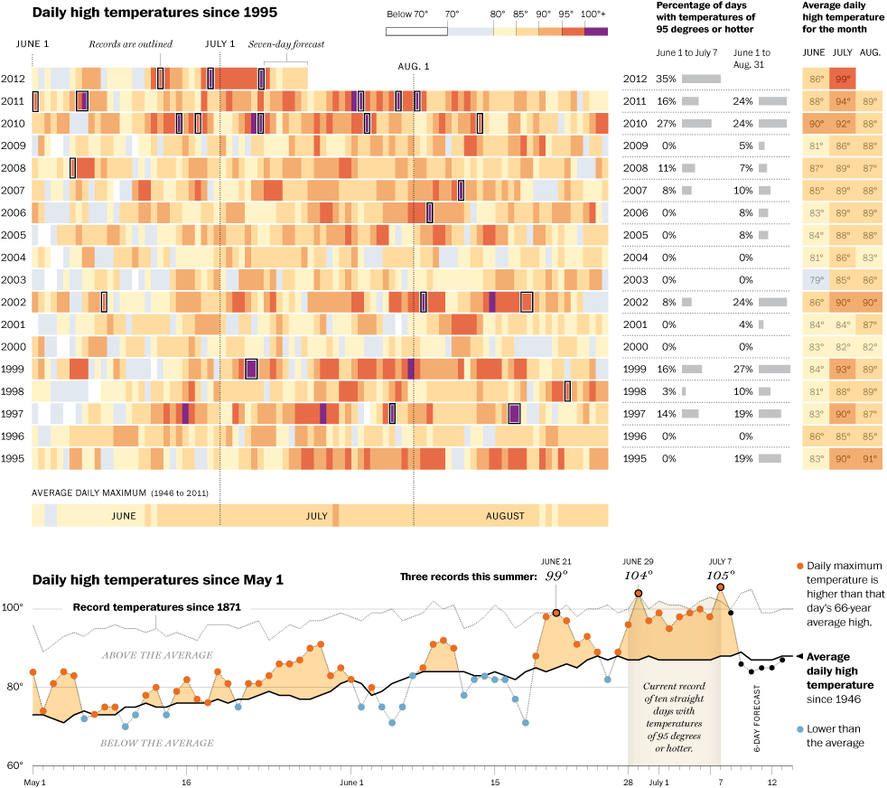
It shows the high temperature each week for the last 17 years (up to 2012). You can see that significant changes in temperature are not uncommon. The daily temperature is not a smooth up and down curve from winter to summer. It's really rather random.
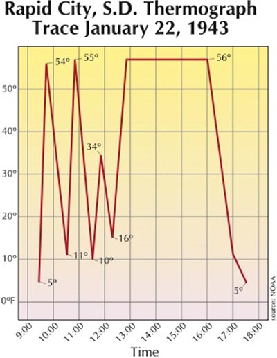
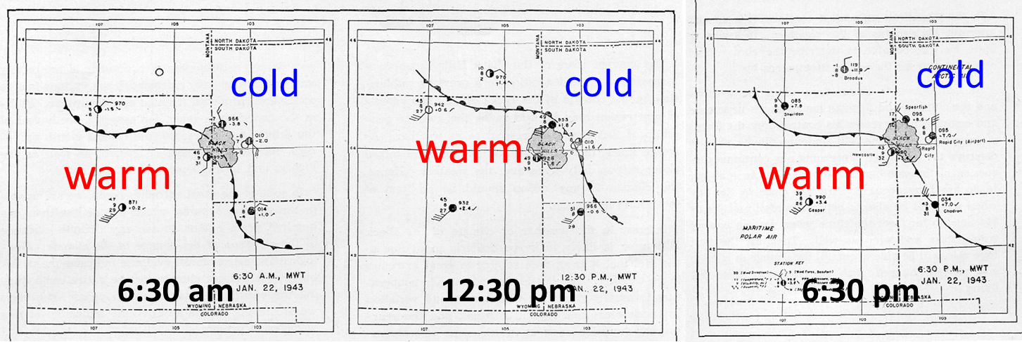
And these variation in temperature from week to week are really not even that incredible if we look at history. One of the most dramatic swings in temperature came on November 1911, in Oklahoma City, when the temperature went from a high of 83°F to a low of 17°F in just 12 hours^! And that's simply the biggest temperature change, not the fastest. On Jan 22 1943, in Spearfish Dakota, the temperature went from -2°F to 45°F in just two minutes^!
 ^
^
This change happened for the same basic reason as the other swings in temperature in the US charts above - but on a much more local scale - it's the shift in boundary between a warm and a cold air mass:
The 1923 incident, or course, was just some wildly unusual, but natural weather. But imagine if it had happened today (and it will certainly happen again, at some point). Unfortunately people have short memories, and don't often look at history.
The most dramatic changes in US weather come from the meandering jet stream - the boundary between warmer air in the south, and cold air in the north. This is naturally variable, and always has been. Some years it is more variable than others.
There's some suggestion that global warming might make the jet stream a bit more variable, but also slower. But it's not clear yet.
What is clear is that the larger US variations in temperature are historically normal.
This is described as:
http://www.rense.com/general96/condition.html (http://archive.is/1J73Z)
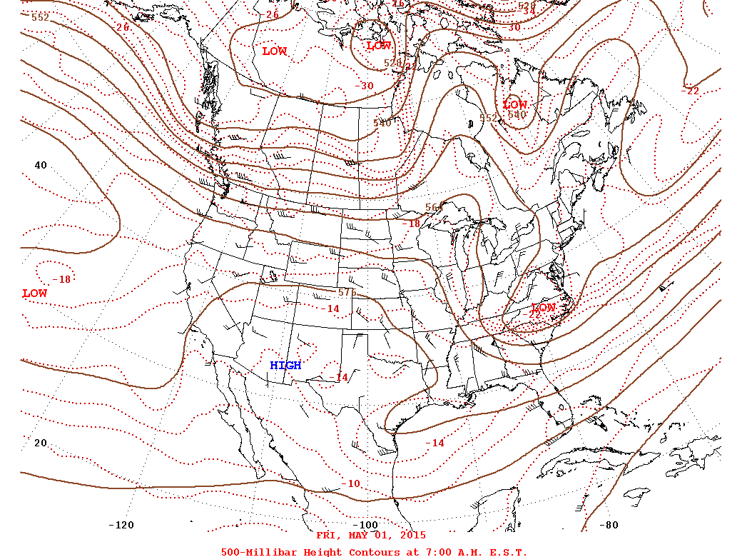
Unfortunately it seems the writer has misinterpreted the maps. Firstly these are not actually descriptions of what happened, they are forecasts of six days in the future. But most importantly they are not actually temperature maps. They are forecasts of the the probability of the temperature being above or below the normal range.External Quote:The two NOAA (National Oceanic and Atmospheric Administration) maps below should be shocking even to a layman of meteorology. The map on top is for the period from February 19-23, the map below is for the period immediately after, February 24-28. These maps are polar opposites and show with clearing clarity the degree to which the weather makers are "forcing" the climate system. Record cold in some regions flips to record warm, and the exact reverse scenario occurs in other zones. All of this in the space of less than a week?
The maps just show if the temperature is likely to be above or below normal, it does not show how much above or below. And because this is the six day forecast, it's very rough. What he really should be looking at is the actual temperature.
Here's the temp forecast for feb 21th (tomorrow). This is in the middle of the date range for the first chart from Rense.
http://preview.weather.gov/graphical/
And here's five days later.
Note this is the exact same time periods as used in the Rense article. However what you see looks vastly different. This is because the Rense charts don't show temperatures, just higher/lower probabilities.
Yes, some regions of the country experience swings in temperature. Tennessee for example goes from 76°F to 46°F. But this is not really that unusual. Temperature variations are largely governed by the movement of air masses. Warm air from the south, and cold air from the north. So when the weather systems move, you get swings in temperature. To determine how unusual these are, we need to look at a historical record.
Here's a chart of temperature for 2013, Macon, Georgia, US.
http://weatherspark.com/history/30840/2013/Macon-Georgia-United-States^
Notice the overall trend with the seasons, but then the wild swings in both high and low temperatures, and much as 30°F (or more) at times. These swings are both normal, and expected. Here's the chart for Los Angeles, in 2011:
Notice the bar across the top of the above chart. It shows red, white and blue regions. This is similar to what is being forecast in the original NOAA charts. These are periods when the temperature is above average (red), normal (white), or below average (blue)
And these variations are not a new thing. Here's the chart for 1950 Georgia:
http://weatherspark.com/history/30840/1960/Macon-Georgia-United-States (http://archive.is/C9sFk)
1950 Los Angeles:
http://weatherspark.com/history/30699/1950/Los-Angeles-California-United-States (http://archive.is/eyNgF)
1960 Los Angeles:
1970 Los Angeles:
Large variations in temperature are not unusual.
Here's an interesting chart from the Washington post
http://www.washingtonpost.com/local/hot-hot-hot/2012/07/07/gJQA5CcnSW_graphic.html (http://archive.is/7PQRq)
It shows the high temperature each week for the last 17 years (up to 2012). You can see that significant changes in temperature are not uncommon. The daily temperature is not a smooth up and down curve from winter to summer. It's really rather random.
And these variation in temperature from week to week are really not even that incredible if we look at history. One of the most dramatic swings in temperature came on November 1911, in Oklahoma City, when the temperature went from a high of 83°F to a low of 17°F in just 12 hours^! And that's simply the biggest temperature change, not the fastest. On Jan 22 1943, in Spearfish Dakota, the temperature went from -2°F to 45°F in just two minutes^!
^This change happened for the same basic reason as the other swings in temperature in the US charts above - but on a much more local scale - it's the shift in boundary between a warm and a cold air mass:
The 1923 incident, or course, was just some wildly unusual, but natural weather. But imagine if it had happened today (and it will certainly happen again, at some point). Unfortunately people have short memories, and don't often look at history.
The most dramatic changes in US weather come from the meandering jet stream - the boundary between warmer air in the south, and cold air in the north. This is naturally variable, and always has been. Some years it is more variable than others.
There's some suggestion that global warming might make the jet stream a bit more variable, but also slower. But it's not clear yet.
What is clear is that the larger US variations in temperature are historically normal.
Last edited: