Claim: Satellites show global warming pause continues by CFACT

Auldy

Senior Member.
I was recently directed to this 'scientific article' by a friend and decided to do some research into its claims and origins. The main focus is on the point:

There was nothing special about the temperature of the Earth in 2014. In fact, there has been no meaningful warming since last century.

This is true no matter what set of temperature data you examine.
Content from External Source
As far as I can deduce, CFACT.org and its affiliate website climatedepot.com have been pushing this story since the start of the year.

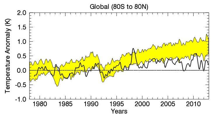
CFACT do not directly reference any scientific study or quote where they obtained their data from but it is written in a manner that suggests it is their own. However on one of the graphs shows that the data came from Remote Sensing Systems (RSS).


The graph above shows us that there has been no meaningful warming since the 1990′s. Today’s school children have never lived in a warming world.
Content from External Source
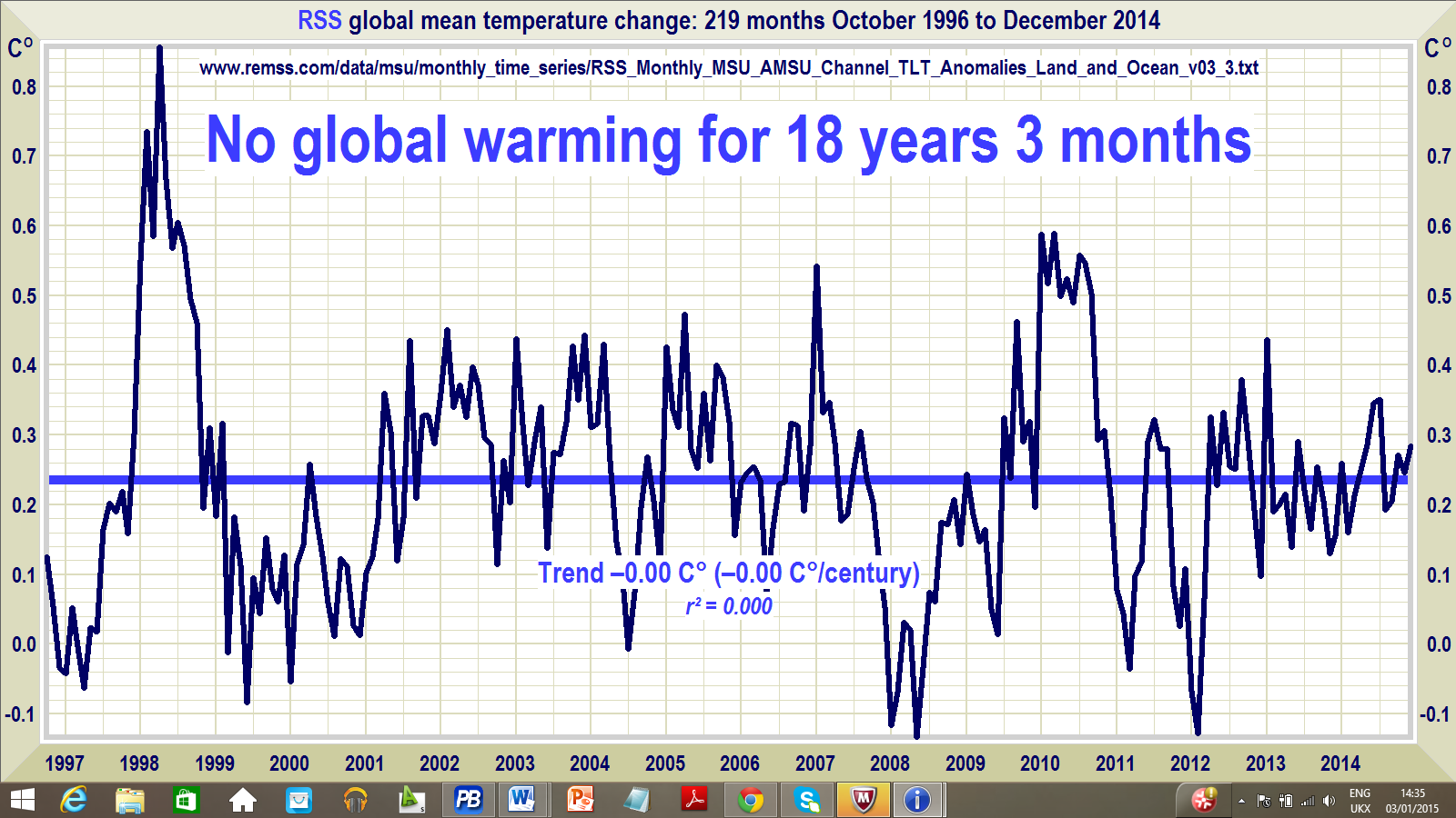
Looking through the RSS website I was surprised that the tone of most of the work was that 'yes, climate change is a thing, it is real' and not a climate change denier site like CFACT.org

One page is devote entirely on the research that RSS has done in the field of global temperature measurements. It includes the following information:

Over the past decade, we have been collaborating with Ben Santer at LLNL (along with numerous other investigators) to compare our tropospheric results with the predictions of climate models. Our results can be summarized as follows:

  • Over the past 35 years, the troposphere has warmed significantly. The global average temperature has risen at an average rate of about 0.13 degrees Kelvin per decade (0.23 degrees F per decade).
  • Climate models cannot explain this warming if human-caused increases in greenhouse gases are not included as input to the model simulation.
  • The spatial pattern of warming is consistent with human-induced warming. See Santer et al 2008, 2009, 2011, and 2012 for more about the detection and attribution of human induced changes in atmospheric temperature using MSU/AMSU data.


But....

  • The troposphere has not warmed as fast as almost all climate models predict.
Content from External Source

I
t appears to me that CFACT.org has latched onto this final point, cherrypicking that data set, and portrayed it in a manner that suggests that global warming is an imaginary construct.

The article makes note that while there is a overall mean global temperature increase, it is out of spec with some climate projections that they have matched their data up with, but can explain this as:

The reasons for the discrepancy between the predicted and observed warming rate are currently under investigation by a number of research groups. Possible reasons include increased oceanic circulation leading to increased subduction of heat into the ocean, higher than normal levels of stratospheric aerosols due to volcanoes during the past decade, incorrect ozone levels used as input to the models, lower than expected solar output during the last few years, or poorly modeled cloud feedback effects. It is possible (or even likely) that a combination of these candidate causes is responsible.
Content from External Source
I can find no mention of the climate pause that CFACT claim they can deduce from the RSS data.
 
Last edited:
PS: first real new thread for me, hope it flows legibly and abides by the PG. Comments/criticism appreciated.
 
Last edited:
The particular graph there is entirely falsified - basically it's 5% of a data set viewed in a vacuum. The original one that supposedly showed the "pause" looked like this:

In case I can't hotlink off slate, here's the original study: http://www.ipcc.ch/report/ar5/wg1/
And Phil Plait's summary of it with the more useful charts in layman's context:
http://www.slate.com/blogs/bad_astronomy/2013/11/05/climate_pause_nope.html

http://www.skepticblog.org/2014/04/22/global-warming-has-paused-not/
This is a more recent article. The second graph is a composit of the "pause" graph, from the MET Office, and a more recent data set.

As it notes, the MET office data set that produced the "pause" graph actually showed 0.05C/decade warming over the prior 16 years, which was still faster than the Paleocene thermal maximum, an extinction event caused by natural warming (not generally counted as a mass extinction, but it is the worst extinction event since the Cretaceous-Paleogene mass extinction).

However, as noted, those figures were only using data from 84% of the planet, and the other 16% was primarily polar ocean water. Including more complete data from that set of data gives a warming trend of 0.12C/decade even during that 16 years - not only no pause at all, but an acceleration.


Now, here we have Kevin Cowtan from the University of York talking about the bias in that 0.12C figure - at 2:55 he shows a variation on the same graph as the last link, except this time it's highlighted red and blue to show the difference between the MET Office figures and the global data - from 1998 to 2006 the global data showed a slightly lower (but still positive) trend, but then in the last couple years in particular the figures diverge and the global numbers show a much faster trend than the MET's incomplete data set. He uses the term "bias" which a few deniers have latched onto, but statistically bias doesn't mean bias in the way we use it with personal feelings, but it means how much influence certain data points have on the whole set.


Now, related to the "pause" claim is also the arctic ice sheet ones. The last couple years, it's been reported that the arctic ice sheet showed record growth in the winter.
http://www.slate.com/blogs/bad_astronomy/2013/09/20/arctic_sea_ice_what_s_really_going_on.html
Which is just 100% wrong. 2013 was only a record when comparing it to ONLY 2012.

2013 did help correct the bias that 2012 and 2007 (both particularly bad years for arctic ice decline) caused. After the 2012 minimum, the short term trend seemed to be around -22% per decade, but with 2013 included it was back to -10.6% per decade, which is around where the long term trend's been hovering since the 80's.

http://www.skepticblog.org/2014/04/22/global-warming-has-paused-not/
I'm going to pull this one back up, as well to call attention down to the bottom. The denial argument focuses on atmospheric warming - 2.3% of the total - and sometimes on glaciers (0.9%) and the arctic ice sheets (0.8%). The real effects (93.4%) hit ocean water first. In fact, this was the denial chorus for years - the oceans will soak up most of the heat and the CO2 will dissolve into the oceans and we'll all enjoy nice warm beaches and it'll be OK.

Ocean warming changes the global currents - the gulf stream shifting southward gives England colder and snowier winters, while changes in the North Pacific are why last year Alaska was warmer than any of the lower 48 for several weeks in the dead of winter. CO2 dissolved in the oceans is also bad, since it lowers pH and many marine organisms are quite sensitive to that. In the marine aquarium hobby, a pH of 7 is considered a "crash" and usually means everything in the tank is wiped out very quickly. In nature, it's one of the things that can cause an ocean dead zone (with simple heat being another, as warm water can carry less oxygen, so if it gets warm enough oxygen breathing animals suffocate and photosynthetic organisms can't release oxygen to take up CO2).
 
Last edited:
This article on deep ocean warming has some info - basically yes there has been a slowing down - but not a cessation. The world IS still warming, but only bits of it at a time - at the moment it is the shallow ocean that is warming, but not enough to account for the "missing" heat:


In the 21st century, greenhouse gases have continued to accumulate in the atmosphere, just as they did in the 20th century, but global average surface air temperatures have stopped rising in tandem with the gases. The temperature of the top half of the world's oceans -- above the 1.24-mile mark -- is still climbing, but not fast enough to account for the stalled air temperatures.

Many processes on land, air and sea have been invoked to explain what is happening to the "missing" heat. One of the most prominent ideas is that the bottom half of the ocean is taking up the slack, but supporting evidence is slim.
Content from External Source
 
Hello my first post and I thought I started here since it's one of the more complex subjects around here :)

I can find no mention of the climate pause that CFACT claim they can deduce from the RSS data.

It's actually not as much a contested fact, the question is more about its relevance. For example the IPCC refers to a hiatus in Global-Mean Surface Warming (GMSW) of the past 15 years (WG I, 5th Assessment Report). https://www.ipcc.ch/pdf/assessment-report/ar5/wg1/WG1AR5_Chapter09_FINAL.pdf Box 9.2: Climate Models and the Hiatus in Global Mean Surface Warming of the Past 15 Years (page 769).

Although hiatus periods of 10 to 15 years are not unexpected it should be mentioned the report addressed the 15 year between 1998–2012. This is why critics can easily point out that the GMST "hiatus" is really more near 1997-2014, more than 18 years now. And if "warming" is taken strictly as surface warming, it's not a false claim on itself. Perhaps more how it can be applied at times?

The term "global warming" or even simpler "warming" can actually refer to several things. Technically it refers only to the Earth's average surface temperature simply because that makes it easier to compare to some of the available historical record, global models and reanalysis. It's also the meaning used in many publications and speeches over the last decades and it's the subject of the most famous illustrations of "run away warming". More recently the topic has shifted to a larger "climate system" but this model is way harder to quantify or verify for example in terms of palaeoclimatology. See also: http://www.nasa.gov/topics/earth/features/climate_by_any_other_name.html

My contribution to this topic is then to point out that the claim is here really only about GMST warming and most of the current climate science is generally about climate change in a broader but more difficult to pin down sense, in terms of single measurements. To be fair, the focus on GMST was not started by the critics and sceptics but it's being latched on to right now simple because it's become a simpler, more vulnerable target. But the claim that satellites show hiatus (pause) in Global-Mean Surface Warming is supported by IPCC and it does open up some new challenges for scientists to understand the exact dynamic especially if we'd approach 20 years. As can be seen in the rest of the IPCC report, GMST is only one of the many concerns and measurements under consideration.
 
Lets take a look at Hevach's first graph. It is obvious that 1998 was an extreme spike upwards compared to the rising trend until then -- associated with a very strong El Nino. Everyone who talks about a pause or hiatus and starting with 1998 is therefore a bit suspect (for cherry picking). The trend from 1975 to 1997 was about 0,16°C/decade. Extrapolating this trend from 1997 to 2014 gives exactly the temperature we measured last year. If you subtract variations caused by the sun, ENSO, volcanic activity you are left over with a steady rising temperature:
upload_2015-2-11_17-4-17.png
 
That's a good graph, wish I'd found that one when throwing together my post. I assume the gray lines are uncontrolled? If so it does a good job of showing how a couple anomalous data points can wipe out a trend if you only look at the data points between them and not the entire set.

However, you've got to be careful with any kind of adjusted data around climate deniers. For example, right now, one of the common claims is that South America is experiencing a sudden cooling trend and that saying otherwise is the "biggest scientific scandal ever," (I love science, but he does know that scientists used to perform experimental surgeries on living humans without anesthesia, right?), when what actually happened is that a few testing stations in Paraguay had to correct their numbers either up or down to control for local conditions like new buildings or maintenance.
Phil Plait dealt with that nonsense yesterday and Kevin Cowtan made a very informative video about it:http://skepticalscience.com/kevin-cowtan-debunks-christopher-booker-temp-conspiracy-theory.html
 
This argument is not nonsense. Many of the explanations attempting to hide it are though. I find RSS's summary of their own data to be a good summation of the issue.

They basically state that the globe is currently warming according to their long range data, but not nearly as fast as all of the models built to predict that warming projected.

So in summary, the problem is not nearly what alarmists make it out to be at the moment, and all of the models on which they have based their alarmism are bunk.


  • Over the past 35 years, the troposphere has warmed significantly. The global average temperature has risen at an average rate of about 0.13 degrees Kelvin per decade (0.23 degrees F per decade).
  • Climate models cannot explain this warming if human-caused increases in greenhouse gases are not included as input to the model simulation.
  • The spatial pattern of warming is consistent with human-induced warming. See Santer et al 2008, 2009, 2011, and 2012 for more about the detection and attribution of human induced changes in atmospheric temperature using MSU/AMSU data.
But....

  • The troposphere has not warmed as fast as almost all climate models predict.
To illustrate this last problem, we show several plots below. Each of these plots has a time series of TLT temperature anomalies using a reference period of 1979-2008. In each plot, the thick black line is the measured data from RSS V3.3 MSU/AMSU Temperatures. The yellow band shows the 5% to 95% envelope for the results of 33 CMIP-5 model simulations (19 different models, many with multiple realizations) that are intended to simulate Earth's Climate over the 20th Century. For the time period before 2005, the models were forced with historical values of greenhouse gases, volcanic aerosols, and solar output. After 2005, estimated projections of these forcings were used. If the models, as a whole, were doing an acceptable job of simulating the past, then the observations would mostly lie within the yellow band. For the first two plots (Fig. 1 and Fig 2), showing global averages and tropical averages, this is not the case. Only for the far northern latitudes, as shown in Fig. 3, are the observations within the range of model predictions.


Content from External Source
 
Oops the above was quoted directly from RSS at this URL: http://www.remss.com/research/climate

Here is a better shot of their data as presented by themselves along with the explanation of what it means:


Fig. 1. Global (80S to 80N) Mean TLT Anomaly plotted as a function of time. The thick black line is the observed time series from RSS V3.3 MSU/AMSU Temperatures. The yellow band is the 5% to 95% range of output from CMIP-5 climate simulations. The mean value of each time series average from 1979-1984 is set to zero so the changes over time can be more easily seen. Note that after 1998, the observations are likely to be below the simulated values, indicating that the simulation as a whole are predicting too much warming.
 
The topic here is CFACT's claim that warming has paused, and 2014 was not the warmest year on record, and the evidence they use to back up those claims.

I was recently directed to this 'scientific article' by a friend and decided to do some research into its claims and origins. The main focus is on the point:
Content from external source
There was nothing special about the temperature of the Earth in 2014. In fact, there has been no meaningful warming since last century.

This is true no matter what set of temperature data you examine.
As far as I can deduce, CFACT.org and its affiliate website climatedepot.com have been pushing this story since the start of the year.

The problem with their claim is that most scientists actually think 2014 WAS the hottest year on record.
http://www.nytimes.com/2015/01/17/s...test-year-on-record-surpassing-2010.html?_r=0
Last year was the hottest on earth since record-keeping began in 1880, scientists reported on Friday, underscoring warnings about the risks of runaway greenhouse gas emissions and undermining claims by climate change contrarians that global warming had somehow stopped.

Extreme heat blanketed Alaska and much of the western United States last year. Records were set across large areas of every inhabited continent. And the ocean surface was unusually warm virtually everywhere except near Antarctica, the scientists said, providing the energy that fueled damaging Pacific storms.

In the annals of climatology, 2014 surpassed 2010 as the warmest year. The 10 warmest years have all occurred since 1997, a reflection of the relentless planetary warming that scientists say is a consequence of human activity and poses profound long-term risks to civilization and nature.
Content from External Source
So this certainly seems at odd with the claim "This is true no matter what set of temperature data you examine."

If you switch to a different data set, TLT (temperature in the lower troposphere, as measured by satellite), then yes it does not seem to match many models. But TLT is not surface temperatures, and the coupling between TLT and surface temperatures is not fully understood. TLT not being as high as was expected does not mean the surface temperature is not as high as was measured.
 
This argument is not nonsense. Many of the explanations attempting to hide it are though. I find RSS's summary of their own data to be a good summation of the issue.

They basically state that the globe is currently warming according to their long range data, but not nearly as fast as all of the models built to predict that warming projected.

So in summary, the problem is not nearly what alarmists make it out to be at the moment, and all of the models on which they have based their alarmism are bunk.

[/EX]

That is not a summary of the external source, http://www.remss.com/research/climate , it's your own interpretation. What RSS actually say was quoted by Auldy in the first post of this thread:


"The reasons for the discrepancy between the predicted and observed warming rate are currently under investigation by a number of research groups. Possible reasons include increased oceanic circulation leading to increased subduction of heat into the ocean, higher than normal levels of stratospheric aerosols due to volcanoes during the past decade, incorrect ozone levels used as input to the models, lower than expected solar output during the last few years, or poorly modeled cloud feedback effects. It is possible (or even likely) that a combination of these candidate causes is responsible."
Content from External Source

which is not at all the same thing as "all the models are bunk".
 
This argument is not nonsense.
First of all: The “nonsense” (perhaps I should use the word misrepresentation, after I studied the politeness policy more carefully) was not about the RSS discussion, but about Bookers article in the Daily Telegraph Hevach was talking about.

Now let’s look at the problem of the TLT-measurements and the fact that these don’t fit within the simulated projections (except for the Arctic). As the RSS site already mentions, several possible explanations are being explored. But there is another problem: surface temperatures (measured by thermometers) show more temperature rise than RSS or UAH do. Climate models predicted it would be otherwise.

Not mentioned on the RSS site is the possibility (suggested by Weng et al., http://link.springer.com/article/10.1007/s00382-013-1958-7) that there could be a systematic error in the measurements. We have seen that before with the UAH measurements in the ‘90s.

Since the rise in surface temperatures does fit within the model projections, as does the decrease in stratospheric temperatures, but the tropospheric temperatures don’t, scientists should consider all possibilities.
 
Back
Top