CPAC Stage Looks Like a Nazi/Neopagan Odal Rune

Mick West

Administrator
Staff member


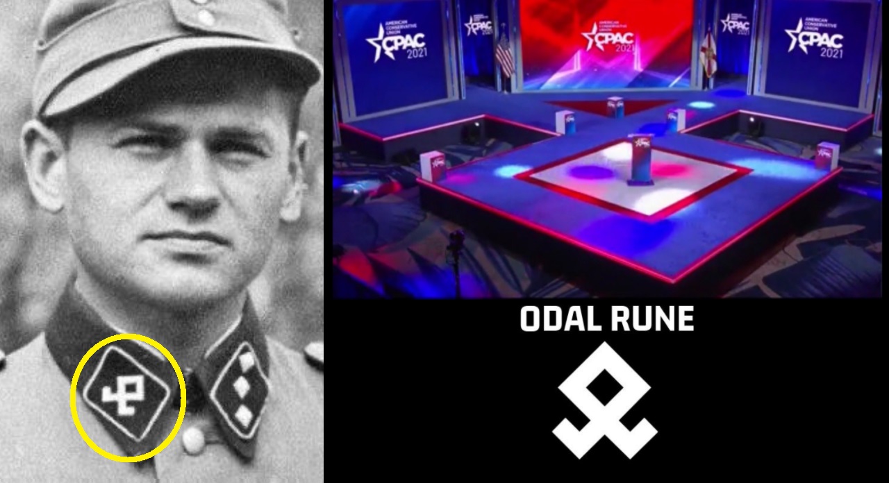
Deliberate or accidental. There seem to be quite a few people in the "this is no accident camp," but then again, accidents do happen with simple geometric shapes.

The shape is certainly there, although you have to ignore the rear walkway, and the walkways that go through the entry and exits. Here I've perspective corrected the above image.
2021-02-27_12-04-21.jpg

It seems rather implausible that this would be a deliberate design choice approved by the CPAC organizing team. Maybe someone slipped it past them? Maybe a coincidence? Or simply plausibly deniable?
 
That's one way to go viral and bring attention to your conference. I guess we'll have to listen to the speeches and see if there is Nazi propaganda in there.
 
To be honest, my first thought was a liberal or never-trumper stage designer did it on purpose. Some former CPAC heads are very upset Trump was allowed to speak. (they want all the election fraud speak stopped). To me the design looks dangerous (ie. people could easily fall off) and doesnt seem to have purpose... unless at some point all the speakers lined up along the back "ramps"/walkways.

My second thought when looking at that Nazi insignia on his lapel, that i have literally never seen before in my life, is that the angles reminded me of the CPAC logo. the half star.
(All the past CPAC stages are hideous in design and visual appeal, as horrible at it sounds -this one is at least not hideous if you dont know about that one Nazi division. Still looks like a dangerous design, maybe the square footage is bigger than it looks in pics. I'd be nervous in heels near those weird edges.)

stage.png
 
The default way to build a stage is to make it flat and rectangular: easiest to build, safest to use. There's usually a reason to deviate from that: e.g. a choir would have risers so that the singers in the back rows can be heard.
I haven't seen any rationale for why the 2021 CPAC stage was designed like that (I haven't looked very hard), but I found pictures of the stages they used in recent years.
image.jpegimage.jpegimage.jpegimage.jpeg
CPAC seems to have always liked "walkway" type stages that jut out into the audience, putting the speaker's podium in the middle of the crowd. I expect that the stage designer wanted to keep that type of shape for the online conference, but make it smaller. The big screen in the center obviously prompted splitting the walkway to the front podium. I don't know why they switched away from having a round podium, though; maybe it has something to do with placing the boxes at the corners?
 
My second thought when looking at that Nazi insignia on his lapel, that i have literally never seen before in my life, is that the angles reminded me of the CPAC logo. the half star.
The angles on the pentagram are 36° and 108°, the rune has 90° throughout.
The main difference is that the side panels of the stage are at a 90° angle with each other, whereas the pentagram has its "legs" aligned straight. The angled backdrop looks and televises better (wheras a straight backdrop works better in a big public venue), and 90° is easiest to build, so these choices feel like they've been made from convenience; though I don't understand why the stage needs walkways in front of the side panels at all: do they serve a function? They do hide the underconstruction of these panels better (more stylishly) than a "skirt" commonly used at a stage edge does.
And why are the side panels shorter than the podium square sides? That seems like a weird similarity to the rune that feels out of place.
 
Last edited:
Well from what I can find the actual rune referenced in the original post doesn't have the 'wings'

https://en.wikipedia.org/wiki/Runes

Screenshot 2021-02-28 101738.png

The Nazi logo does as does the stage, they seem a little redundant if everyone just using the stage as a pathway to get to the pulpit however if you wanted to have lots of people on the stage for some presentations etc, they would provide more room at the back.
 
Simple geometric shapes often get repeated unintentionally throughout history, one shouldn't read too much into such things unless you have evidence that points towards intent. Were there any other subliminal messages delivered in the speeches or printed material? Did Schlapp express anything like there's "nothing wrong with nationalism", say? (Context: https://www.thedailybeast.com/cpac-chairman-matt-schlapp-theres-nothing-wrong-with-nationalism .)

Regarding the back bar connecting the two legs of the rune, was there a point at which people lined up along it? That might explain why they illuminated it in blue, rather than just continuing the black triangle backwards; had they done the latter, the similarity would have been far more obvious. (But still not necessarily anything more than coincidence.)

At the end of the day, if you look at the design elements they may have requested - a central jut with a focal point for the podium, and wings, and with a clean but strong hard-edge feel in right angles, then there really aren't many options apart from the above. But one person's "strong" and "right angles" is another person's "brutalist", you can't win.

(Aside: yes, I've finally set my avatar as I've just noticed another "(F)" has joined the site (and I'm colourblind, so put very little weight into the chroma) - don't worry, I don't intend morphing.)
 
I was reminded of this symbol used in Keith Roberts’ science fiction/ fantasy novel Pavane. I think this bears out @fatphil’s point that symbols often repeat without any intentional reference.
1614511634693.png

Spoiler: in that story, the inward and outward arrows used by the mysterious old people are finally revealed to represent nuclear fusion and fission. No relation to nazism or fascism.
 
They do hide the underconstruction of these panels better (more stylishly) than a "skirt" commonly used at a stage edge does.

good point. i cant stand those skirts.

And why are the side panels shorter than the podium square sides?


i imagine because perfect symmetry is less pleasing to the eye.

56a25ab6-2e71-47b4-9aa1-6b3b8f9f0925.jpeg

That seems like a weird similarity to the rune

the runes legs in the OP are actually only half the distance. where as the stage is longer.


i also see the rune being claimed online, that this shape is used by white supremecists... but that symbol looks more like a standing up jesus fish. so i guess the legs dont matter all that much anyway. (that one i have seen, and i did think it was a modern jesus fish variation! never knew it was a nazi symbol).
download.jpg
 
The Odal rune, upside-down, was briefly used by the Scottish National Party - a "civic nationalist" party (as opposed to "ethnic nationalist"). Seemingly by accident (supposed to be a thistle - the national flower - plus the Scottish flag)

2021-02-28_06-38-13.jpg
 
Business Insider:
Article:
On Wednesday, Design Foundry said in a statement seen by Insider that it was "saddened and horrified at the accusations that this was a deliberate act."

.....

Saying ACU and CPAC had "no interest" in promoting antisemitism, Walters described the stage design as an "unwelcome distraction" and said that CPAC and ACU would not use the company again.

The company, which has designed stages and event settings for clients including Citibank, Target, and MSNBC, makes no mention of the 2020 CPAC design on its digital portfolio, although images of its design for 2016 CPAC can be seen here.

Responding to the controversy, Hyatt Hotels, which hosted the event at its Hyatt Regency, said Sunday it took the concerns "very seriously."
 
Back
Top