
This claim is going a bit viral on the anti-vax side today. The source appears to be Alex Berenson from here: https://alexberenson.substack.com/p/vaccinated-english-adults-under-60
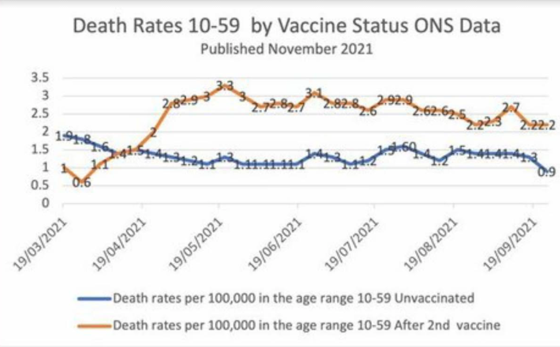
He looked at some UK government data and made a scary looking chart from a table in an excel file posted on a government site. This is being spread by people who are convinced that the vaccines are actually poison and part of some global depopulation scheme. They are claiming this is proof that the vaccine might reduce Covid deaths, but dramatically increases overall mortality. I eyeballed the excel data and it appears the chart he made matches the published data. So, assuming the data is not a typo, my initial guess is that this is an artifact of the very broad age range, 10-59, with the older 50-somethings (who have a higher death rate in general) being much more likely to get the vaccine than healthy young teenagers. So the vaccinated among those age 10-59 would have a higher death rate simply because they were much older than the unvaccinated. I haven't seen any debunkings of this chart and data yet, though - just a lot of anti-vaxers posting it as proof that they were right all along and the vaccines really are a deadly poison. Thanks.
https://www.ons.gov.uk/peoplepopula...ths/datasets/deathsbyvaccinationstatusengland