Fixed Width is now default, and how to change it

Mick West

Administrator
Staff member
In order to make the site more accessible to new visitors, I've made the default view be fixed width. This means that posts will no longer stretch all the way across the screen when you make the browser window full width.


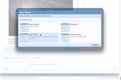
If you don't like this change, you can change it with the "Style Chooser" at the bottom left of any page
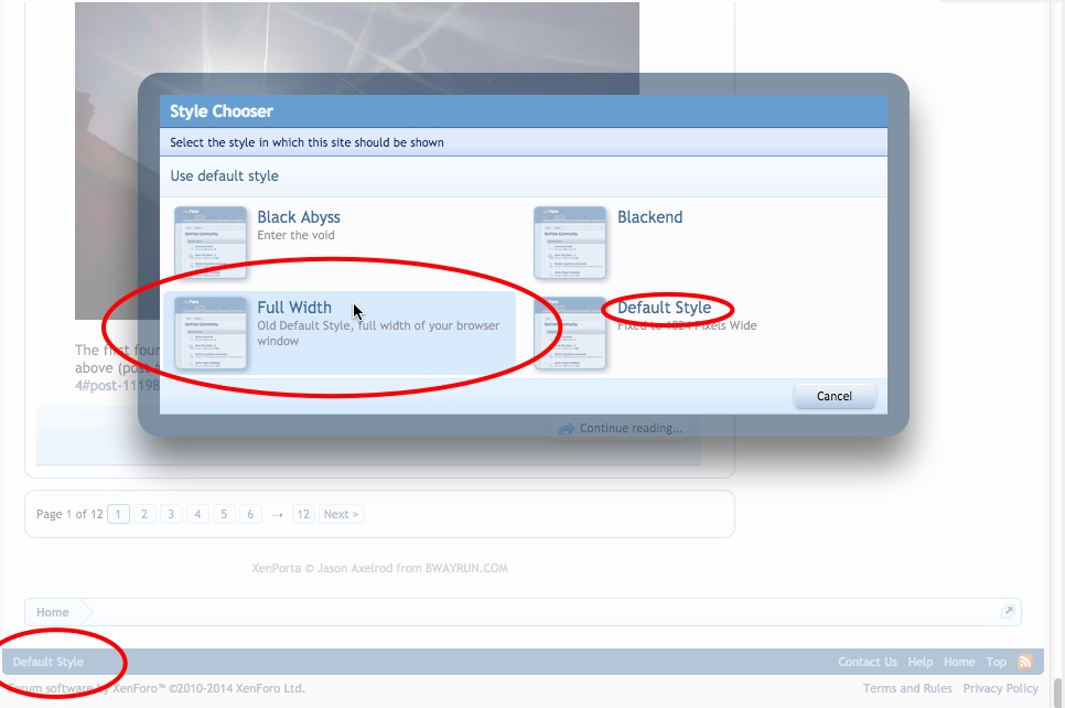


You may find you have "Full Width" already selected as default. If you would like to try the new "Fixed Width", then simply select "Default Style" from the Style Chooser.
 

Attachments

  • upload_2014-8-2_9-4-7.png
    upload_2014-8-2_9-4-7.png
    150.3 KB · Views: 446
Last edited:
And let me know if you prefer it like this, or the old way.

It should not affect viewing on mobile devices.
 
the photos look a lot better in the "pics you took yourself' threads. I cant stand not being able to see a whole pic in my browser window! so I like it
 
the photos look a lot better in the "pics you took yourself' threads. I cant stand not being able to see a whole pic in my browser window! so I like it

Interesting. I did not realize they were broken like that, it should have been resizing them regardless. Must be browser specific. You have IE11?
 
OK....THAT is why I was cussing out my Chrome!! (I kid)

I can just use the tool that Chrome includes to expand the screen...no problemo!

(THIS idea might help your site when viewed on Tablets, iPads and SmartPhone screens?)

(EDIT)...Aaaaand....selected "Style Chooser" (lower left part of the bottom of the page) and...done!! Looks good.
 
Last edited:
Interesting. I did not realize they were broken like that, it should have been resizing them regardless. Must be browser specific. You have IE11?
yes IE11. I don't know if they are 'broken'. just some are/were way too big. but not all, yours from the other night with all the clouds fits perfect (even before this new width thing.).

a few are too long still because of my toolbars maybe but its a lot better than it was.
 
yes IE11. I don't know if they are 'broken'. just some are/were way too big. but not all, yours from the other night with all the clouds fits perfect (even before this new width thing.).

a few are too long still because of my toolbars maybe but its a lot better than it was.

They should all fit within the page, unless something is messing with your browser. What toolbars do you use?
 
^^but better than it was before. hmm just found out I can put my tabs ont he top area. so a have a tiny bit more room. but jasons pic is still too long. maybe its a sideways camera issue?
 
Last edited:
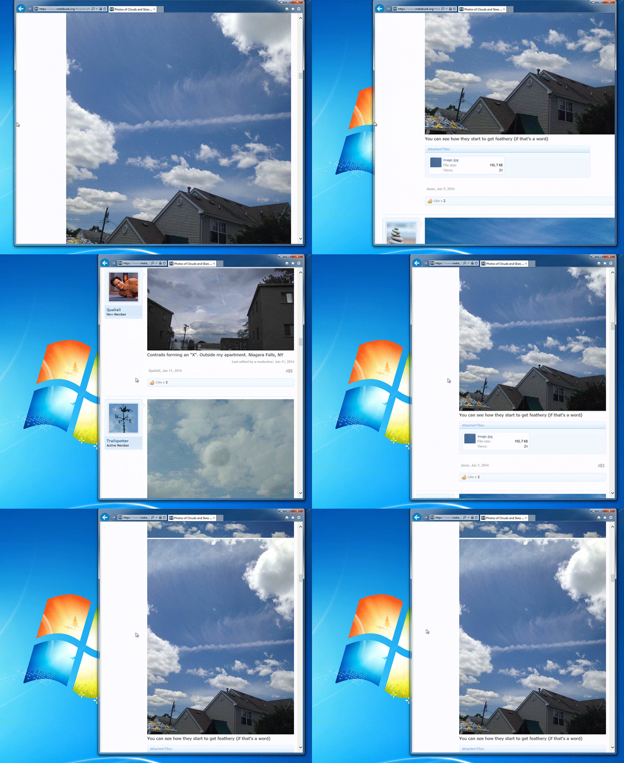
Ah, you mean too tall, too long vertically. Unfortunately the web just expects you to scroll for pics that don't fit vertically. What you can do is just drag the side of the browser window and make it narrower.

Like this:
 
good tip. thanks. that helps a little but not completely. if it looks like a really pretty pic I just save it and look at it from my desktop too
 
I THOUGHT something looked different!

I like it better. I frequently dragged the screen to make it narrower, because especially on long posts it's easier to read the narrower width text.

Which is why newspaper articles have columns and don't run articles across the entire page.
 
If there's any demand, I can make ab optional theme that's even narrower. I picked this width (1024) as being about the same as wired.com
 
Sorry I had to change the order of the themes (otherwise theme inheritance got rather messy), which might mean you got reverted to the default. Please just re-select the theme you want, as above. This should not happen again.
 
No, just letting you know.

Jolly Good.

The different styles are not very popular. Only six people use Blackend. I had to set them up so they inherit from the default style to make propagating changes easier.

Having the same font should also minimize layout inconsistencies.
 
Jolly Good.

The different styles are not very popular. Only six people use Blackend. I had to set them up so they inherit from the default style to make propagating changes easier.

Having the same font should also minimize layout inconsistencies.
I use Blackend!

\m/ ^.^ \m/
Fire
To begin whipping dance of the dead
Blackened is the end
 
Sometimes, after reading too much in blackend, I see black & white lines after looking away form the screen. Trippy!
 
blackend still sounds like the sort of disease you get from hanging out with unsavoury members of the opposite sex.
 
Back
Top