This image has been knocking around the internet for a few years, often as part of collections like "top ten unexplained ghost photos", with stories like:
http://hoaxes.org/weblog/comments/falling_body_photo
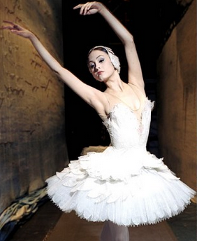
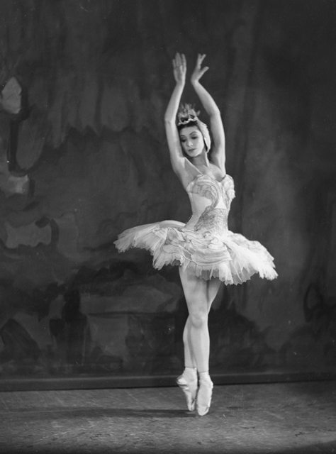
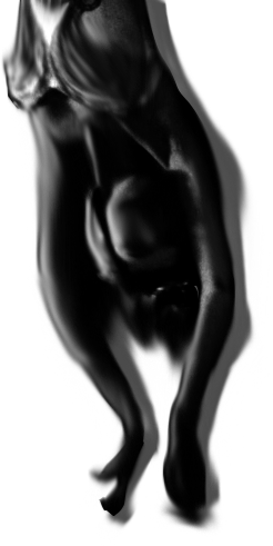
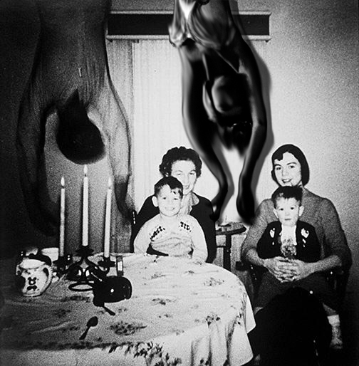
It appears to be a digital composite of an old family photo and another image, possibly a ballerina (suggested by @deirdre, here). The original posting of the image is unclear. The earliest known version is in 2009, by Thomas Ligotti. A likely origin is the thread that spawned the "Slender Man" meme: "Create Paranormal Images" on somethingawful.com, dating back to 2009 (tracked down by @Ray Von Geezer, here).Sometime in the 1950s the Cooper family of Texas bought an old house and moved into it. On their first night there, the father took a photo of Mom and Grandma posing with the two kids at the dining room table. Everyone was happy and smiling. They were living the American dream.
But when the photo was subsequently developed, they saw, to their horror, that what looked like a body falling or hanging from the ceiling had materialized behind them. It hadn't been there when the father took the photo. So where had it come from? Was it an apparition of a deceased former tenant of the house? No one knew.
https://forums.somethingawful.com/showthread.php?threadid=3150591
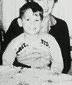
The origin of the "Cooper family" background photo was revealed when one of the boys in the photo, Robert Copper, commented here:
When my older brother sent me this link I was floored. We are the two boys in the picture. Well we were back in 1959. I have many picture like this one, but not this one. My mother had a habit of throwing away pictures that she didn't like. Eventually the ones she kept were passed along to me. What annoys me is that somebody got hold of a family photograph. The story is almost entirely fiction. Our last name is Copper, not Cooper. Does anybody know who did this?
Robert kindly had an old slide scanned which shows that it is indeed him and and brother in the photo.
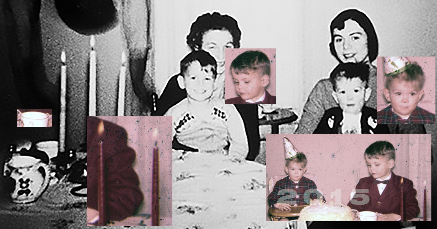
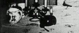
Other features in the photo match:
- The drapes
- A small portion of the tablecloth pattern
- The candlesticks (only two, presumably to match the cake)
- mug with gold rim
[Note this is a summary thread from the discussion below, so the following posts may repeat information]
Last edited: