
Walter Bislin
New Member
Hi. I'm an engineer and try to educate Flat Earthers, sometimes with a little success ")
According to geodetic measurments the shape of the earth is not exactly a sphere, but slightly bulged at the equator - oblate spheroid. Flat Earthers claim that this oblateness can not be seen on satellite images.
This is not true. I searched some high resolution infrared images from the Himawari 9 satellite and measured the ratio of the equator diameter to the pol-to-pol diameter from the image, by cropping the original image at exactly the edges of the earth. The resulting ratio of the dimensions of the cropped image is exactly as measured by geodesic measurments of the earth, within the error margins.
Here my result:
Choosing good Satellite Images
There are many weather satellites in geostationary orbits around the earth. They stay at the same point over the equator, because they orbit at the same rate as the earth rotates. One of the newest is the Japanese weather satellite Himawari 9. It's image sensor has 11 000×11 000 pixel resolution, that is about 1 km/pixel. So this 42,6 km difference in the diameter should result in about 37 pixel difference in height. This should be measurable in a graphic software like Photoshop or Gimp.
There are some problems though: The earth is not always lit by the sun exactly from behind, one of the poles is usualy not lit by the sun. Ideally we have to find an image taken at equinox at a time where the sun is exactly behind the satellite. Another problem is that the atmosphere has no sharp edges and is itself about 50−100 km high. From RGB images it is difficult to find an edge that can be used to measure the diameters accurately.
But luckily weather satellites also take infrared images from the earth. In infrared imagages you can see unlit regions because the earth is emitting infrared radiation at night and day and the atmosphere itself is transparent. So we can get infrared images with sharp edges.
The infrared images of the Himawari 9 satellite have a resolution of 5500×5500 pixels. That still should get a good enough measurment of the difference in the diameters.
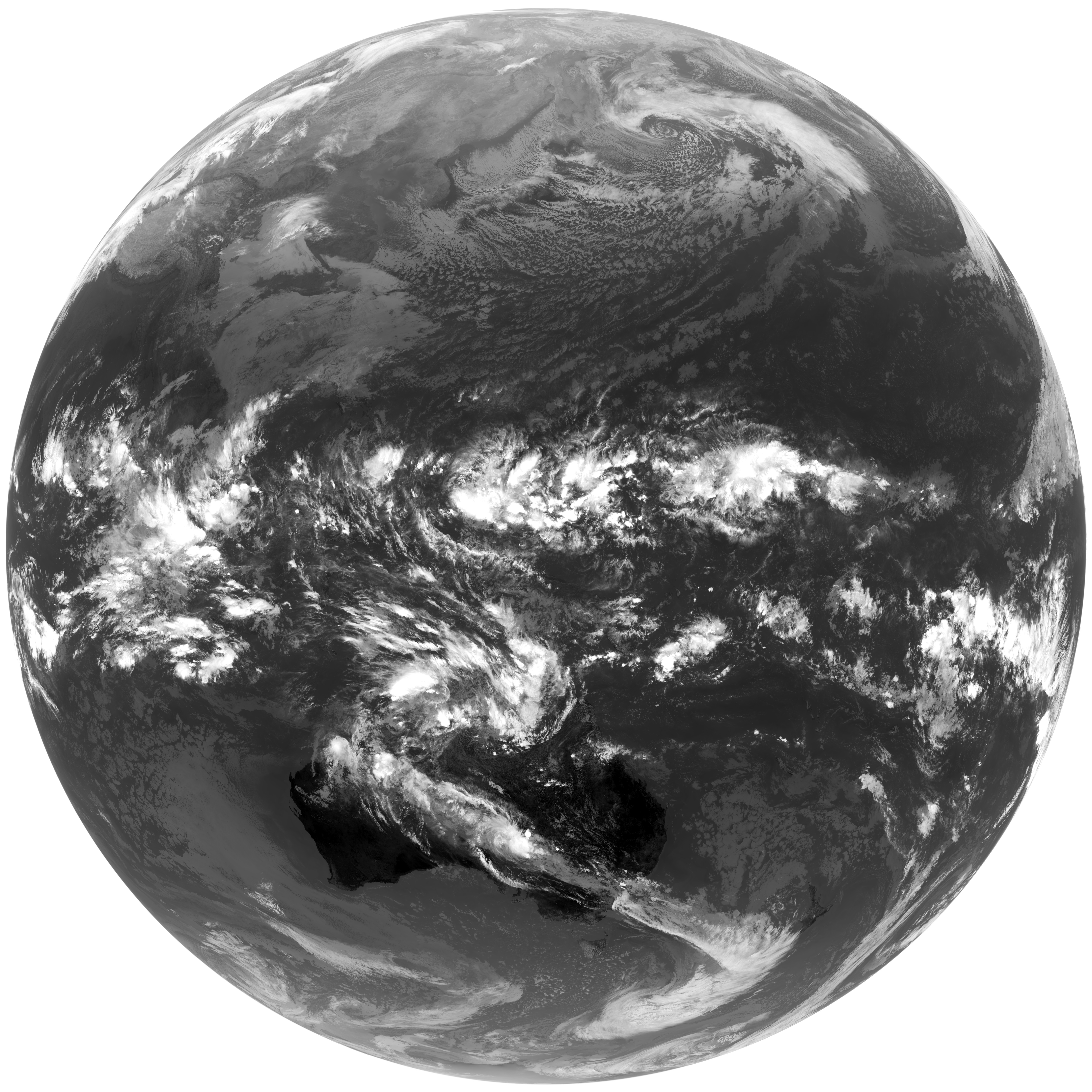
I used this original image for my measurements:
http://www.jma-net.go.jp/sat/data/web89/parts89/himawari9_first_image/grs_l/B11_l.jpg
More Infos on my blog page:
http://walter.bislins.ch/bloge/index.asp?page=Can+we+see+the+Oblateness+of+the+Earth+on+Satellite+Images?
According to geodetic measurments
the shape of the earth is not exactly a sphere, but slightly bulged at the equator - oblate spheroid. Flat Earthers claim that this oblateness can not be seen on satellite images.This is not true. I searched some high resolution infrared images from the Himawari 9 satellite and measured the ratio of the equator diameter to the pol-to-pol diameter from the image, by cropping the original image at exactly the edges of the earth. The resulting ratio of the dimensions of the cropped image is exactly as measured by geodesic measurments of the earth, within the error margins.
Here my result:
- Original image size: 5500x5500 pixels
- cropped image size: 5442±1 pixel times 5422±1 pixel
- Aspect ratio of the image: Width / Height = 1,003 69±0,000 37
- Aspect ratio of the earth: Deq / Dpol = 1,003 35
Choosing good Satellite Images
There are many weather satellites in geostationary orbits around the earth. They stay at the same point over the equator, because they orbit at the same rate as the earth rotates. One of the newest is the Japanese weather satellite Himawari 9
. It's image sensor has 11 000×11 000 pixel resolution, that is about 1 km/pixel. So this 42,6 km difference in the diameter should result in about 37 pixel difference in height. This should be measurable in a graphic software like Photoshop or Gimp.There are some problems though: The earth is not always lit by the sun exactly from behind, one of the poles is usualy not lit by the sun. Ideally we have to find an image taken at equinox at a time where the sun is exactly behind the satellite. Another problem is that the atmosphere has no sharp edges and is itself about 50−100 km high. From RGB images it is difficult to find an edge that can be used to measure the diameters accurately.
But luckily weather satellites also take infrared images from the earth. In infrared imagages you can see unlit regions because the earth is emitting infrared radiation at night and day and the atmosphere itself is transparent. So we can get infrared images with sharp edges.
The infrared images of the Himawari 9 satellite have a resolution of 5500×5500 pixels. That still should get a good enough measurment of the difference in the diameters.
I used this original image for my measurements:
http://www.jma-net.go.jp/sat/data/web89/parts89/himawari9_first_image/grs_l/B11_l.jpg
More Infos on my blog page:
http://walter.bislins.ch/bloge/index.asp?page=Can+we+see+the+Oblateness+of+the+Earth+on+Satellite+Images?
Last edited: